PeopleFund App
Summary
Most people in the US intend to retire at some point, but few realize (or maybe just avoid) the fact that without additional individual retirement savings, the monthly average social security payout would be a meager $1,500/mo. The simple fact is that saving and growing wealth is a skill in and of itself, and most people experience a lot of anxiety when planning an investment strategy. Enter PeopleFund. The concept is simple - don’t manage your money yourself, deposit it with a real human finance professional who will manage it for you!
My role
Tools used
Sketch
Adobe CC
Slack
Connecting vetted finance pros with people who don’t want to deal with it.
We all stress about money
Unless you’re Jeff Bezos. Then this app is definitely not for you. But most people are aware of the stock market, investing and retirement planning. We’re just not very good as a species at thinking ahead and executing a well-researched financial strategy on a daily, monthly or yearly basis. That’s why professionals exist, yet many people never seek them out. Consider that…
Roughly
$55%
of Americans have money in the stock market.
35% of Americans have
$1k
or less saved for retirement.
$100,000 today will be worth
$54k
in 20 years if left uninvested.
Is there interest on both sides?
This was another creative exercise in conceptual design but though the scope of the work was narrow, I still went ahead and created a short survey to try and get some insight into whether money managers would be interested in a platform where they can run a “fund” and people simply move money in and out.
Not all finance professionals are…good.
The key to this platform is getting buy-in from quality money managers that would be willing to make their investment management performance publicly visible. But not all finance professionals have strong performance records. More research and a thorough understanding the regulatory landscape would be required to bring a service like this to market, but initial feedback was mixed, with some people showing interest in participating in the platform, while others voiced disinterest or legal blockers.
You guessed it. Wires.
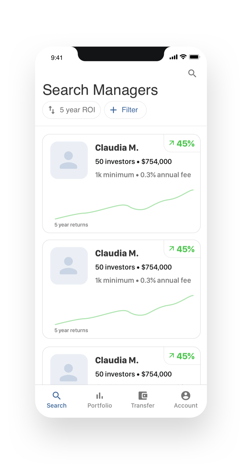
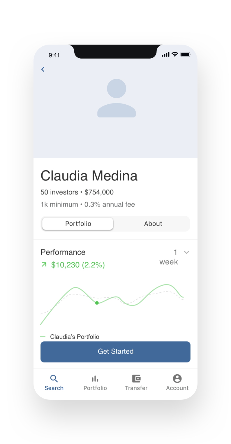
So after the intial research, it was clear that at least one half (the people who need their money managed) are interested. Through some guerilla interviews, I also learned that people in my demographic consider human advisors more trust-worthy than the algorithmic advisor offering most readily available to people currently. I wanted the wires to focus on the flow of searching for, finding and investing with a manager.
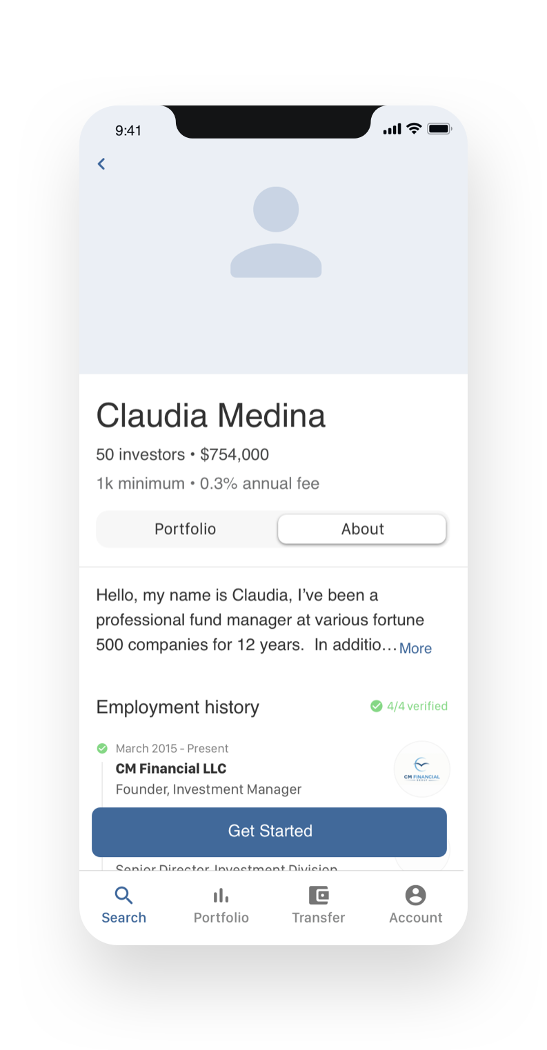
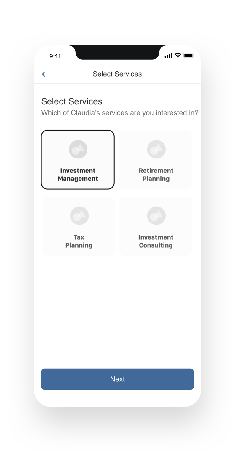
Simple yet informative
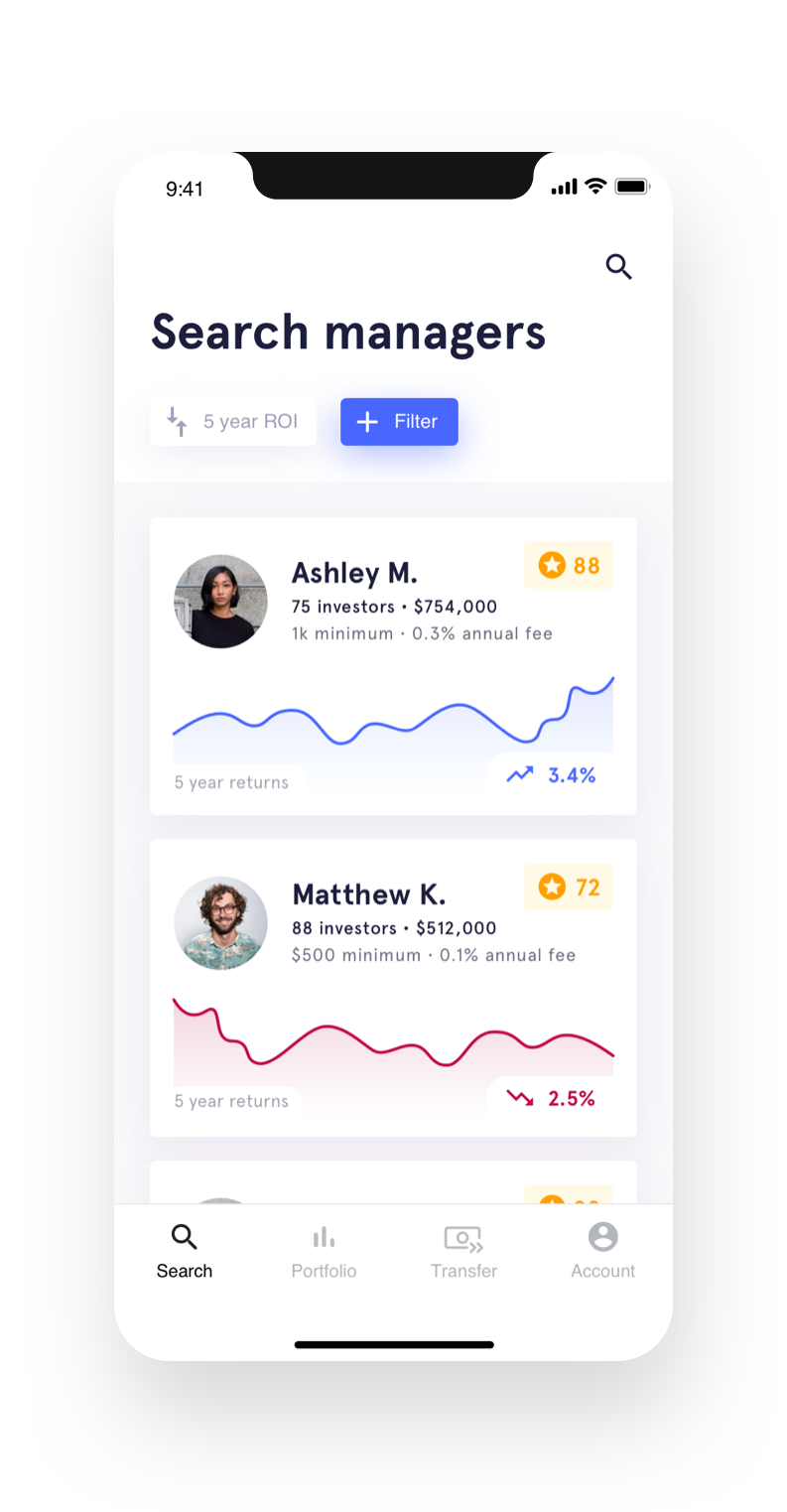
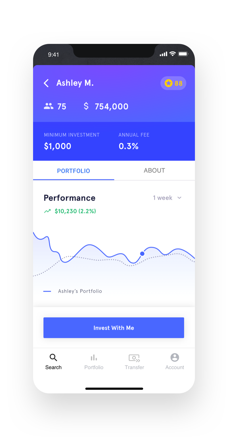
From the intial research, I found that most people want to know that the manager has experience, and that people want to choose how risky they want to be. The search flow has prominent access to sorting and filtering to narrow down money managers by any metrics, and the details of a manager show a verified work history, performance metrics, how much the advisor takes as an annual commission from the value of the fund, etc.
Bringing it to life
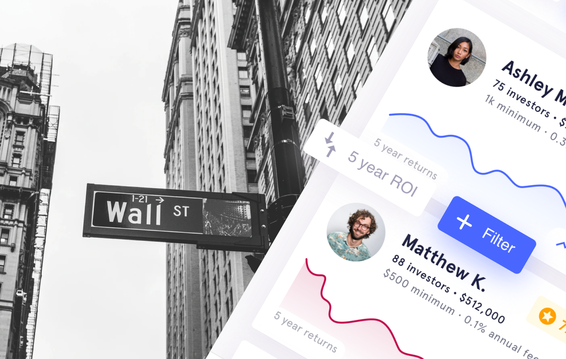
Much like the goMrkt app concept, this one required a considerable bit of care to slice out the UI assets that our UI designer created. Once again, I dove head-first into rebuilding the UI comps as a collection of bitmap exports to make my life easier in After Effects.
Motion design
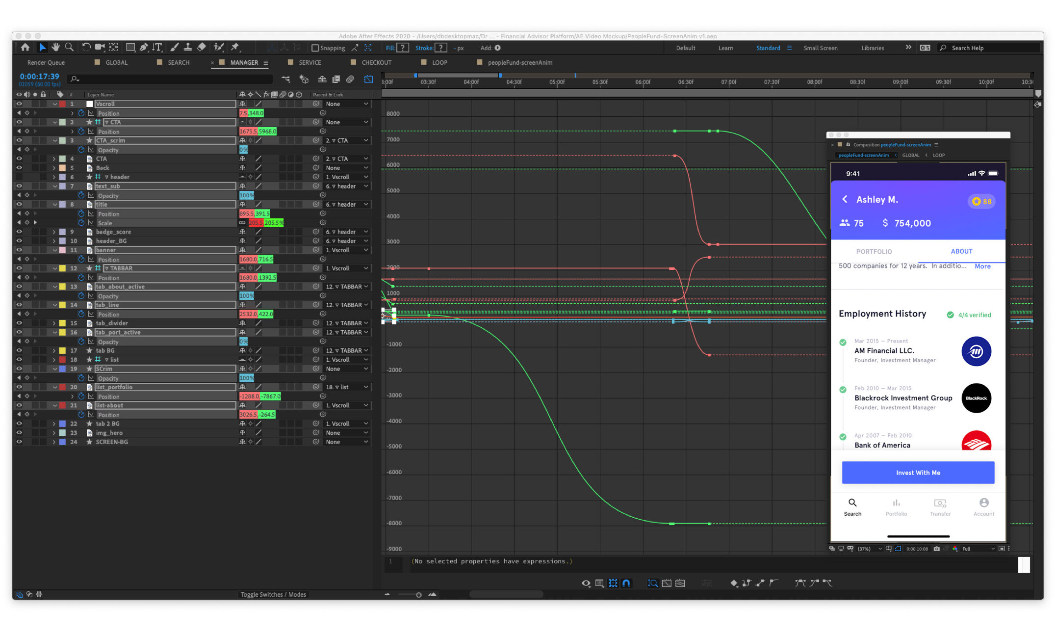
This app’s motion design presented some unique challenges, especially on the money manager’s profile screen. Not only were there many moving elements, the transition from half-screen bottom sheet to full-screen modal, as well as switching tabs all had to be seamless and convicing, just like a real app. For complex sequences like this, its best to think three times, and animate once. Also, guide layers were definitely my friends.
Making a seamless loop
After the final screen animation, all that was left was to place the exported screen animation video into an After Effects device mockup. SInce these videos are just short demonstrations of the concept, it’s nice to have them loop seamlessly. Most AE mockups are created in 10s clips. So I had to time-remap the screen animation to make sure it would loop seamlessly right back to the starting state.
U-Eye candy
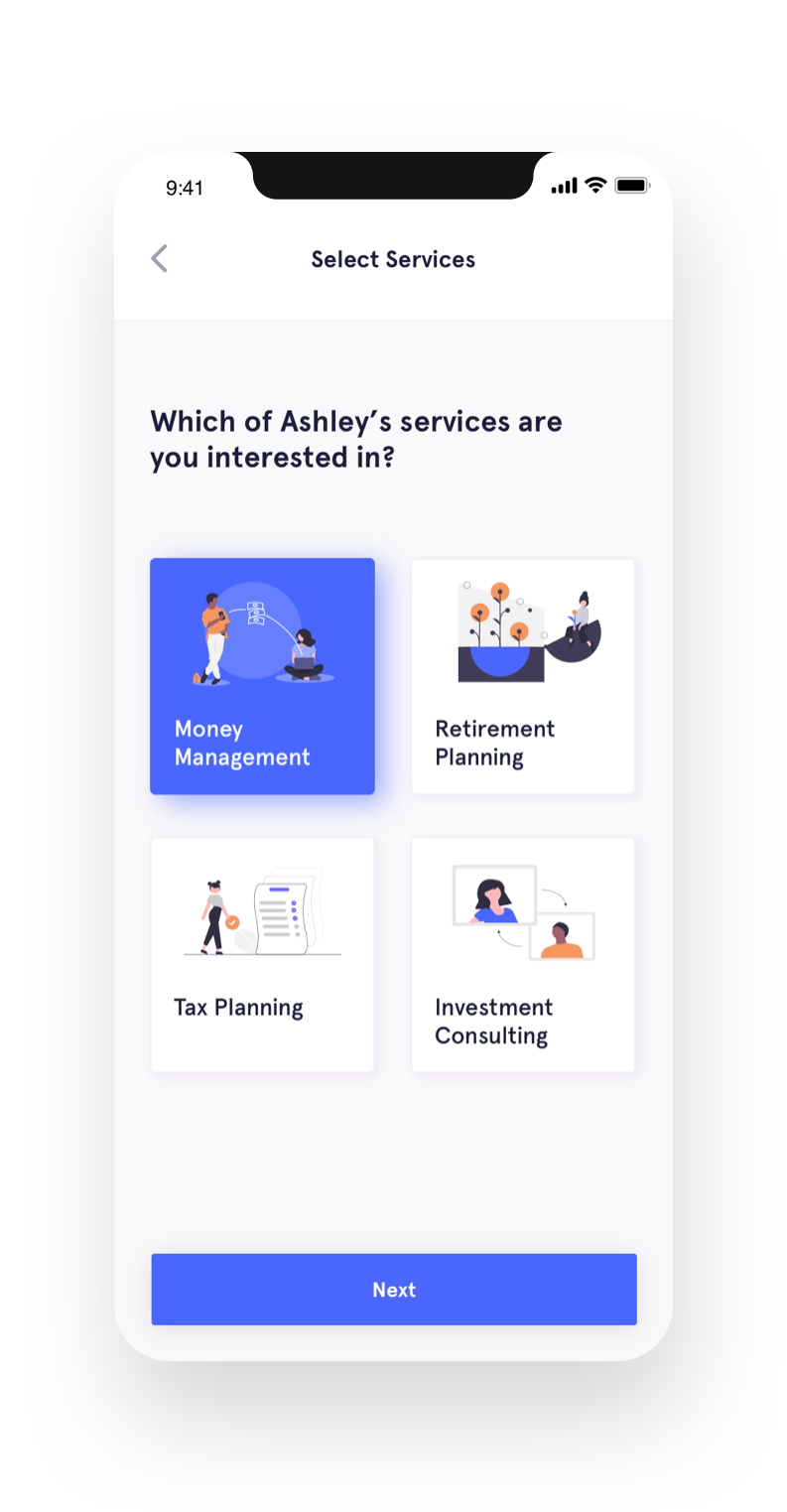
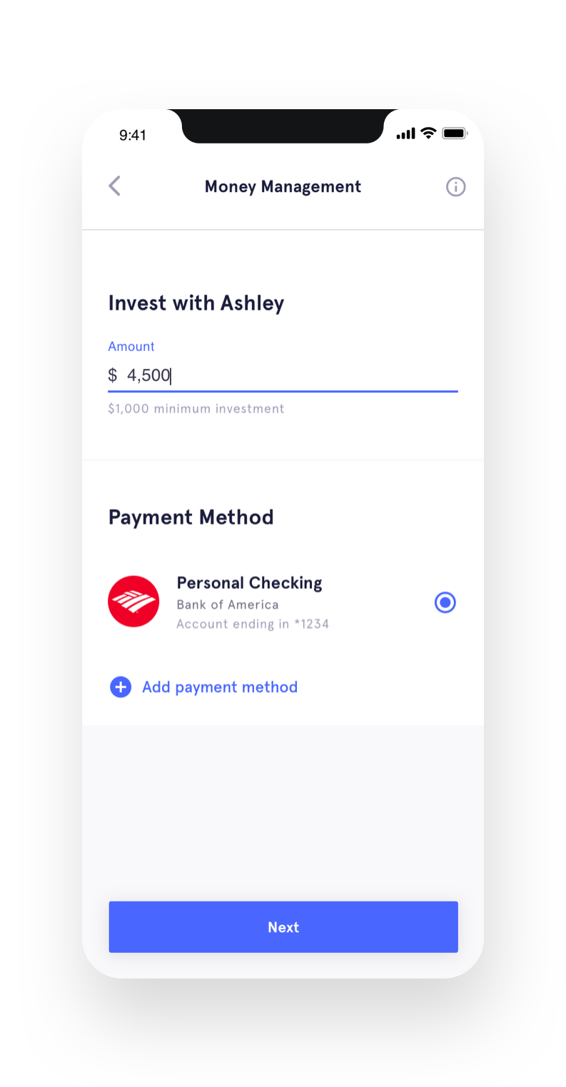
Pun intended. I've spent a good bit of time rounding out my own UI skillset, but for this project, I was fortunate enough to work with an extremely talented UI designer and below are the final interface comps she produced for your viewing pleasure.
