DB-Design.co
Summary
While experience design is my day job, I’m also an avid hobbyist when it comes to programming using various web technologes. My interest in modern web frameworks like React and Gatsby made me want to challenge myself to break out of the Sketch files and into the code editor.
My role
Tools used
Sketch
Adobe CC
Origami Studio
Draw.io
React.js
JavaScript ES6
CSS 3
HTML 5
Notion
Git
VS Code
Could I have bought a template and called it done? Yes. But where's the challenge in that?!
There are many portfolio templates out there, and there’s definitely a common theme regarding the content and top tasks for users visiting a portfolio site. But rather than jumping right into the design, I wanted to take a step back, and really ask my self the “who”, “why”, and “how” of portfolios.
Building Understanding
Who’s actually going to use this thing!? Well, as it turns out, that’s mostly rhetorical and obvious - recruiters, hiring managers, and fellow designers that have to figure out who they’d like on their team. What’s less obvious is what these folks might respectively need from the portfolio.
Internal hiring is
6x
more effective than all other sources of hiring
Referrals are
5x
more effective than all other sources of hiring
87%
of recruiters use LinkedIn to check candidates
This data revealed more about where to focus my efforts. For recruiters, I wanted to make sure that my linkedin, phone number, email and resume were all very easy to access.
For designers and hiring managers, I wanted to provide multiple layers of depth for the content, so that they could skim for a high level understanding of my skills, or they could get deeper into my process if they were interested.
Don’t re-invent the wheel
There aren’t many entirely “new” problems in UX for web, but It’s remarkable how often designers neglect to do even a quick competitive audit to see how others have approached similar problems.
I found a few porfolios by respected designers doing excellent work, and took some screenshots to keep as a reference.
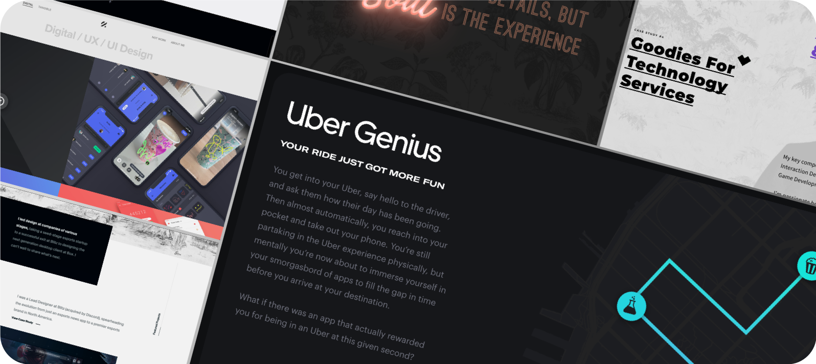
It was immediately clear that on top of sound navigation patterns, mobile-first designs, and clear hierarchies, the best UX portfolios were also beautiful and delightful - all without compromising usability.
Develop the information architecture
With my target personas and the corresponding research in mind, I created a basic information architecure for the portfolio.
This is a good time to reflect on how the navigation will function, as it can influence the overall structure. I opted for a home screen that will scroll to the key sections, and provide dropdown options for jumping between different projects.
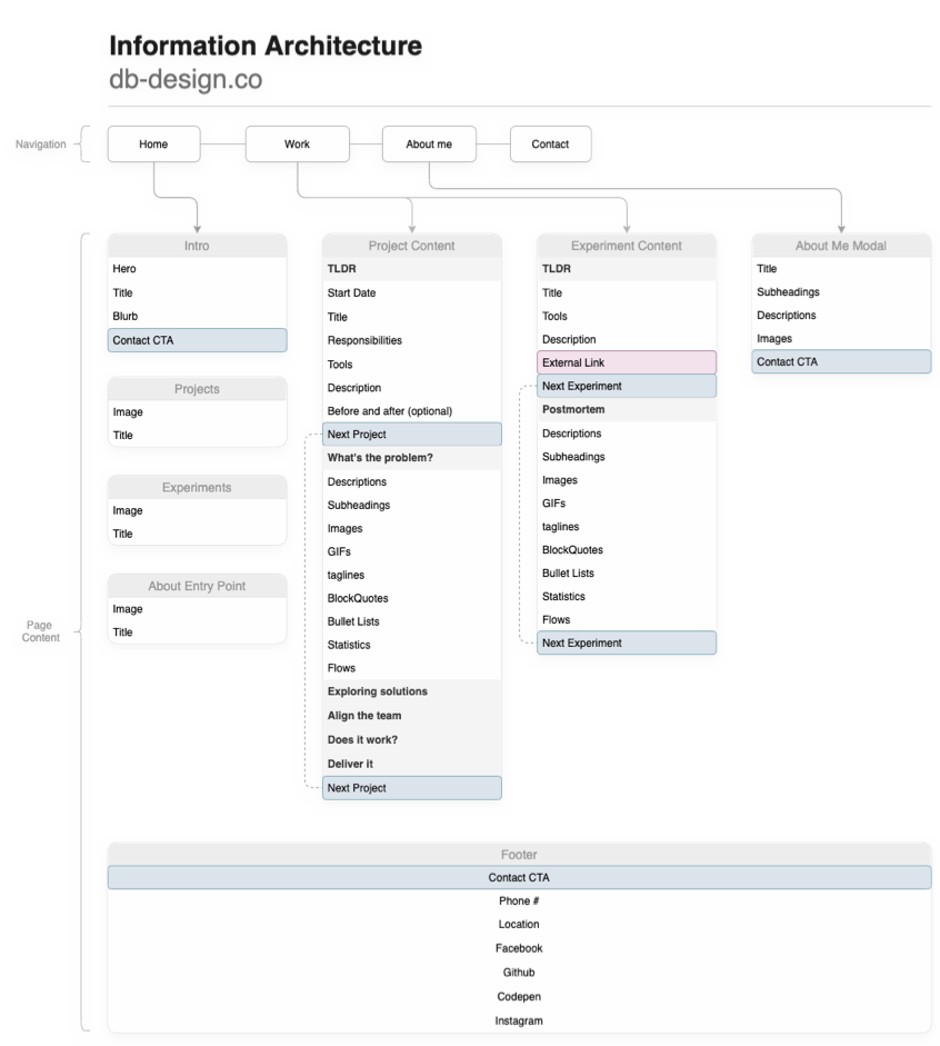
While the final architecture changed in a few places due to timelines for getting an MVP out, it was very helpful to conceptualize how the various areas of the site could be laid out.
Putting pen to paper
Armed with the above knowlege, I began iterating divergently on various layouts as well as data types that would be needed for the implementation.
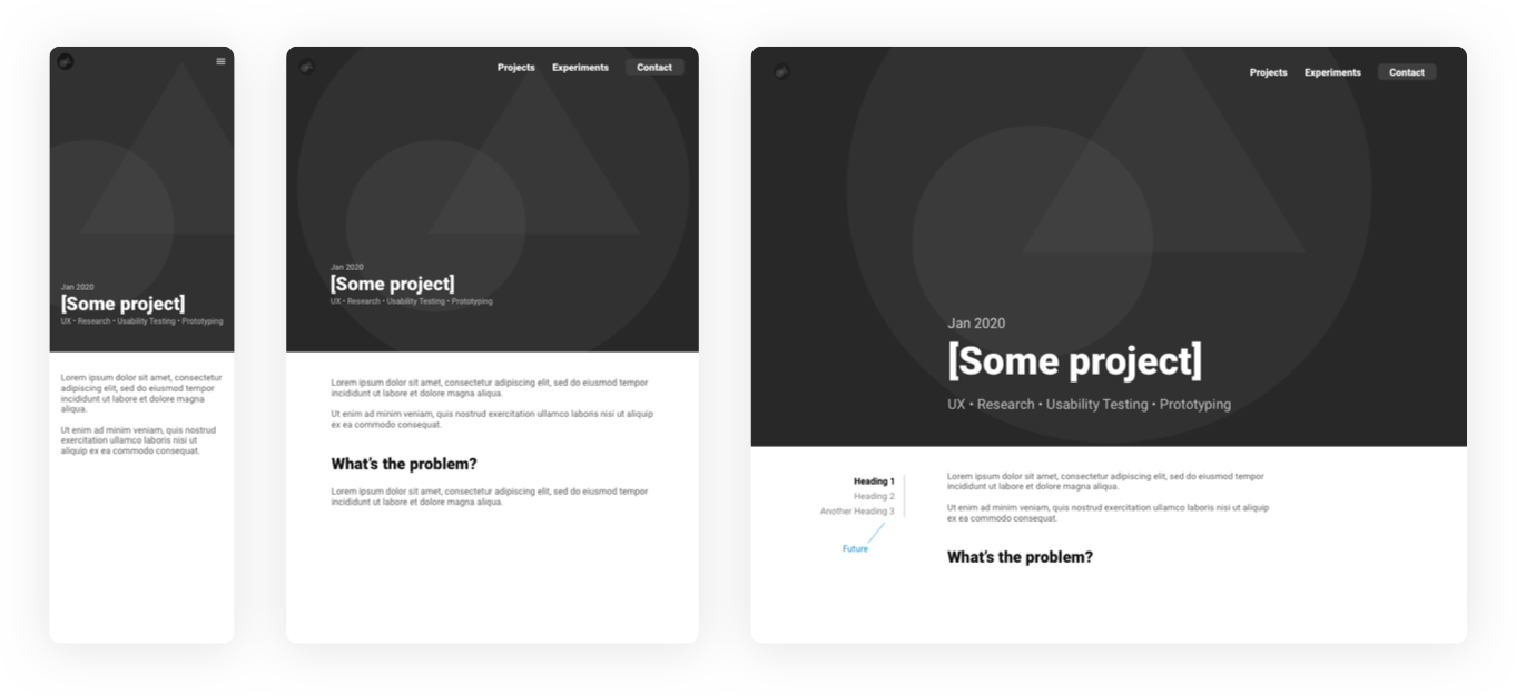
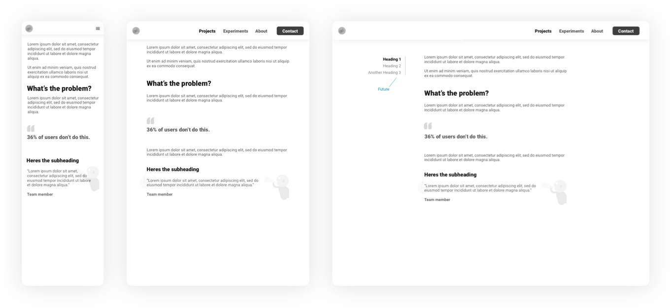
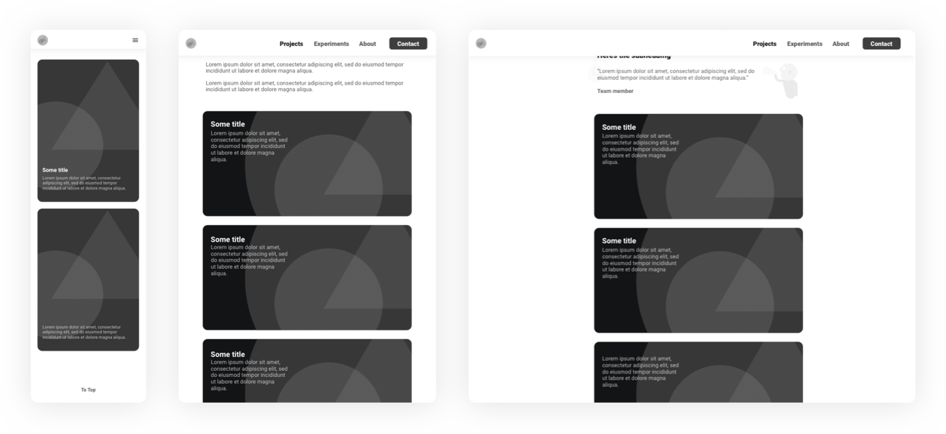
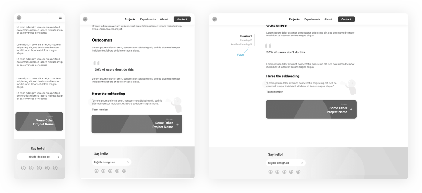
Storytelling
I knew the bulk of the portfolio would live in the project details, since my plan was to create some detailed case studies.
Reading them is a time investment that my target audience would only be interested in if I was on the “short-list” for a position. So the audience is small, and high value.
At this point I jotted down a few “How-might-I’s”
How might we...
- Draw the reader in, and keep them engaged through out?
- Make it clear and easy to view my CV and contact me?
- Enable the user to skim content easily to get “the gist”?
- Keep it clean, simple and easy to navigate?
- Make a lasting impression on the user?
The goal was to capture the direction for the content, and subsequently write the first case study to stress out the content components in the wires, see what might be missing, and also to serve as the basis for refining the natural flow of the case studies, since they would be assembled out of reusable code components which could be arranged in any order.
The case study you’re reading was the one I wanted to use as a baseline, since I was already working on this project. (so meta…). After writing an outline of the high-level story arc, I started clacking away.
Branding
At the core of every strong brand is a statement that should inform every interaction between the world and that brand. A personal brand is no different, but the brand should be - well… personal! so I crafted a statement to help anchor the visual identity of my portfolio to who I am as a human.
Branding means getting clear on who I am, and what I want to consistently convey to people.
My statement
I am committed to pushing the boundaries of my abilities, always learning and evolving, and reaching beyond what I think I’m capable of, in design and in life. I want my brand to inspire my peers, project confidence tempered by humility and humor, and above all, showcase me as a designer, life-long student, teammate, and down-to-earth human being.
Logo design
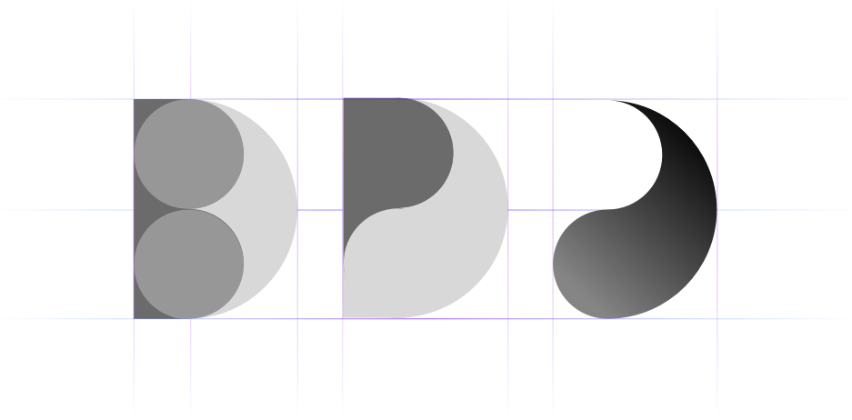
I wanted the logo to be simple and modern, and based on my initials. After some explorations, a clean and simple approach emerged. I liked that the shape looks like a droplet of paint, evoking feelings of creativity, as well as resembling one half of the yin-yang sign, which symbolizes balance - and all the while, the shape is rooted in the combination of the letters D and B.
Developing the UI
i believe that UI and interaction design are integral to the overall user experience, as they communicate the intangibles that humans are so full of, and are so captivated by - emotion, delight, connection, inspiration, beauty.
These are extremely difficult to quantify, and yet we consistently see that companies that invest in these intangibles overwhelmingly tend to be innovators and market leaders.
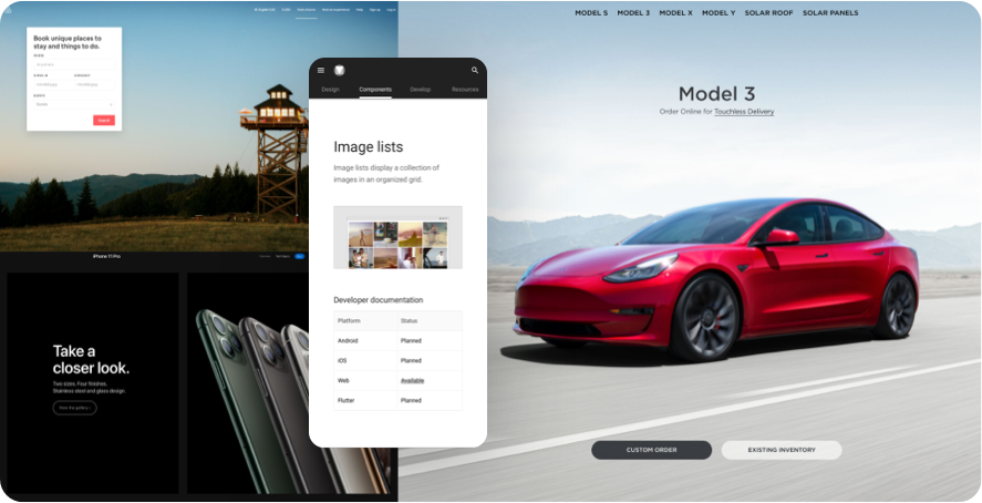
Great businesses invest in great design.
So while the wires should be unambiguous on how stuff should function, there’s always room for collaboration and alternative ideas from UI designers and engineers on modifications to help with anything from code reuse to visual consistency.
UI design should never just be though of as "painting the wires".
Gathering inspiration
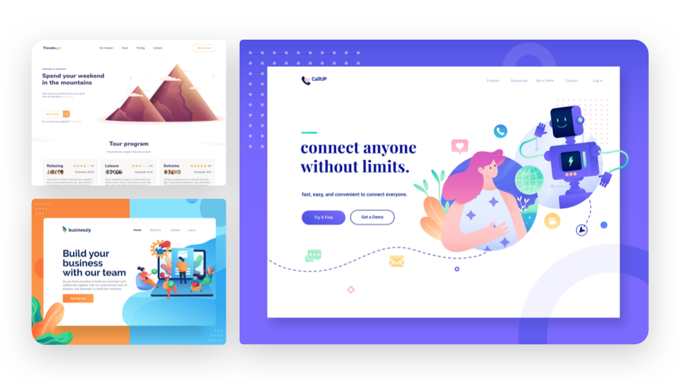
UI trends emerge now and again, but the time tested trend has remained to simplify, minimize, delight, and declutter. So I collected some inspiration to make sure the UI reflected what my target audience would look for as a valuable skill.
Fighting off my inner perfectionist
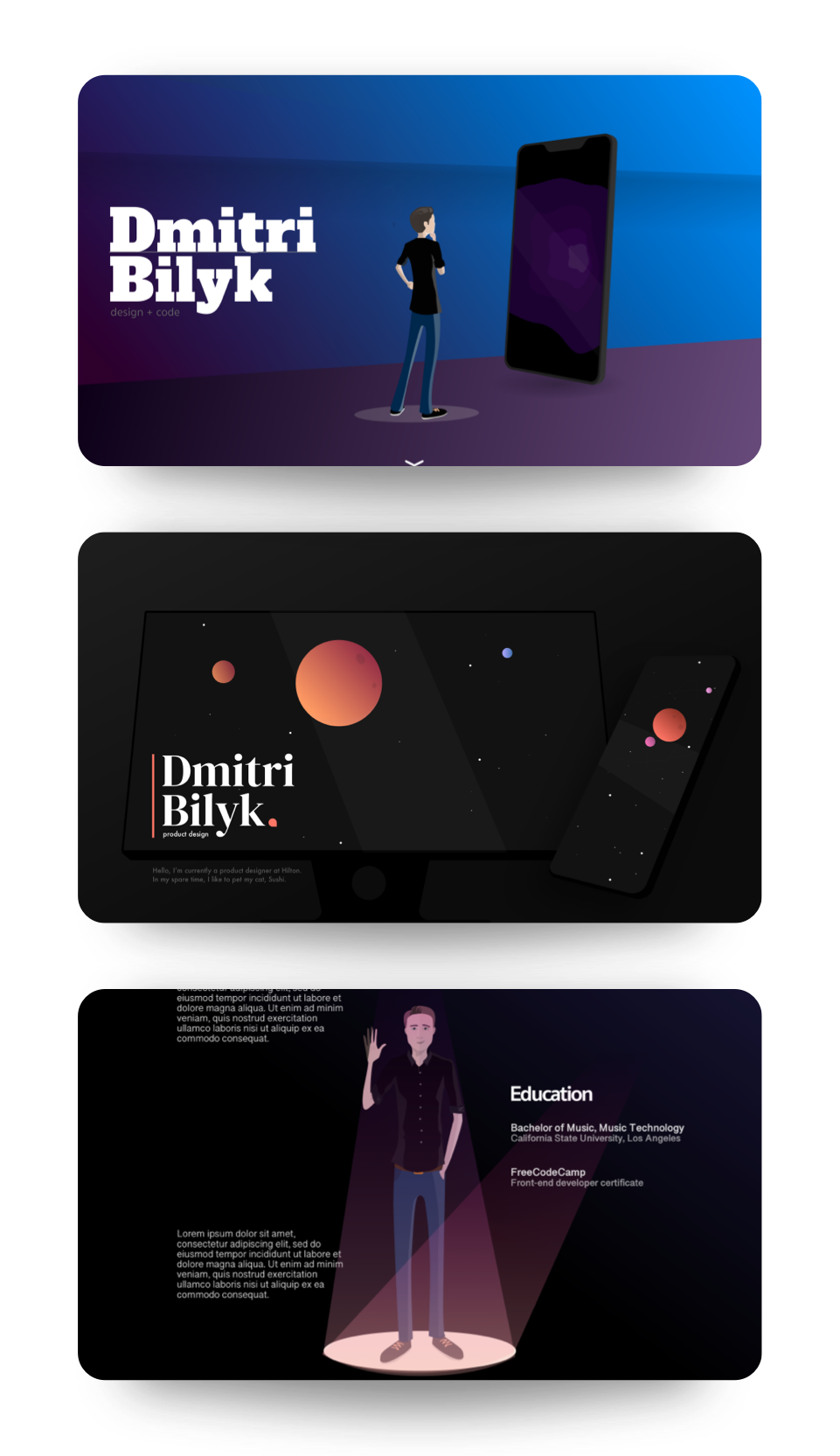
Truth be told, the UI was probably the hardest part of the entire design process, since I have a tendency to be a harsh critic of my own work, and it’s not my most developed skill set.
I started getting bogged down with my perfectionist tendencies so I had to exercise some self-restraint and commit to an intial approach since done is (begudgingly) better than perfect!
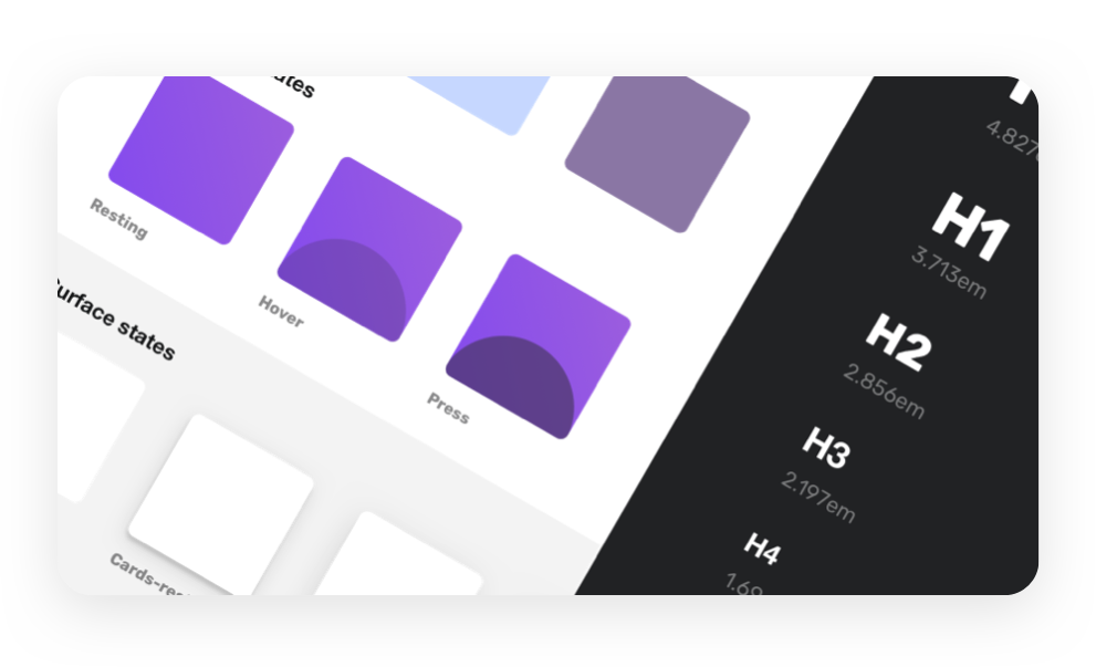
Creating the design system
From my experience working in enterprise UX, I’ve found huge value in creating design systems to not reinvent the wheel. At enterprise scale, they can become inflexible, sepecially if not well thought-out early on, but at this small scale, they’re very convenient.
So I put together a small design system in Sketch for this project to make sure that the interface remained visually consistent.
Ready, set... code!
It may be tempting to skip the human - centered design process for new business founders, feature - fixated product teams, and bootstrapped startups.
But the biggest mistake a product team can make is solving a problem that doesn’t exist.
Why not just design and code at the same time?
Computers are relentlessly logical. They will do exactly what you ask of them, no more no less. That’s why it’s so important to understand what problem you aim to solve for people - because no amount of code will ever figure that out for you.
Code is the automation of business strategy. Design is how you arrive at that strategy.
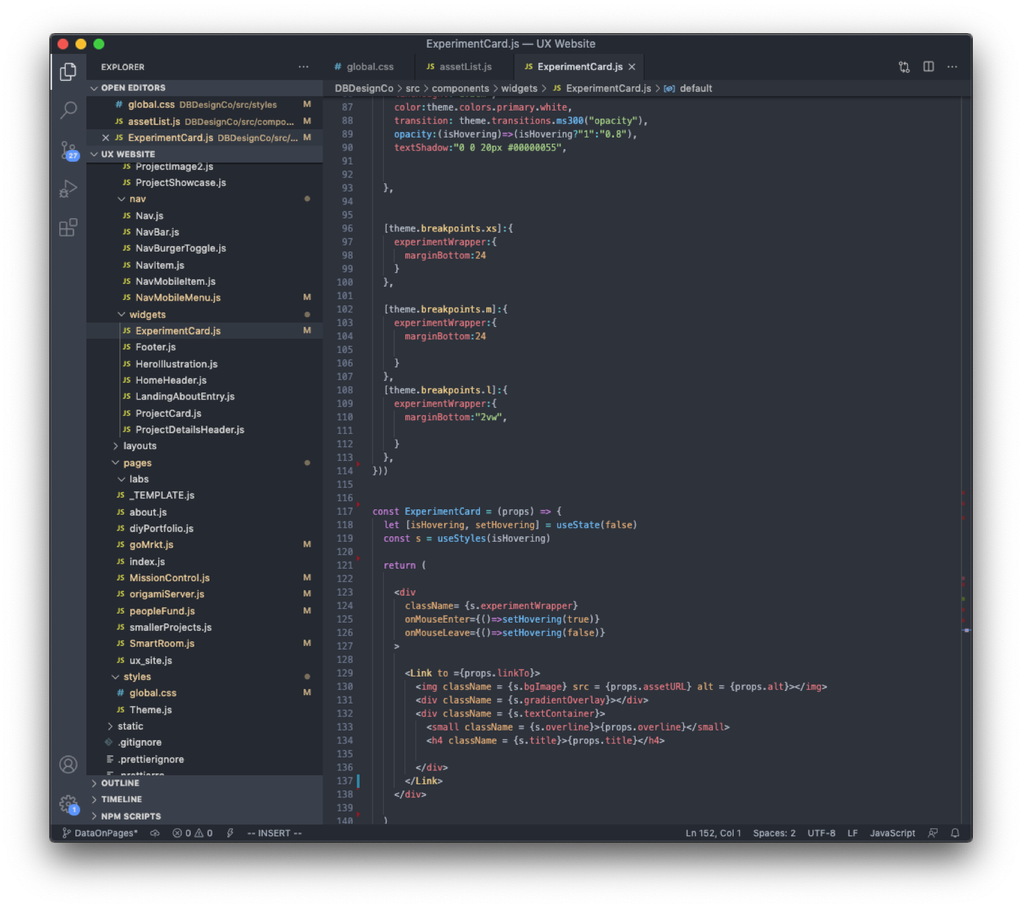
So with the designs all ready to go, it was time to jump into VS Code and start my head around how to approach the development process.
So how am I going to build this thing?
I’d used and fell in love with React for some other projects, so I decided that’d be the framework to build the site.
I’m not a professional programmer, but it’s been a hobby for years, and I find the challenge of it to be extremely rewarding, so I wanted to use this project as an opportunity to really focus on code quality since it’s easy to take shortcuts when you’re working on your own codebase.
Staying on track
Most digital product teams use Agile to structure their dev process, but I didn’t have the time luxury of spec’ing that many scenarios just for myself to write them.
I opted instead for a combination of Notion and Team Gantt to create the tasks and keep myself in a Kanban-style workflow for the duration of the project.
After all was said and done, it took me longer than expected to wrap up the build. This was in part due to the fact that my work commitments tended to get in the way and also because of some scope creep that I ended up having to cut for the MVP build. It happens to the best of us, and it's easy to get wrapped up in perfectionist tendencies, so it was a healthy exercise to take a step back, and acknowledge that done is better than perfect, and I could always go back to iterate and polish it more over time.
Outcomes
Since launching the portfolio and promoting it on LinkedIn, I’ve had a significant uptick in traffic from google, as well as recieving more inquiries from recruiters, and I continue to drive conversations with fellow designers.
