GoMarket App
Summary
In a technologically advanced society, the grocery store has remained remarkably unchanged. What could the future look like if it was built from the ground up to leverage the logistical and data capabilities we see disrupting many other industries? This concept explores how an entirely new type of online-focused grocery chain could optimize the online shopping experience by removing the overhead of traditional brick and mortar stores and redirecting that investment into the delivery pipeline.
My role
Tools used
Sketch
Adobe CC
Slack
A peek into the future of vertical integration and innovation in the grocery shopping experience.
Building understanding
While this project was really a short exploration of a complex business model, I still wanted to grab a bit of data about the market size and consumer habits to understand how people currently shop and what the market opportunity might be for such a business.
Approximately
50%
Of people take a list to a grocery store.
Shoppers spent
$638
billion dollars on groceries in 2018.
Shoppers make
1.5
trips to the market per week.
Mapping out the shopping flow
The core of any shopping experience, whether virtual or in-person is the funnel. The process by which customers browse, inspect, configure, save, and ultimately pay for goods. What is fairly unique to the grocery shopping experience is the concept of having a pre-defined list of items. 69% of women and 52% of men take a list to the store.
We’ve all done it at some point, and food is something we HAVE to buy, so after a while, we develop pretty consistent preferences and the focus becomes less about browsing and more about the efficiency and accuracy of collecting the stuff you know you need.
Order your entire grocery list
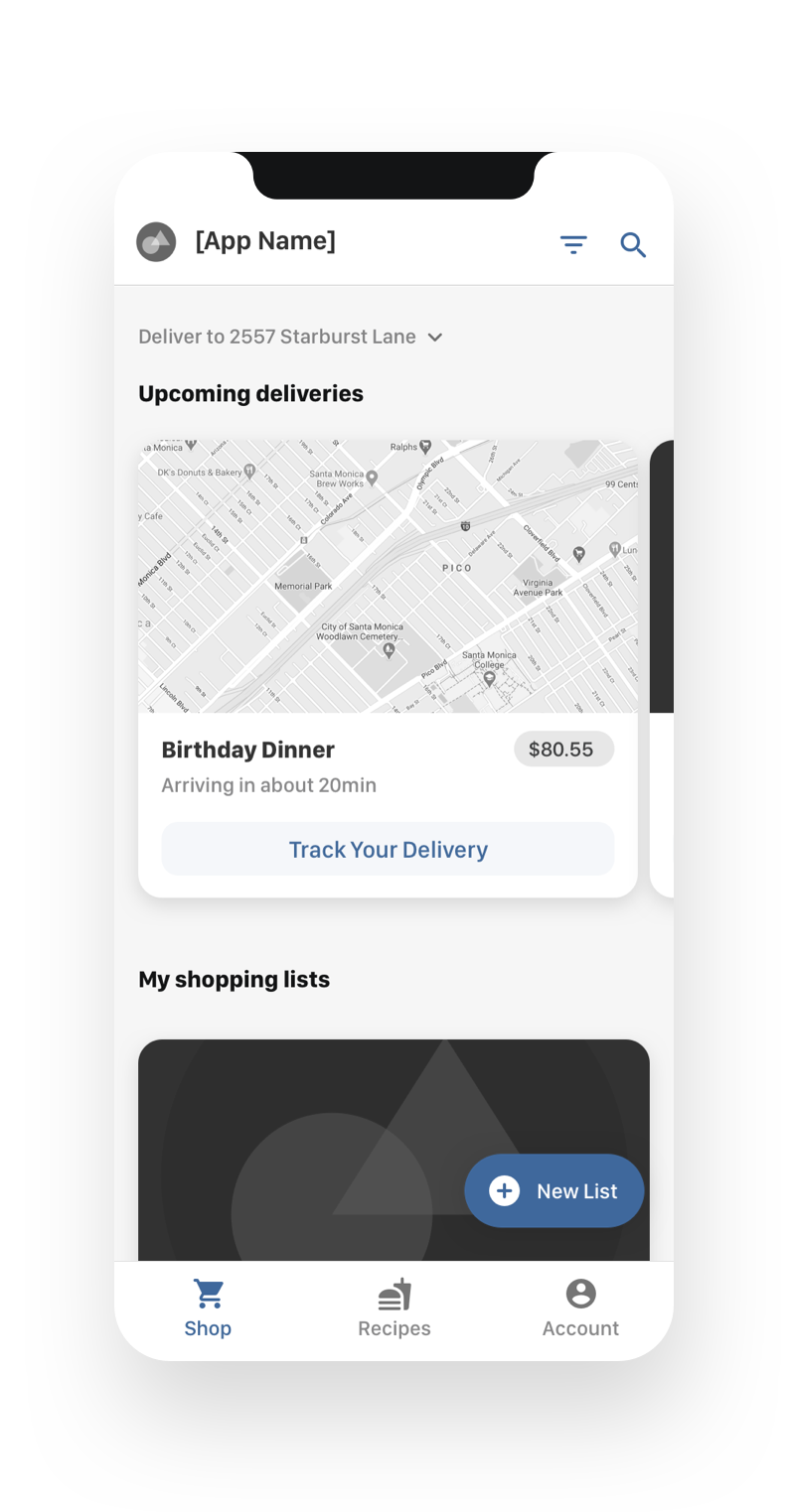
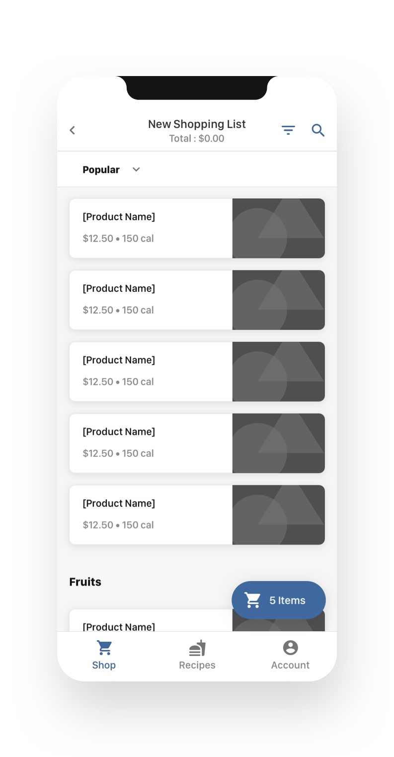
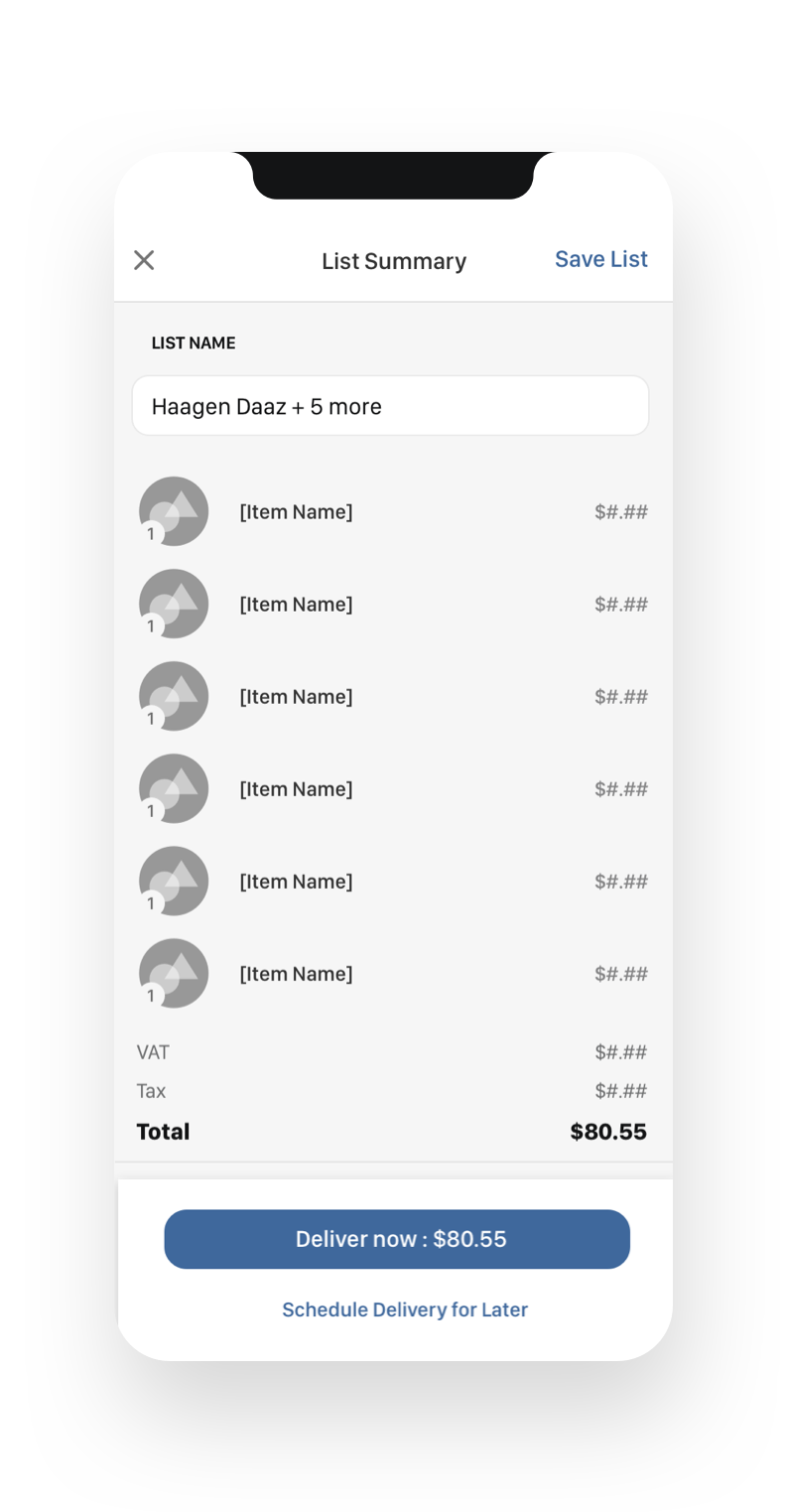
I wanted to make the search page focused around saved lists that users can re-order, schedule and so on. Once a user goes through the checkout flow, they have the option to save a new list so they can quickly order the same collection of items in the future. Features that could be viable later on would be browsing recipes and ordering the EXACT ingredients immediately to your door.
Spec the wires
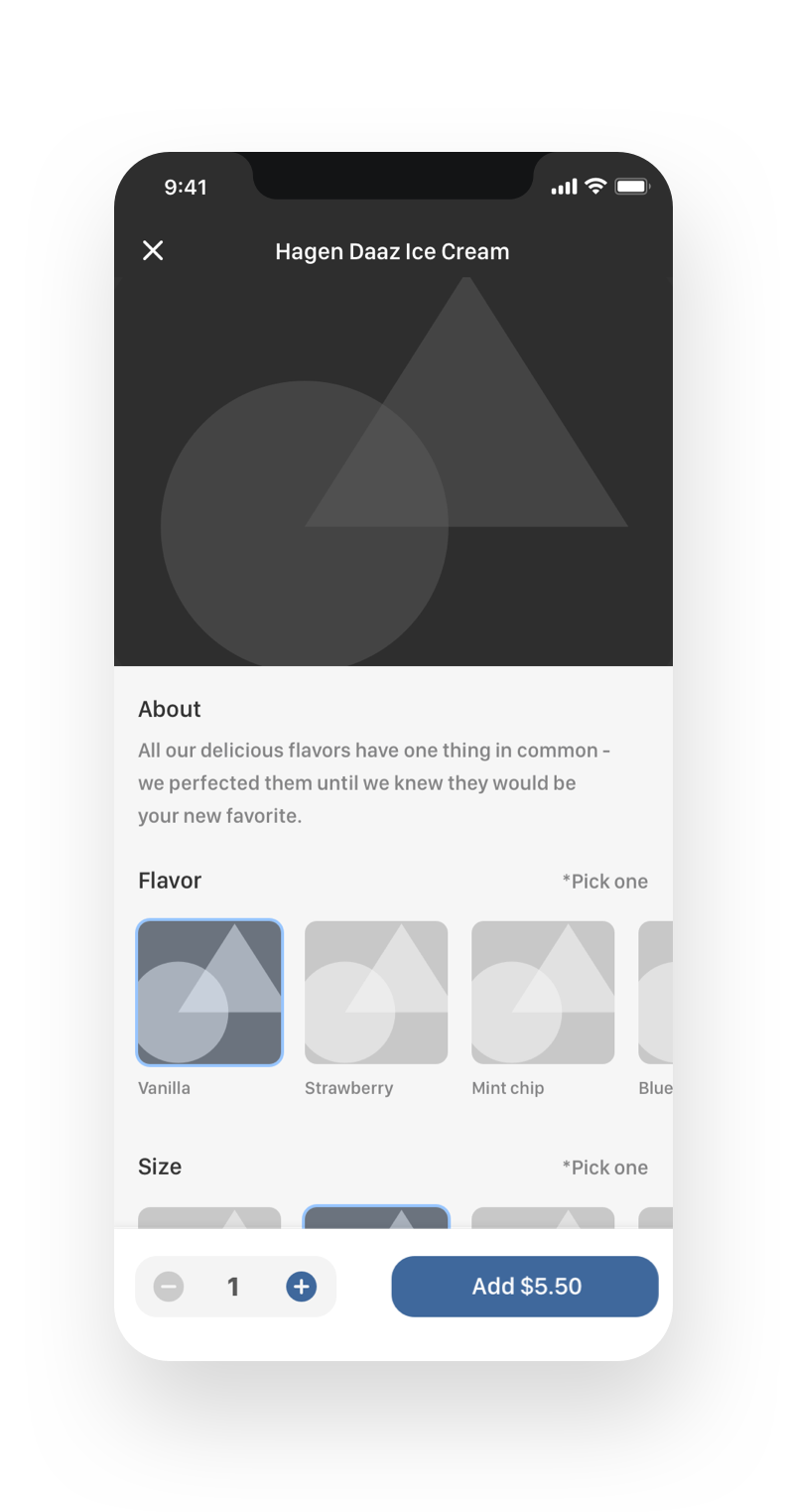
Organizing the required data was tricky since food can be priced by the specific product, by size, flavor or weight. Below are the final wires I came up with that were handed off to UI for visual design. I collaborated closely with our UI designer to make sure they understood how it would function during the motion design phase. Seeing as this was a concept and not an actual app, i didn’t have to create any detailed UX scenarios or documentation. Whew!
Bringing it to life
We wanted to explore how the app would actually transition and flow. I’ve typically had to create interactive prototypes for testing, but since this was more of an exploratory, blue-sky project, I opted to take the opportunity to get into the weeds with After Effects.
Storyboarding the interactions
Storyboarding doesn’t always have to be literal. For interface mockups, a simple list of ‘events’ works jsut as well. I made a list of motion events for every screen to make sure I knew exactly which elements were going to need to be exported separately.
Preparing the assets for export
While Sketch has a great plugin for sending screens directly to After Effects, there were still far more layers than I needed to animate, and some complex symbols needed lots of work to import correctly. Instead, I opted to rebuild each UI screen with exports of each element that would need to be individually animated.
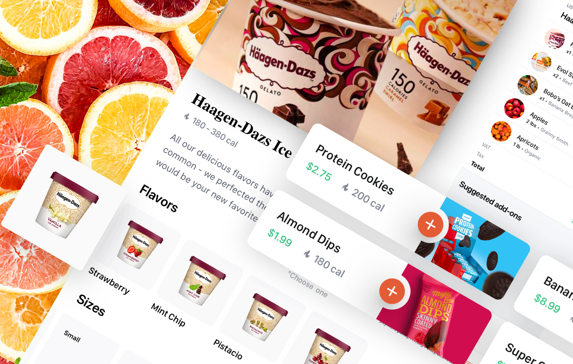
Motion design
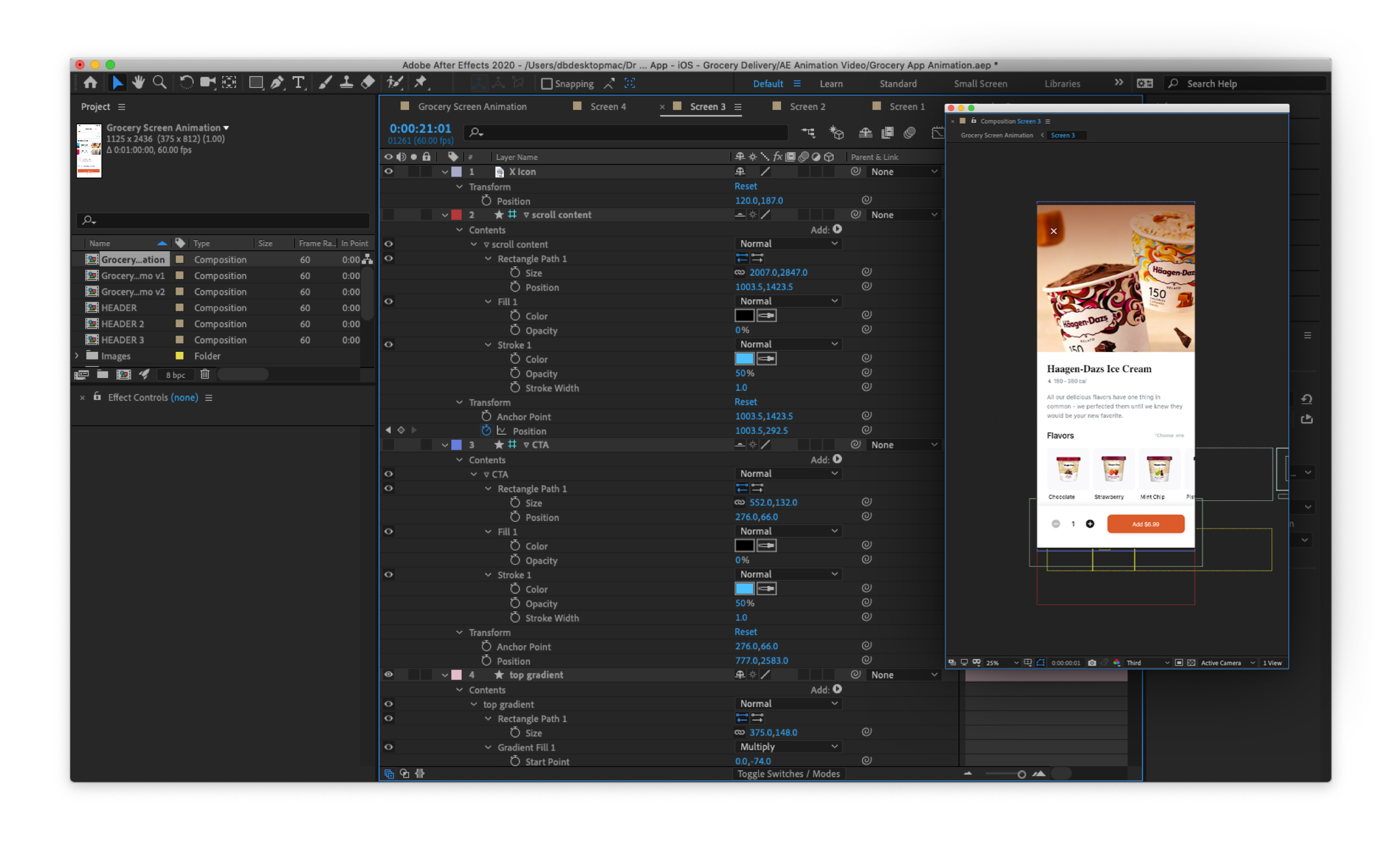
Once I got all the exported assets sent to After Effects via the fantastic AEUX plugin, I created a precomp for every screen. Then, I also made a precomp that was the “master” and used that to create the transitions between screens. A few small details, like the static status bar were also in the master precomp.
Results
Once all the animations for each screen were done, I exported that video, and imported it into a video mockup to create the final looping video demo of the concept. It took some extra back and forth to get the time right so that the screen animations would return back to the exact initial state as the beginning of the video, but the result is a seamless, infinite mockup loop.
