Alcon Vision Simulator
Summary
Our vision is possibly our most important sense - the one we lean on to do pretty much everything we do and the one we’d suffer most from losing. So I was excited to help Alcon design and develop an interactive, cross-platform experience to help family members of those suffering from debilitating cataracts to simulate various outcomes using Alcon’s cataract surgery and lens replacement surgeries.
My role
Tools used
Figma
Notion
Slack
We set out to help patients and caregivers make better decisions on their cataract surgery options.
Words can only go so far
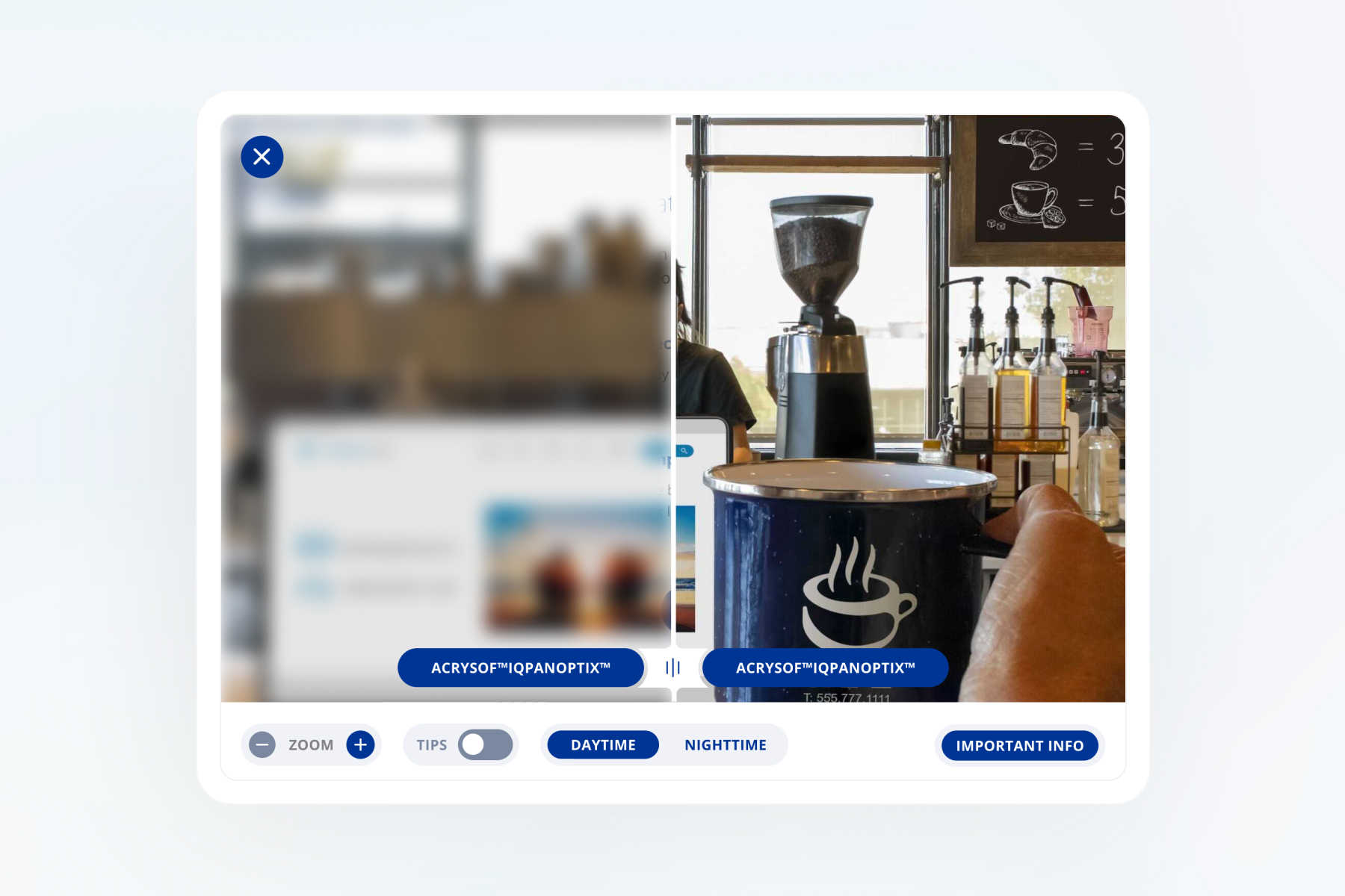
For patients with cataracts, words are the only thing they can rely on to describe the options and results of corrective surgery and lens implants. But they often have family, care-givers and doctors who can guide their choices. We partnered with Alcon to design a light-weight vision correction simulator to help the patient and those in their ‘orbit’ to better understand:
- How do different implants impact vision outcomes
- How do lenses perform at night vs. in the daytime
- What is involved in cataract surgery
- What are all the various options for treatment

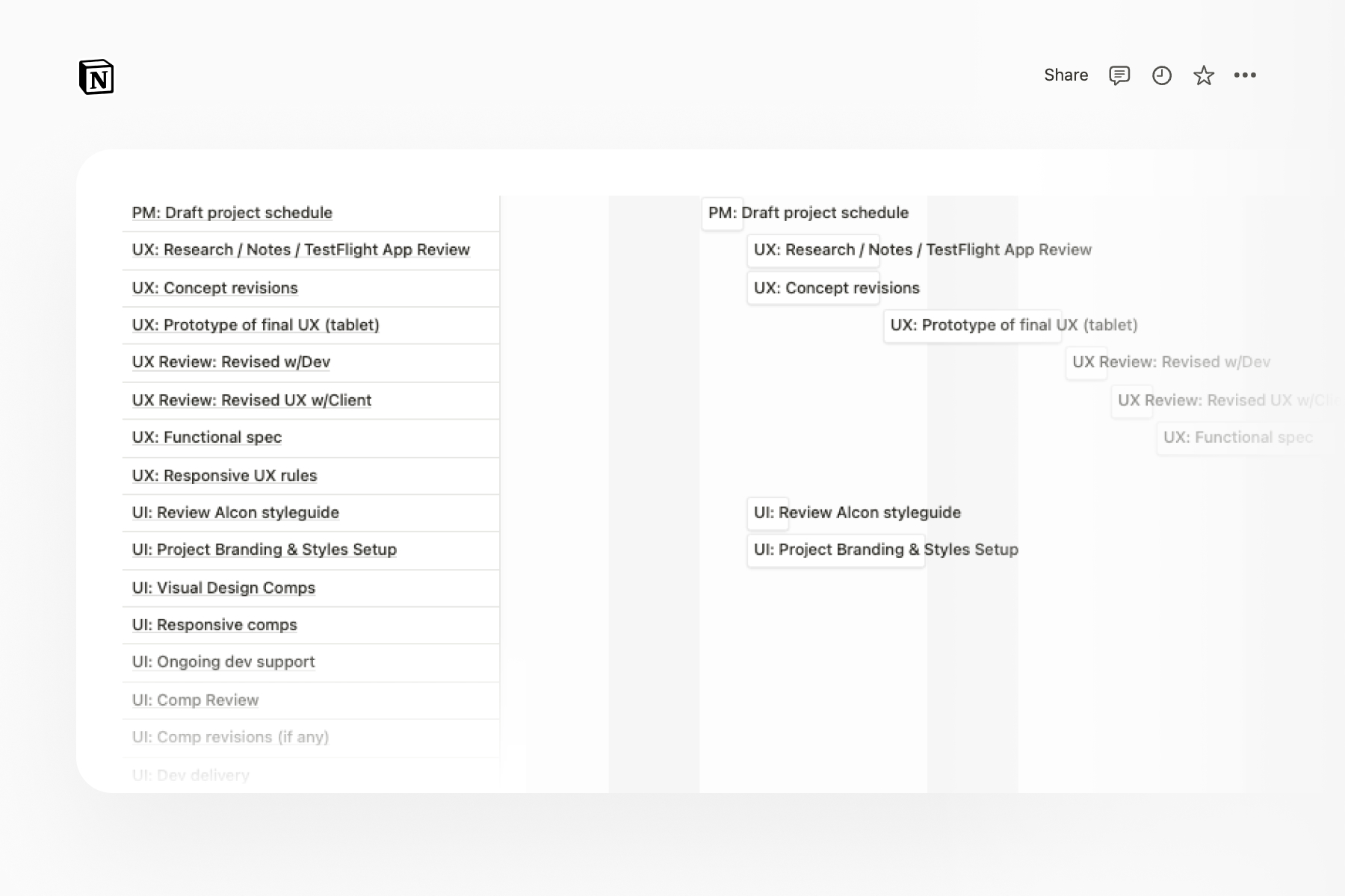
Project planning
I collaborated with counterparts at Alcon and ColorFlow to establish a tight schedule for design phase of the project. Unfortunately, Alcon’s timeline did not allow for UX testing, so I advocated for the creation of a UX concept prototype that we could all interact with as a ‘dogfood’ test.
Exploration and experience prototyping
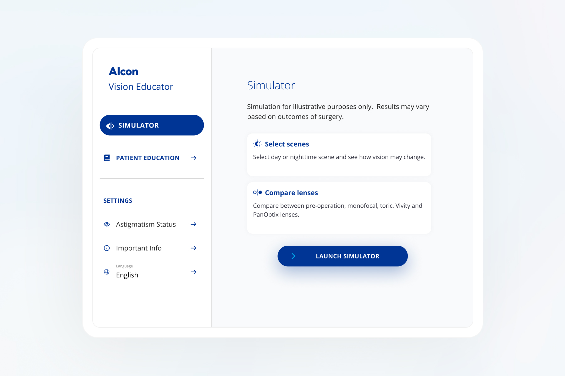
Our stakeholders at Alcon had a relatively clear idea of what was to be included in this app, as well as some references from competitor experiences which set the bar that we wanted to exceed. I used their input and reference resources to explore and ideate around key parts of the experience such as:
- Cross-platform navigation
- Onboarding flows and personalization
- The vision simulator itself
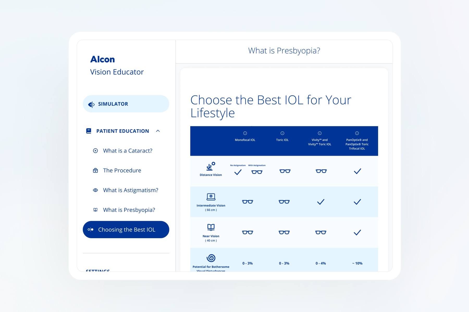
- Patient reference guides
- Popovers
- Modals
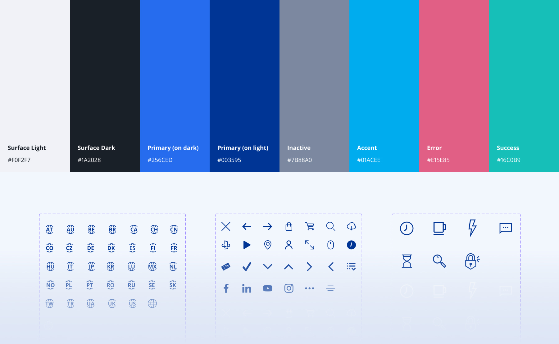
Prepping UI in parallel
While I was in the weeds iterating on the layout, structure, and function of the app, our UI designer was working in parallel gathering branding guidelines, color palettes, and fonts as well as exploring and establishing a UI design system for the new app look and feel.
Deliverables
Our counterparts at Alcon loved the UX prototype. They also showed it to a few users on their end with positive feedback prior to building. The client chose to build the app function based solely on the UX prototype, so I did not deliver detailed UX specs or tickets for this project.
While it's not my preferred way of ensuring that developers implement the design as intended, ultimately the client didn't budget for additional time needed for explicit UX documentation and they ended up building the app relatively close to the spec.
Results
This was a small, 1-month project to complete all design work from ideation through UX/UI specs. As a result, our success was mainly measured in terms of client satisfaction. On this measure, we were very successful as our stakeholders at Alcon were impressed with the speed, quality and detail of our work and were grateful that we stayed well within a tight timeline and created an experience that was far better than that of Alcon’s competitors.

