UI Explorations
Summary
While designing digital experiences has been my primary focus for the past few years, I do equally value the importance of visual or user interface design. I started noticing more and more job postings looking for “T-shaped” designers, generalists or product designers responsible for UX and UI design. As with everything, the only way to get better is through deliberate practice so I’ve been spending time sharpening my UI skills. You can also check out these examples on Dribbble.
My role
Tools used
Figma
Sketch
Adobe CC
The UI concepts below were designed in under a day, as part of the Daily UI challenge prompts.
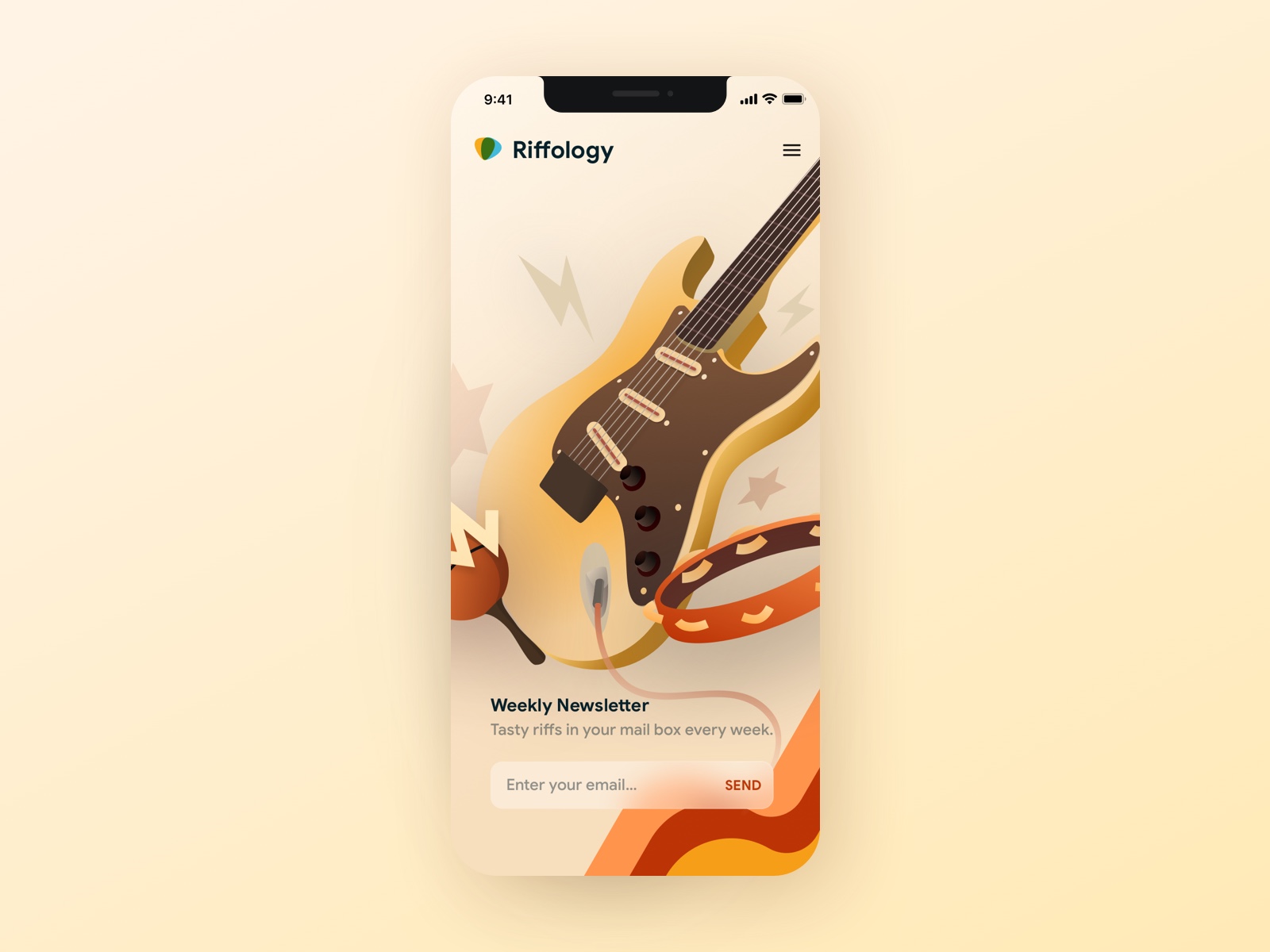
Newsletter signup
For this concept, I wanted to create something music-related since that is my first love and a life-long hobby. I focused on making something with a vintage feel, and tried to draw the user in visually with a compelling illustration. This one ended up getting a lot of love on Dribbble!
Bookly appointment booking
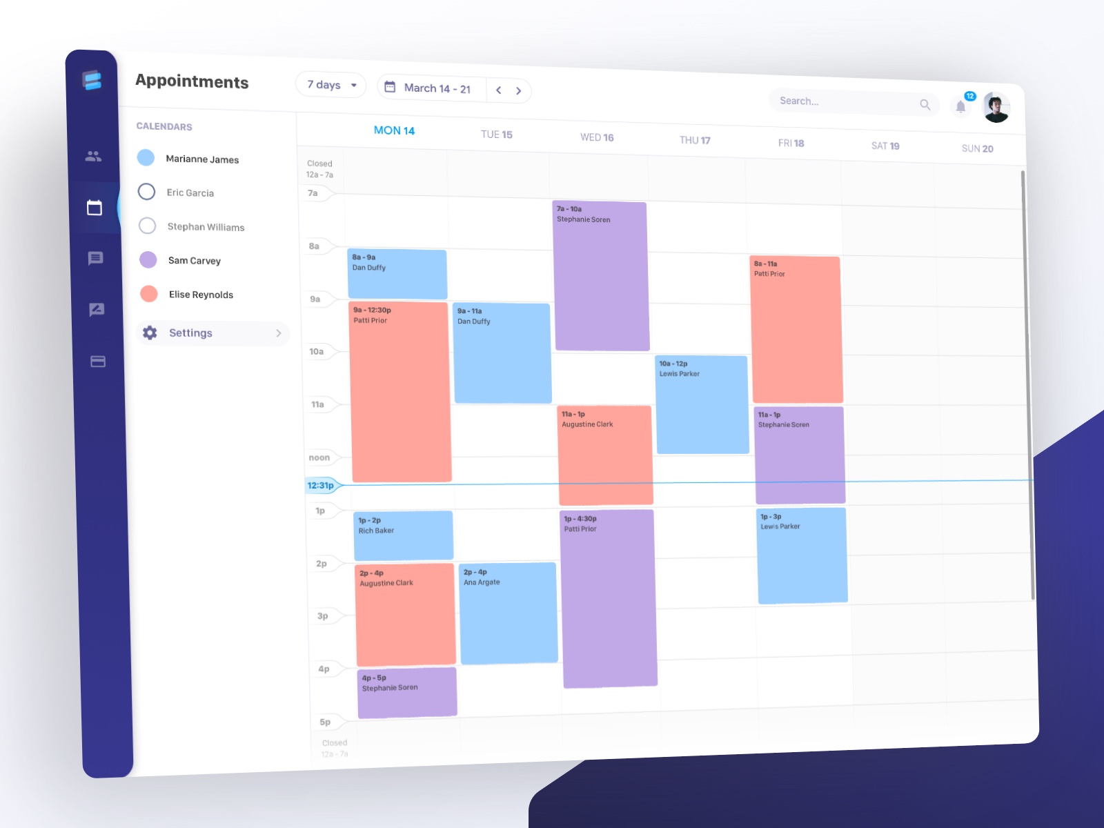
Bookly was inspired by some brainstorming around the small business management space. I tried to make a delightful calendar with a clear vertical timeline, support for multiple appointments as an admin, and a menu structure that would give the user maximum screen space to focus on the current task.
I also to a stab at designing a quick logo, taking inspiration from calendar time blocks and shaping them into a B.
Fintech app
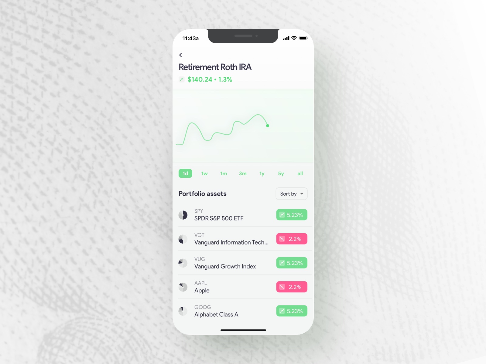
As I noted in my dribbble post, the concept for this UI was merging two approaches to personal investing. The robinhood way, where the user has to manually configure stocks, and the M1 Finance way of building a portfolio “pie”.
This concept tries to unify the simplicity and elegance of robinhood’s UI while reimagining a cleaner approach to displaying each individual slice of the user’s portfolio pie.
Payment widget
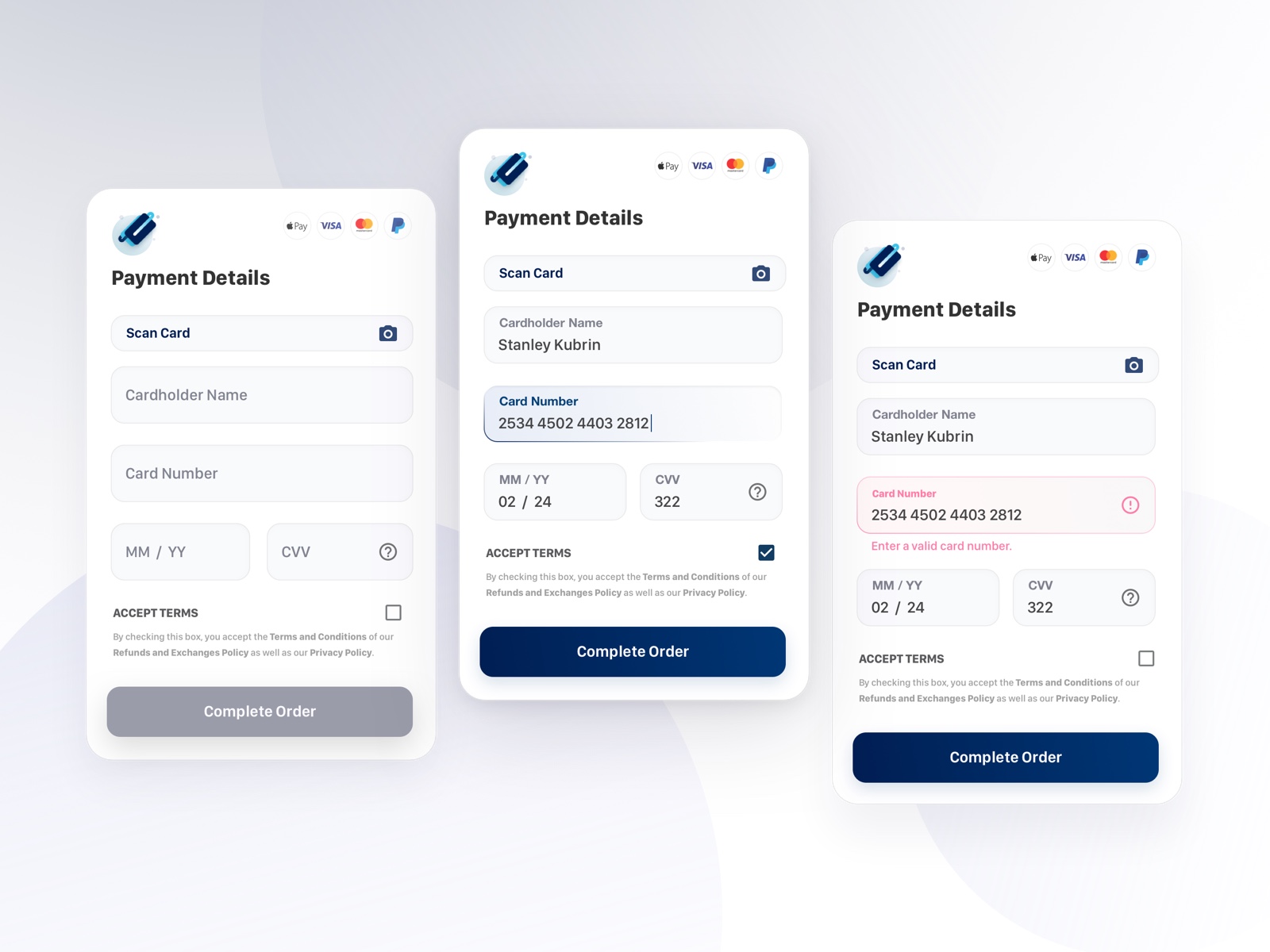
I decided to be a bit adventurous with this UI. The border gradients for showing the active and error states serve to both accent the focused field, communicate state of the field, and to give some dimensionality to the input fields.
I also used bold, strong colors for the CTA and illustration to communicate trust and stability since payment forms can cause considerable anxiety in people.
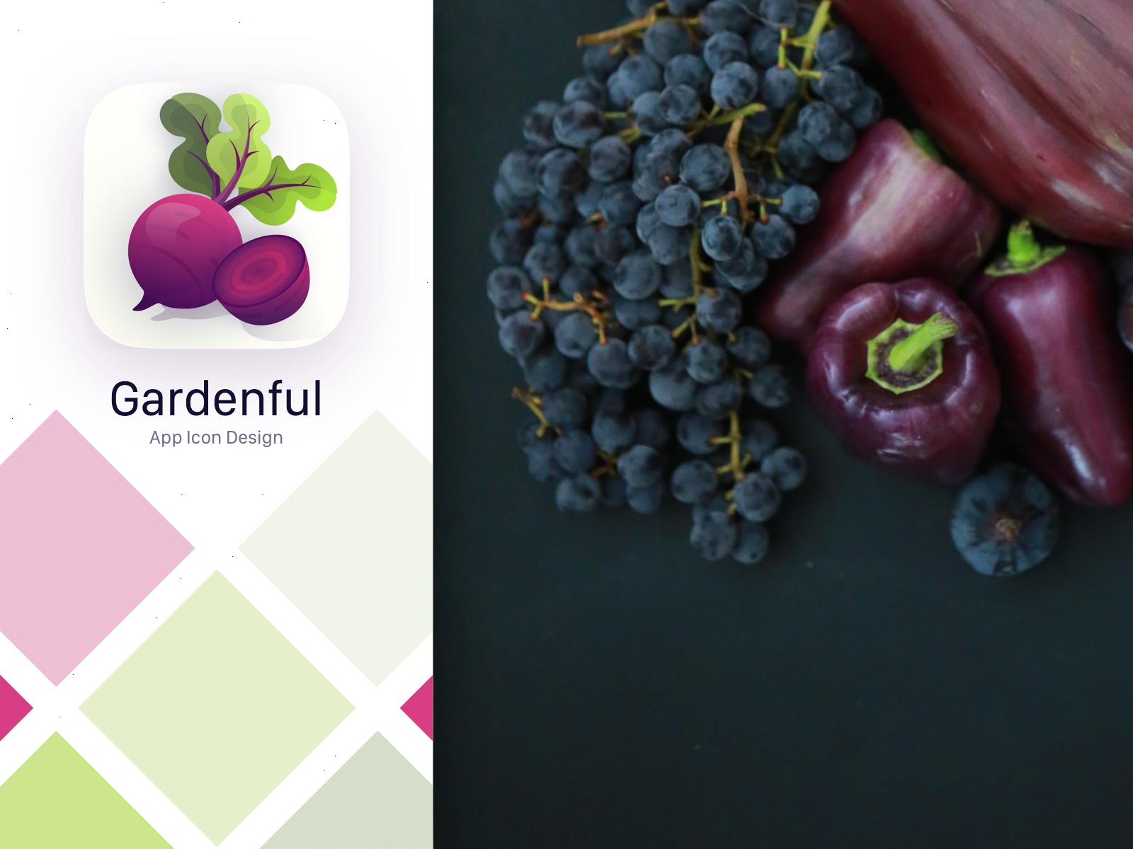
Gardenful app icon
This app icon for a gardening app was a lot of fun to create. I first did a quick search for a variety of garden-related images to get some inspiration. I knew I wanted the app to have a clean, minimal aesthetic, but still look cute and inspire people to get their hands dirty to grow some delicious veggies!
More to come
Lately I’ve gotten considerably more busy, but I intend to work on more of these as time allows. If you liked some of these UI explorations, feel free to connect with me on Dribbble or just throw me a like! 😁
