Smart Room App
Summary
Imagine having a personal remote for everything in your hotel room. Control your room lights, set the temperature before you even arrive, turn down the AC without getting out of bed, set a sleep timer for your TV, browse the TV guide with the swipe of a finger... complete control, right in your hand. That's the Smart Room app.
My role
Tools used
DynaList
LucidChart
Sketch
Principle
Origami Studio
InVision
Our goal was to create a flexible UX framework to give guests immediate control of their room.
The Jumping Off Point
The Smart Room concept was originally launched as a "live" proof of concept to gather data regarding the behavioral impact of smart devices, free in-room TV streaming content, and a "personal remote" app.
The proof of concept was rolled out to 13 test properties and the mobile app module had survey and feedback built in to gather customer insight.
The system included a set-top box with a custom TV UI, the Smart Room app module, and a backend system for deploying, monitoring and troubleshooting all components of the ecosystem.
Why Re-design?
On Dribbble, re-designs are well and good, but in the real world, they're not to be taken lightly. The payoff must justify the huge amount of work that is re-implementation. So why did we decide that was the "one true way"?
Existing UX wasn’t user-tested prior to launch
Our product owners (whom had been on the project before I joined) said that there was no user testing done on the existing UI. Their initial goal was to expose the feature set, and collect insight into how users respond prove the value of the product.
Inflexible IA
Now that the concept proved successful, it had to be scaled. The old architecture was rapidly degrading with every additional feature resulting in a fragmented, inflexible information architecture.
Complaints in customer feedback
Open-ended in-app customer feedback cited the app module was "annoying to use” for a variety of reasons, even though overall, they enjoyed the capabilities.
Failed heuristic evaluations
The system did not satisfy many heuristics such as graceful error handling and recovery, visibility of system status, efficiency of use, consistency, flexibility, etc. It simply didn’t make sense to scale a product with such a weak foundation.
Understanding the existing system
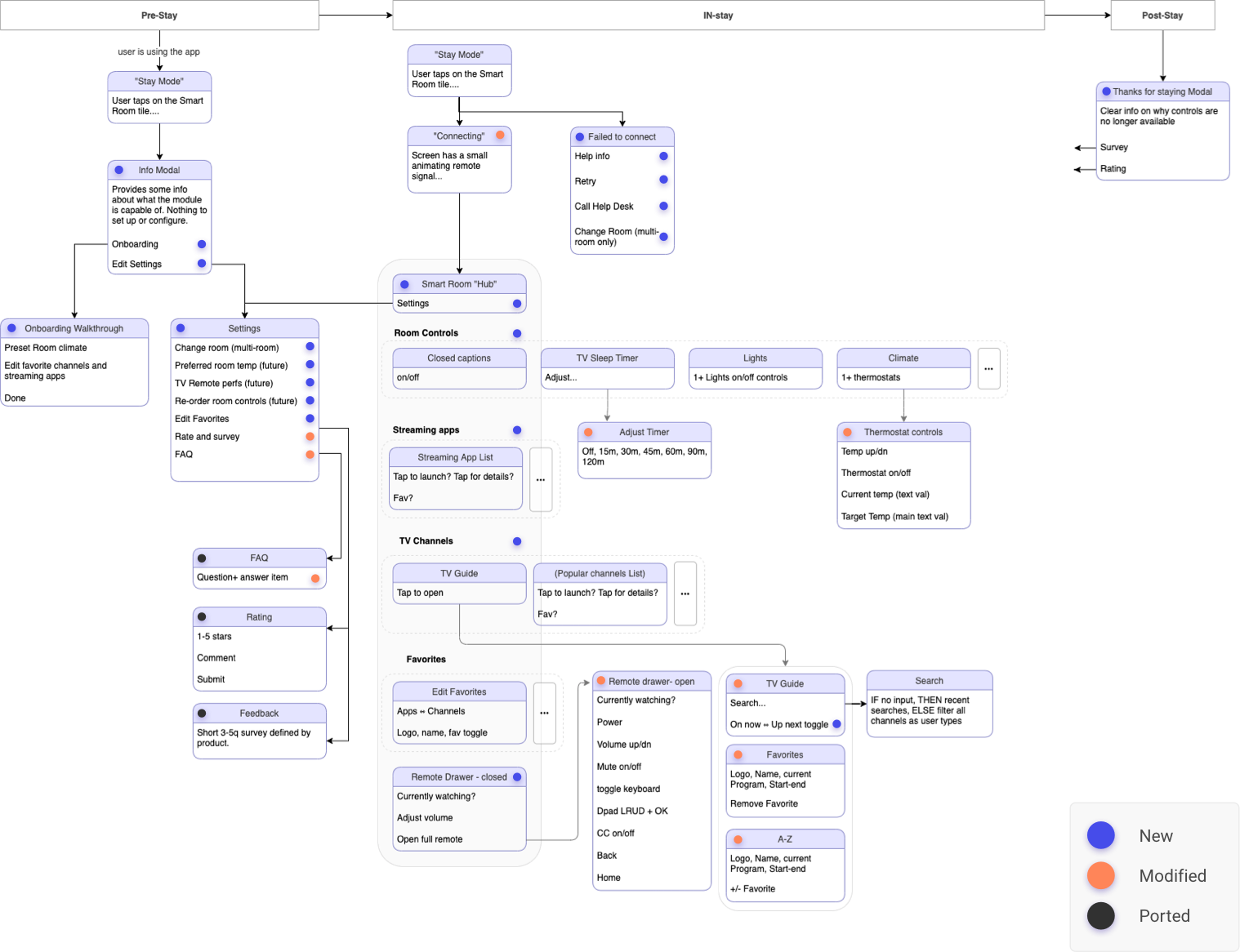
To understand how to break down the problem and create a reference IA, I mapped out the existing architecture at a high level, and place it in context with the three core segments of every hospitality journey - pre-stay, in-stay, and post stay.
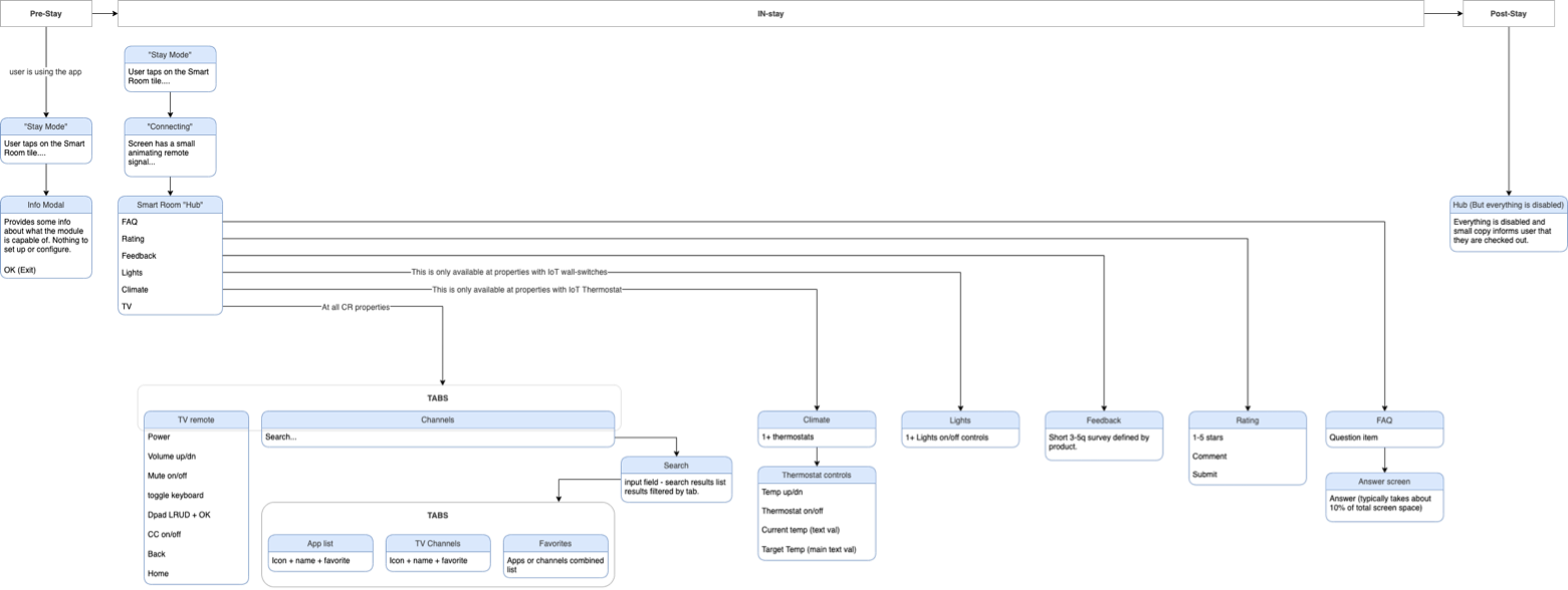
IA painpoints
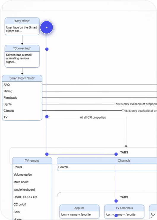
Deep, branching navigation
It’s not always possible to simplify navigation, but should TV channel switching really be 7 touchpoints down?
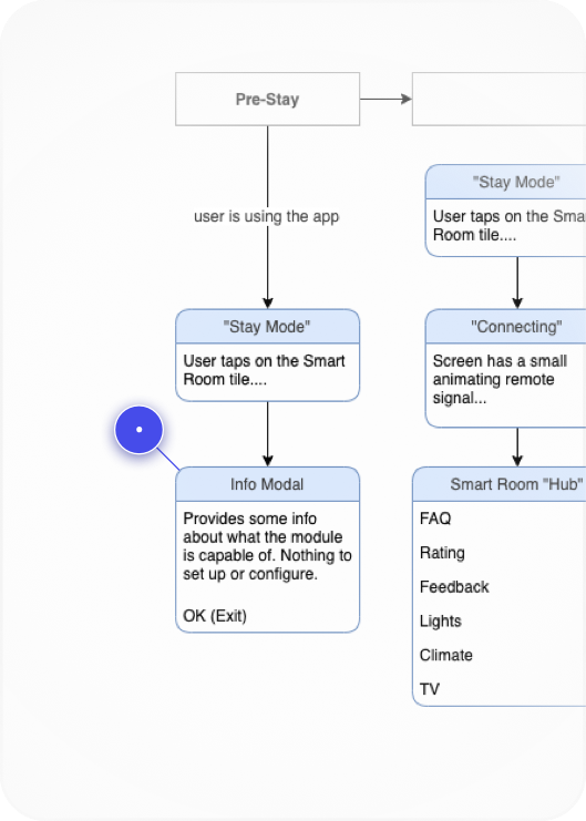
Static pre-stay experience
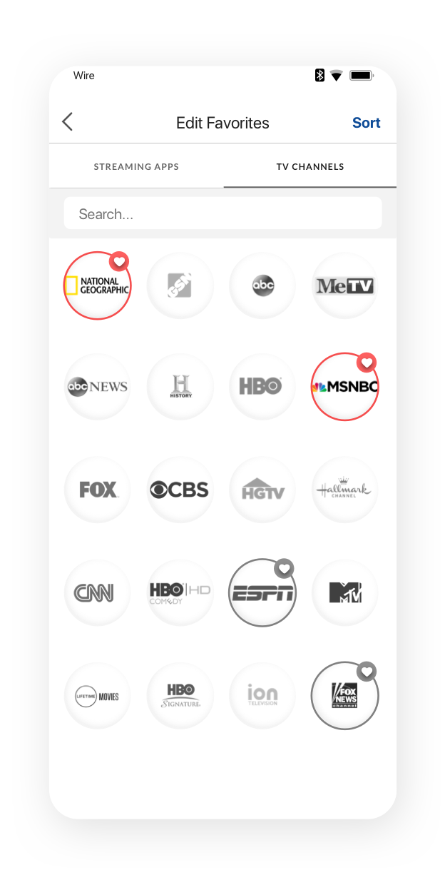
Why not enable the user to preset favorite channels/apps BEFORE their stay? Dev confirmed it's possible. We could also configure target temperature.
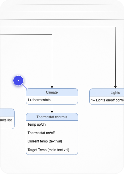
An entire screen for at most 3 thermostats?
Can we elimintate this bloat and still have the user understand what they’re controlling?
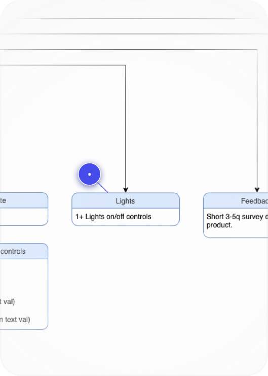
Do lights need their own top-level touchpoint?
Most of the hotel portfolio consisted of focused service properties. They won’t retrofit every room with 10 IoT lights. How to simplify?
Painpoint Discovery
The hub screen had quite a few issues that made it impossible to build upon as the system scaled out.
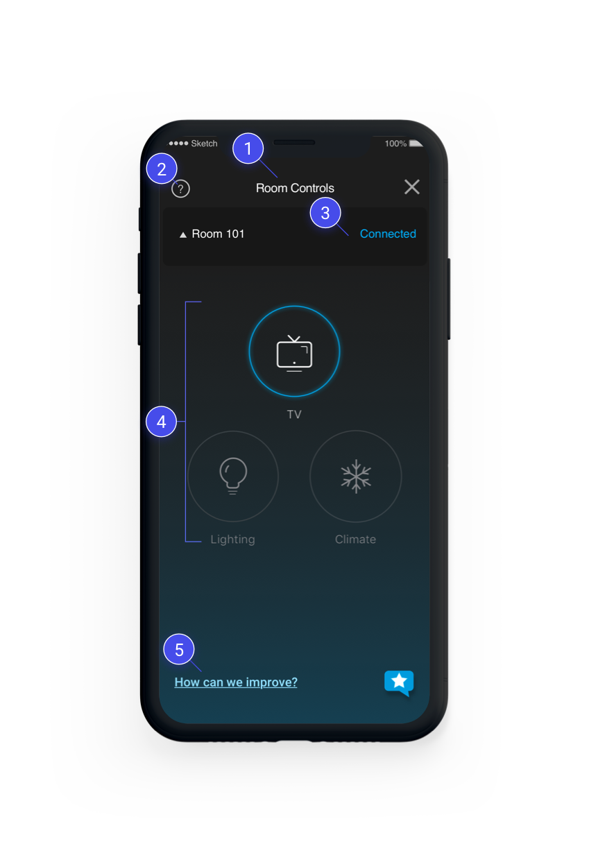
Is “Room Controls” even an intuitive name for this screen?
We took this question as a note to include in testing.
Having an FAQ as a top-level touchpoint is a red flag.
One of Nielsen’s 10 usability heuristics is “recognition over recall”. If the product is so confusing that a top-level FAQ is needed, then we’re already asking the user to recall FAQ info to understand the product. The design should map more naturally to user’s expectations.
This hub page still shows even when the app failed to connect.
The user has to either open this menu (in multi-room scenarios), or tap here to try and reconnect. This violates the "visibilty of system status” heuristic because the app shows nearly the identical screen state for “disconnected” and “connected scenarios”
Interface geared toward many smart devices, when the opposite is needed.
Many hotels were choosing not to buy smart switches, thermostats, or both. Now we have a “hub” that does nothing but introduce one extra step before the user can control the only thing available - TV.
Survey and rating shouldn’t be on the main screen once system scales to more properties.
However, there is nowhere like… Settings... to put these types of items. How might we create a Settings experience that can structure some of these elements but remove them from the top of the navigation tree?
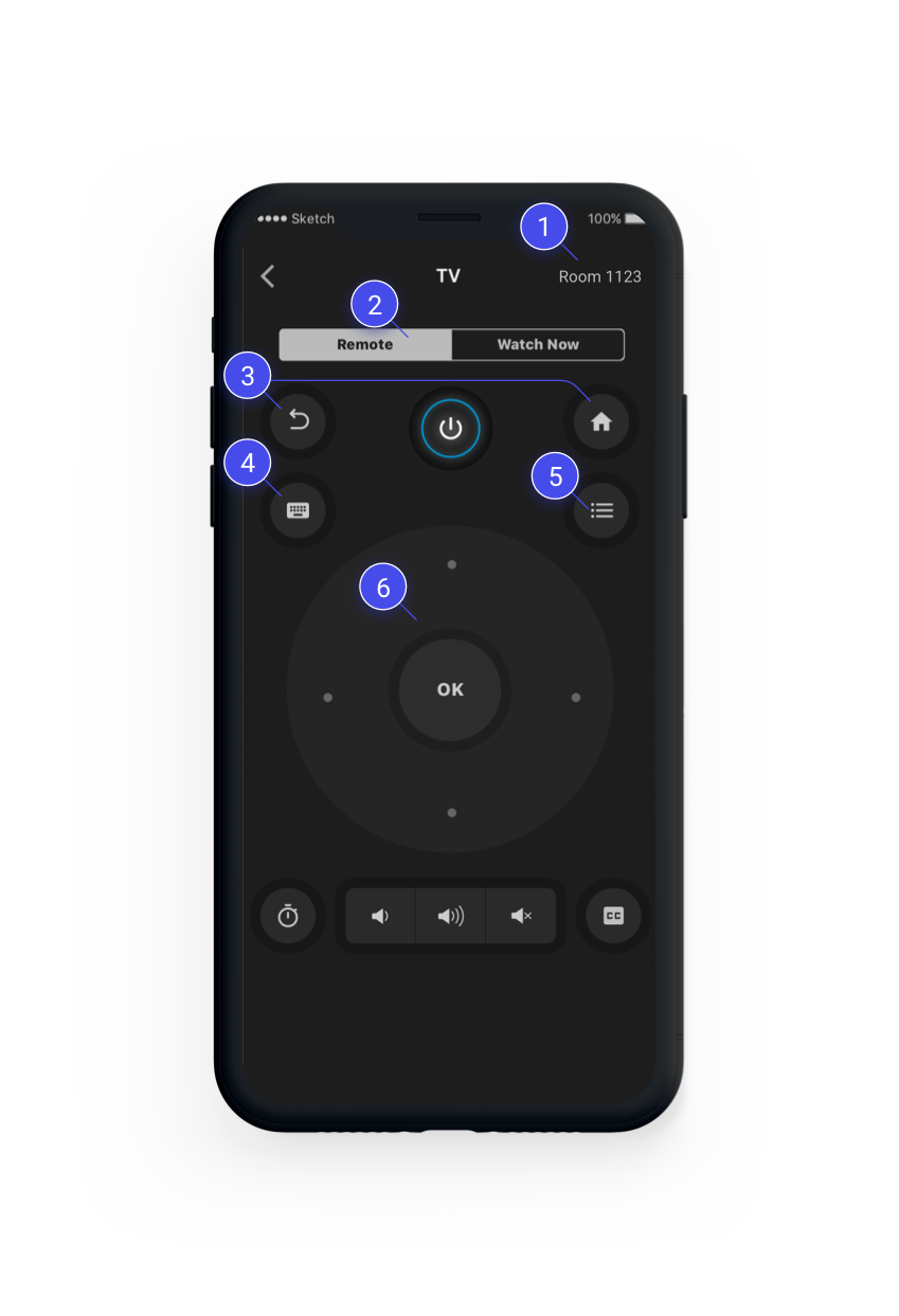
Misusing iOS/Android action bar with static text
This area is typically used for string or icon touchpoints, but instead has a static label. This is also not helpful since user should have already known what room they are connected to.
Why default to Dpad remote in the first place?
I began asking myself and the team - why is this the default way of controlling the TV when everyone has experienced the pain of Dpad tv nav? Shouldn’t control be more immediate than this? Another note for testing.
Most important touchpoints are hardest to reach.
I looked into Adobe Analytics for the data - Back and Home were among the most common touchpoints, second only to the D-pad. Why are they so far out of comfortable reach?
Keyboard mode was…literally just a native iOS/Android keyboard.
It just opened the keyboard on top of the remote. No help text, no explanations. It didn’t show what keys the user sent to the TV. This was just. Bad.
Can you guess what this icon means?
Neither could anyone I asked in a quick hallway test. “List” was the closest people got. It opens the TV guide - on the TV UI. Even though users can launch channels directly from their phone. Do we need this? Add to future testing objectives...
Smartphones have no tactile feedback
How is a user supposed to accurately tap the desired function without looking down? Can we reduce the need to look down through and alternative control scheme that plays to a touchscreen’s strengths?
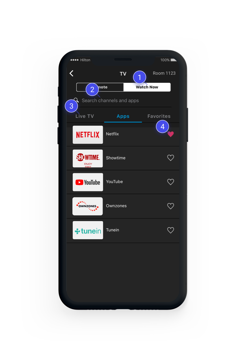
This is very deep down the nav tree
We knew from weekly Smart Room customer insight emails that TV and Apps were the most frequently used areas of the ENTIRE experience. So I knew we’d want to shorten the path to these controls.
Search was infrequently used
I wanted to probe this in future testing, but overall, having an app header + search bar + tabs that takes up 1/3 of the entire screen is not great. We’d need to ideate on this. The tabs also persisted when the user began a search, even though the search results quickly taper off after the first few letters. Why make the user click more tabs?
Tabs are inefficient here
It didn’t make sense to me that Apps (13 max) and Favorites (averaged 2-3 for users who had them in Adobe Analytics) would need their own tabs. One of my goals for the redesign was to reduce unnecessary navigation bloat like this to reduce the number of steps to… well… anything!
Favorites engagement was low
Favoriting is also supposed to speed up access to the user’s preferred shows and channels, yet the tab is buried at the same hierarchical level as Apps and TV channels. How could we make favorites more easily accessible and useful to drive engagement, and customization?
Project Goals Emerge
- Create a more flexible, adaptive, and scalable UX system.
- Reduce the number of complaints in in customer feedback.
- Increase the average rating within the Smart Room module.
- Reduce the number of steps to control the various aspects of a user’s room via the app.
- Increase engagement across the stay journey, not just while they are on-property.
- Align the UI of the mobile app with the TV interface.
- Increase the session time within the Smart Room app module.
Who is this for?
There are certainly projects which target highly specific customer segments and journeys. Developing a persona via interviews, surveys and analytics can be helpful. But looking at the app engagement data, it was clear that we’d be casting a VERY wide net since there were millions of monthly visitors.
In my humble opinion, personas yield little benefit for enterprise businesses serving extremely diverse customer bases. For a project that was intended to scale to thousands of properties in multiple countries, it would be a futile exercise to try and crystalize some archetypal user(s) for whom to design this product. There are many heated debates around this topic in the UX community.
We already has 16 personas, all with slight variations in income, work/leisure travel needs, intiutive vs methodical shopping habits, ages, and so on. But all they really communicate is that our customer base is extremely diverse.
Cross-reference secondary data
Ok, so personas were going to be too broad to be useful for this project. But reviewing current data on the market landscape of IoT, streaming and TV viewing could give some more specific insight, for example...
42%
between 35-54 years old
39%
between 18-34 years old
50%
have some college education.
58%
are not married.
50%
have at least one child.
50%
Own at least one smart TV.
Testing against low and high proficiency technology users
Getting some insight into the demographics and current market exposure to the technologies at play helped me understand that while the market is growing, there is still a wide range of proficiency levels with IoT, smart TV, and streaming usage.
Because of this I wanted to make sure that in testing, we would screen users based on their exposure to these technologies, and make sure that we could structure the feedback with the context of what type of user was providing it.
Solution Discovery
To gather from the diverse perspectives of stakeholders and team members, we scheduled a short 1 - 2 hour brainstorm session for each of the logical sections in the experience.
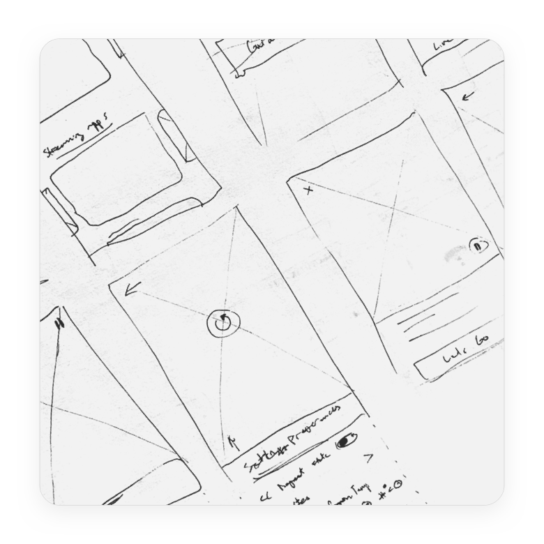
Crazy eights
Sketch as many different ideas as possible in short time span, then sharing ideas with the group.
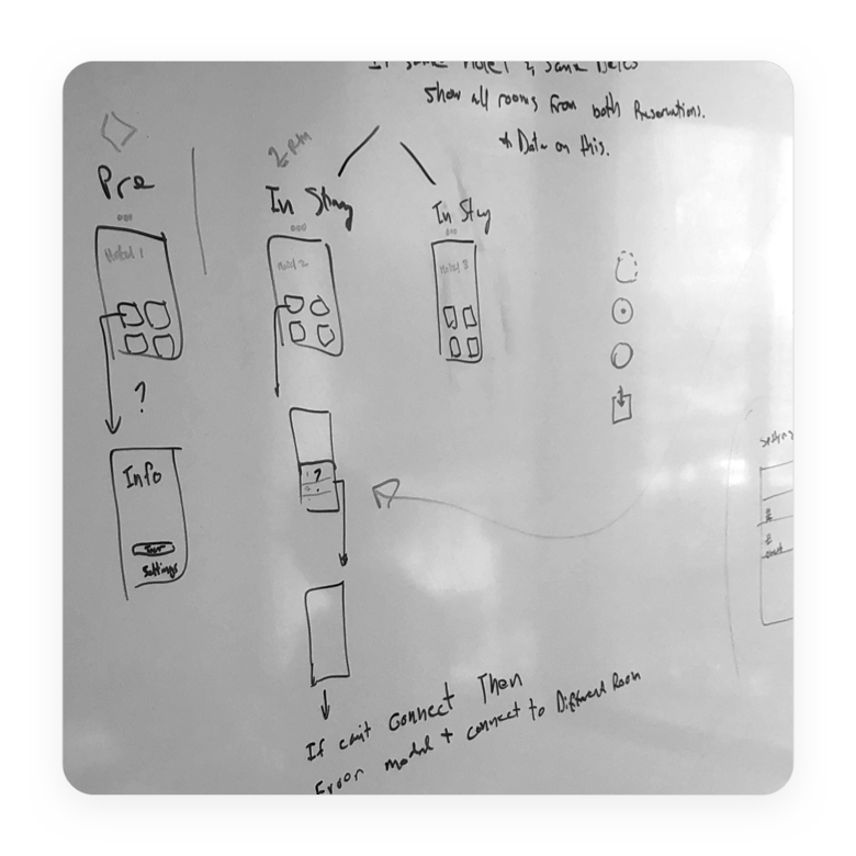
Whiteboarding and co-creation
Sketching ideas together, reacting to ideas, discussing, listing open questions, topics for exploration, etc.
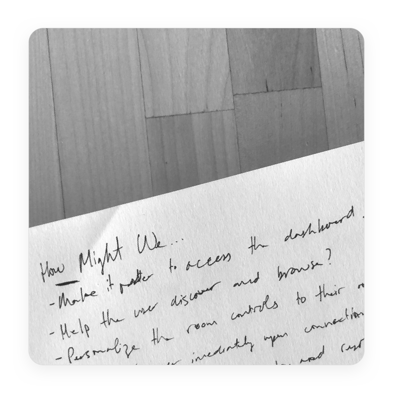
How-might-we's
Getting the team to contribute their unique perspectives on the problems our users face, and frame them as objectives to keep in mind.
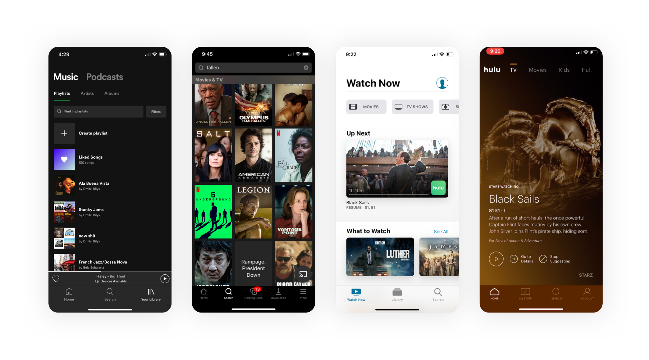
Competitive audits
Chances are, people have already encountered and designed solutions to the problem at hand unless you’re working on a bleeding-edge project, or newer interaction paradigm like voice, AR/VR, and so on.
Yet I noticed that some UX designers don’t keep an eye on the ‘competition’ when designing.
Information architecture exploration
Armed with insights into our users, team perspectives, and competitor strategies, I dove into exploring how to logically structure information.
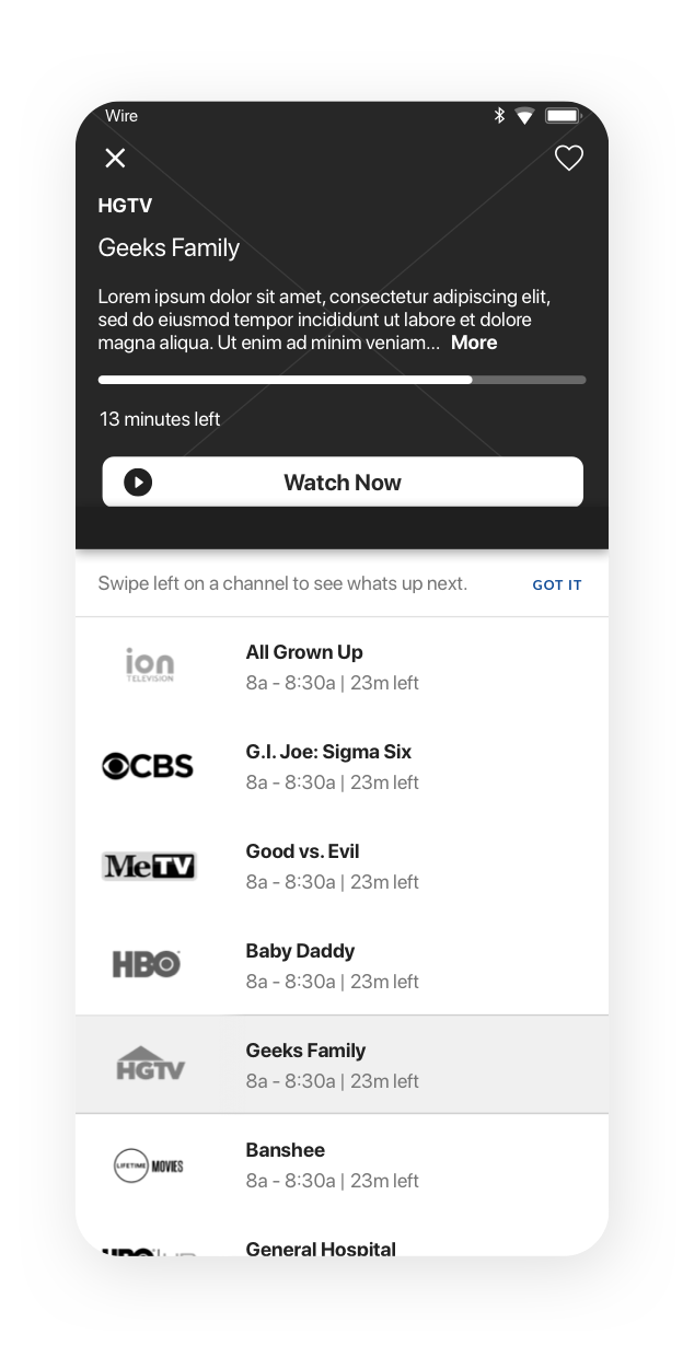
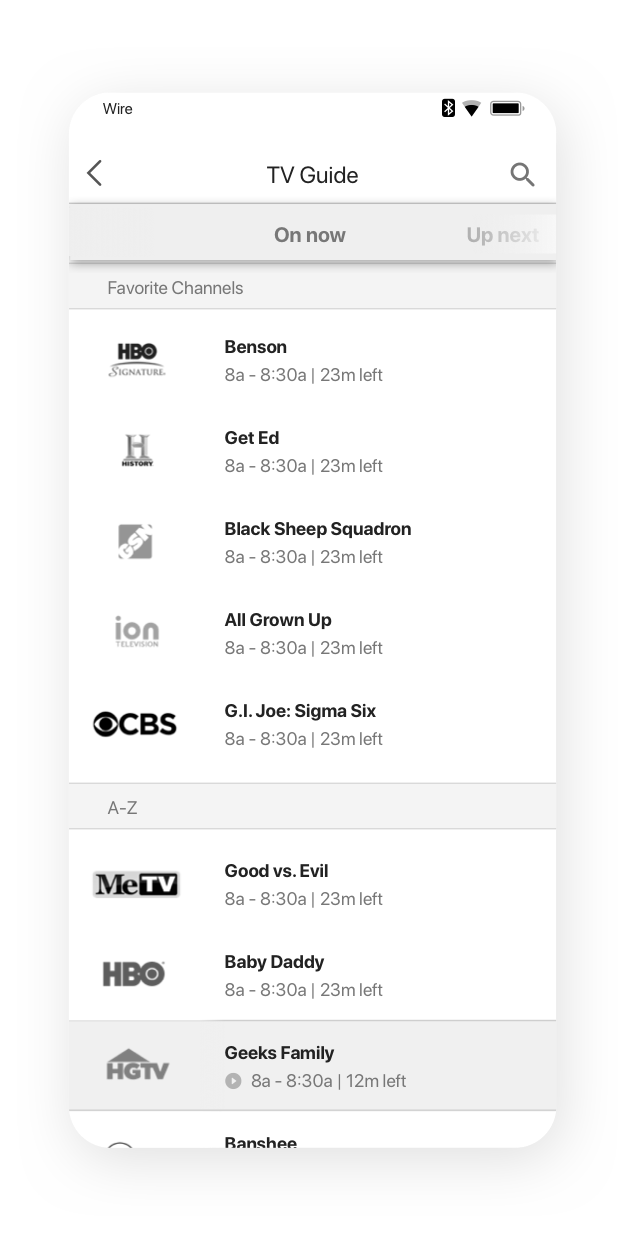
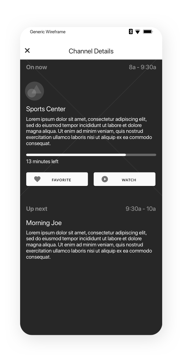
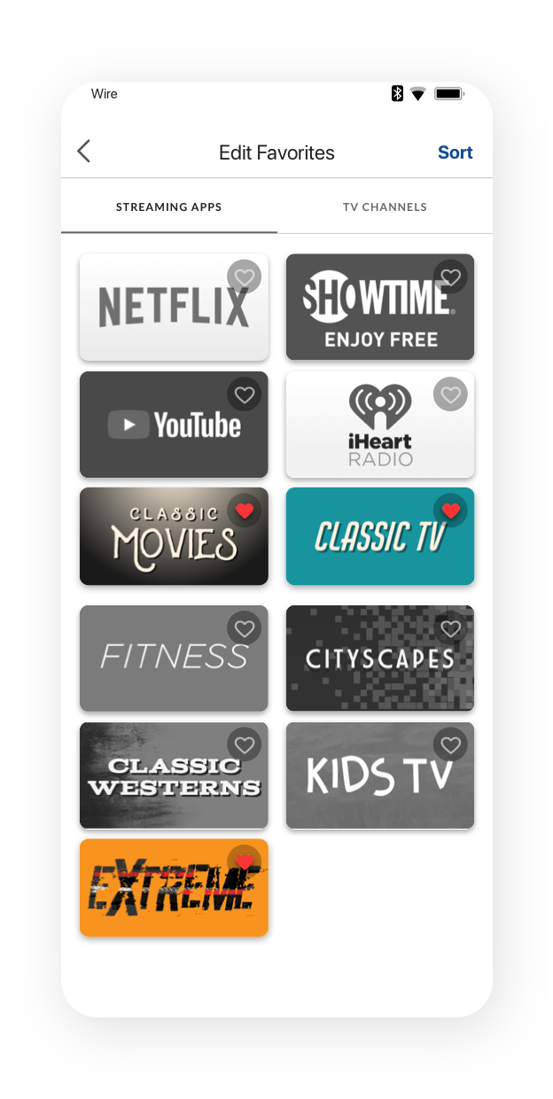
Wireframe exploration
Information architecture and wireframe explorations can influence each other, but the goal of any large project is to develop a system not a just a bunch of screens. At this stage I’m rapidly iterating on layouts, patterns, hierarchies and touchpoints.
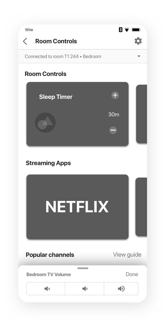
Prototyping
I often create prototypes as a means of communication. Sometimes, stakeholders struggle to visualize a wire flow, or set of screens. It’s much easier to get the point across with prototypes.
Prototypes for testing require additional scrutiny since they can distract users with confusing placeholder copy, inconsistencies, etc. Fidelity should align with testing objectives.
Prototyping Toolkit
Sketch
InVision
Principle
Origami Studio
Test and learn
When collaborating with our researcher on the testing strategy, I realized that we’d need to test in-person because Sketch and Invision don’t support horizontal scrolling, which was a key component of the shallower IA. I made one Principle prototype for the dashboard, TV guide, and favoriting sections. And another for room controls interactions.
How to test a swipe-based TV remote?
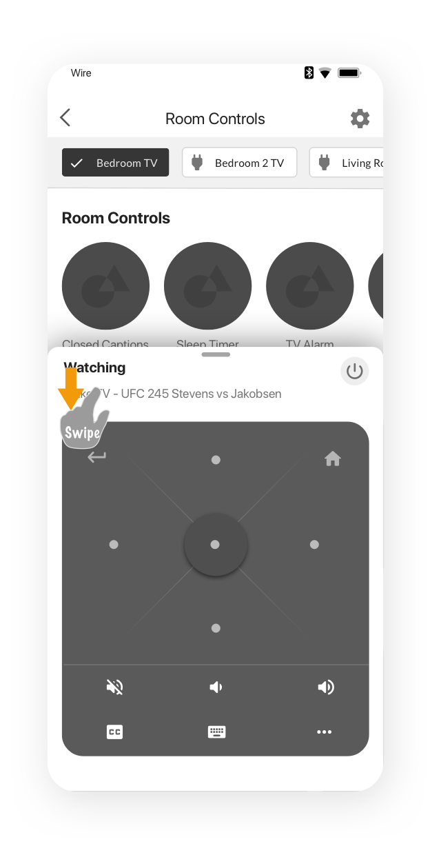
I also designed an alternative control scheme that treated a ’tap’ anywhere on the control surface as an “OK” and swipe to move. I wanted to see if users would understand the interaction, and whether they’d prefer it over the standard D-pad.
But I’d need a working remote to test it! Luckily, our product owner (my hero) agreed to slot a few dev tickets to create a working build of the interaction to test before we went and shipped it instead of the D-pad.
How to sort IoT devices?
I also wanted to know if there was any clear pattern to organizing the IoT devices in a row. We added a sorting exercise to the test plan for this as well.
FAB or “drawer”?
Next, we wanted to see if users prefered a more detailed remote “drawer”, or if a simple FAB would be recognizable. The FAB had the advantage of leaving more screen real-estate for browsing, especially on smaller phone sizes.
"Chips” for switching TVs
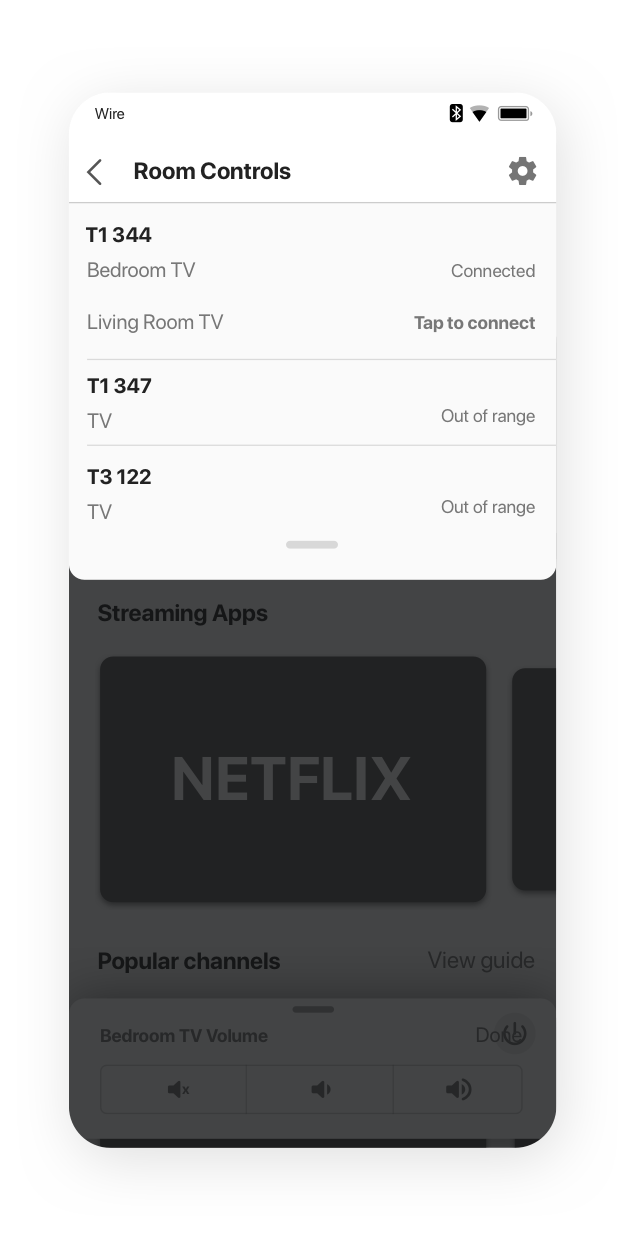
Originally, users would have to go through a separate page to control the TV if a room had more than one. I needed a way to easily switch control between multiple TVs in suites. Chips seemed like a logical choice, but I also needed to make sure they understood that selecting a new TV would mean that all the dashboard controls now applied to that TV.
Collaborating with UI
My medium fidelity prototypes were meant to give the user the sense that they’re using a real app, but that had nothing to do with staying flexible for UI to work their magic. When they came to me with concerns regarding element sizes on the dashboard, dark mode,etc. we worked together to refine the visual structure without introducing additional risk to the functional aspects that performed very well in testing.
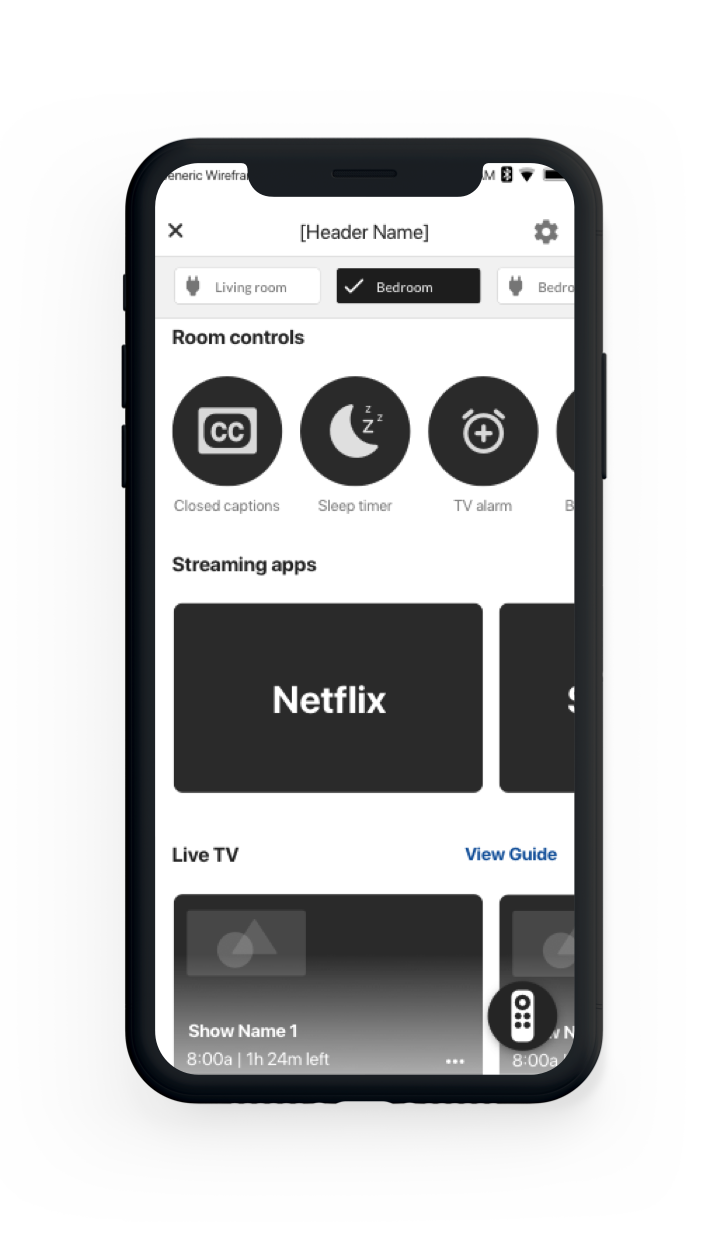
Wireframes
The extensive UX documentation was all using low-fi wires.
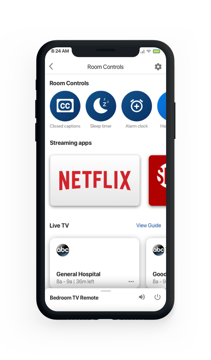
Medium Fidelity
Testing was conducted with convincing medium-fidelity prototypes.
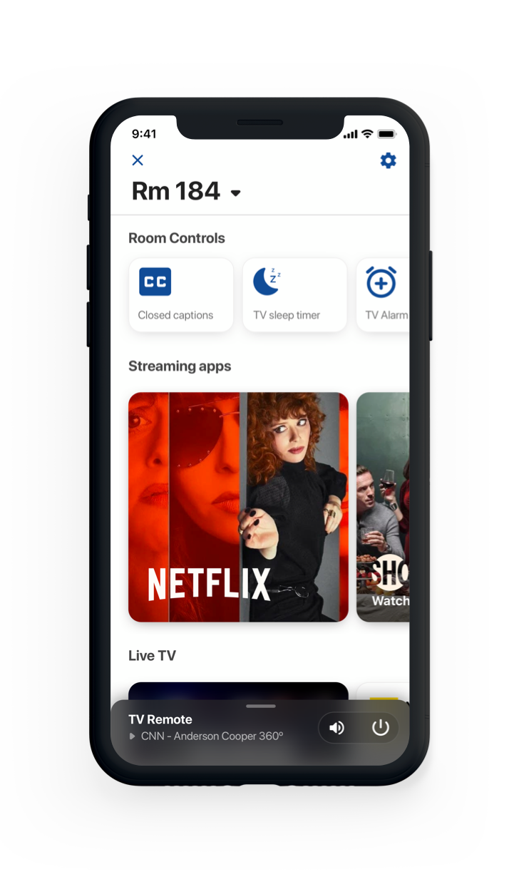
My Suggestion to UI
What I shared with UI to explore layout.
The Final Interface
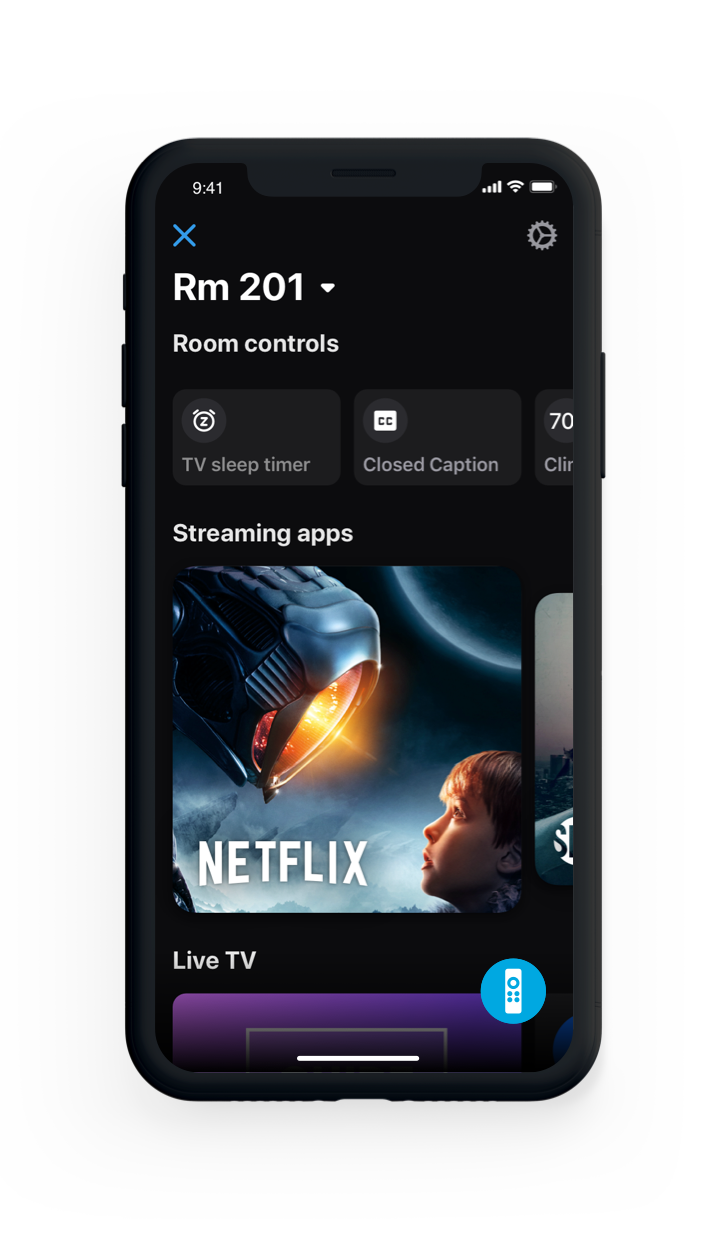
This was the version of the interface that we shipped.
Collaborating with product and engineering
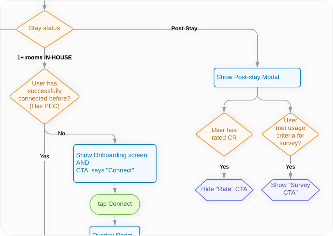
Some aspects of UX design are better expressed as logic diagrams rather than wire flows. This often comes in handy with gracefully handling edge cases or reasoning about technical limitations. If I’m discussing the expected functionality of application state under various conditions, I’ll typically create one or more of these as a discussion guide. I’ll also include them in the final Confluence specs for future reference.
PDFs vs Confluence for UX specs
Yes, I’ve delivered UX specs in PDF form. Before dev tickets are written, I typically slice out my own initial UX spec and send it to product as a PNG or PDF for reference. However, PDFs have a number of significant weaknesses…
PDF's aren't version-controlled
By contrast, every identically named image that’s uploaded to a confluence page will automatically version control and insert into the same place as the old one.
PDFs fail as a source of truth
On teams where I’ve delivered a PDF spec, I’ve had countless issues with stakeholders and team members asking for revisions, referencing old decks by accident, forgetting where the deck is and so on. On Confuence, I create a new page for each JIRA epic. It’s the one and only source of truth for UX specifications.
PDFs are hard to link to tickets
On large projects like this one, I can simply insert a link into each JIRA ticket that directly links to the EXACT flows related to that story.
PDFs are slow to update
Specs inevitably change and flex all the way until the product is shipped. PDF were never meant to serve as “living” documents.
A few lessons learned
A crucial part of any team's process should be taking time to review what could be improved for the next project to come down the pipeline.
New technical constraints meant changing UX
There were several aspects of the design which product and dev deemed feasible which, in the end, couldn’t be delivered. Some of these issues made it all the way past JIRA stories. We had to go back and update the spec to simplify things that couldn’t be built as new technical challenges were discovered.
This was primarily a communication issue. To solve for this, in the future, my takeaway was to communicate with developers a bit more frequently on their respective technical areas of expertise to confirm or disconfirm feasibility earlier without relying solely on product.
UX spec as JIRA tickets become finalized
It only took me one or two of the epics to learn this. Because the Confluence spec is meant to align directly to epics, tickets and scenarios, I would try and save time by starting to build out the spec, and then move stuff around once the tickets were done.
In practice, this ended up being less efficient. Even though waiting for tickets to be finalized is a blocker for the spec, there were 100+ tickets, and different problem areas were moving at different rates, so I could simply switch to working on one area of the project while the tickets were being finalized for another.
Solutions
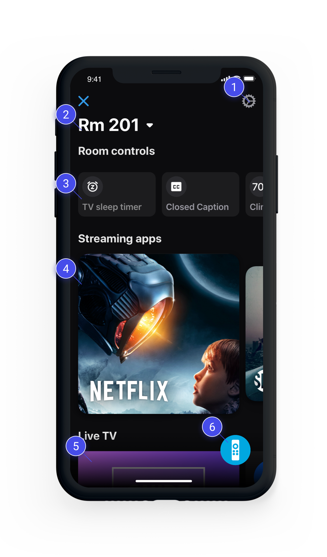
Below are just a few of the new designs that both alleviated existing pains we identified in the old design, and set up a robust UX system to expand on as the product evolves.
Settings Menu
Removed infrequently used touchpoints from the “hub”. Provided an extensible place to add personalization and config options.
Room number as title
Since this is the “connected” state of the app, the room number is the most logical title for what you’re connected to. In scenarios where there are multiple TVs to control, a row of switchable 'chips' would be directly underneath this.
Room controls row
Users loved these capbilities in testing and had no issues with grouping TV controls, IoT lights and thermostats in one row. Allowing the user to sort was something we slated for future released based on testing, since users varied greatly in their preferred sorting order of these functions.
Streaming apps row
Since we had no means of deeplinking directly to content WITHIN apps, launching a streaming app would open the app remote drawer to allow users to navigate the content immediately.
Live TV browsing
Initial release included a clear entry point into the TV guide experience, but users could also scroll through what’s currently on and change channels directly from the dashboard.
TV remote FAB
Although I thought the drawer would be the winner in testing, it turned out to be ignored by users. By contrast, when testing the FAB, all users easily understood the icon, and liked having the remote accessible. We were also able to place it on the guide screen for quick access after changing channels.
Suite TVs in header
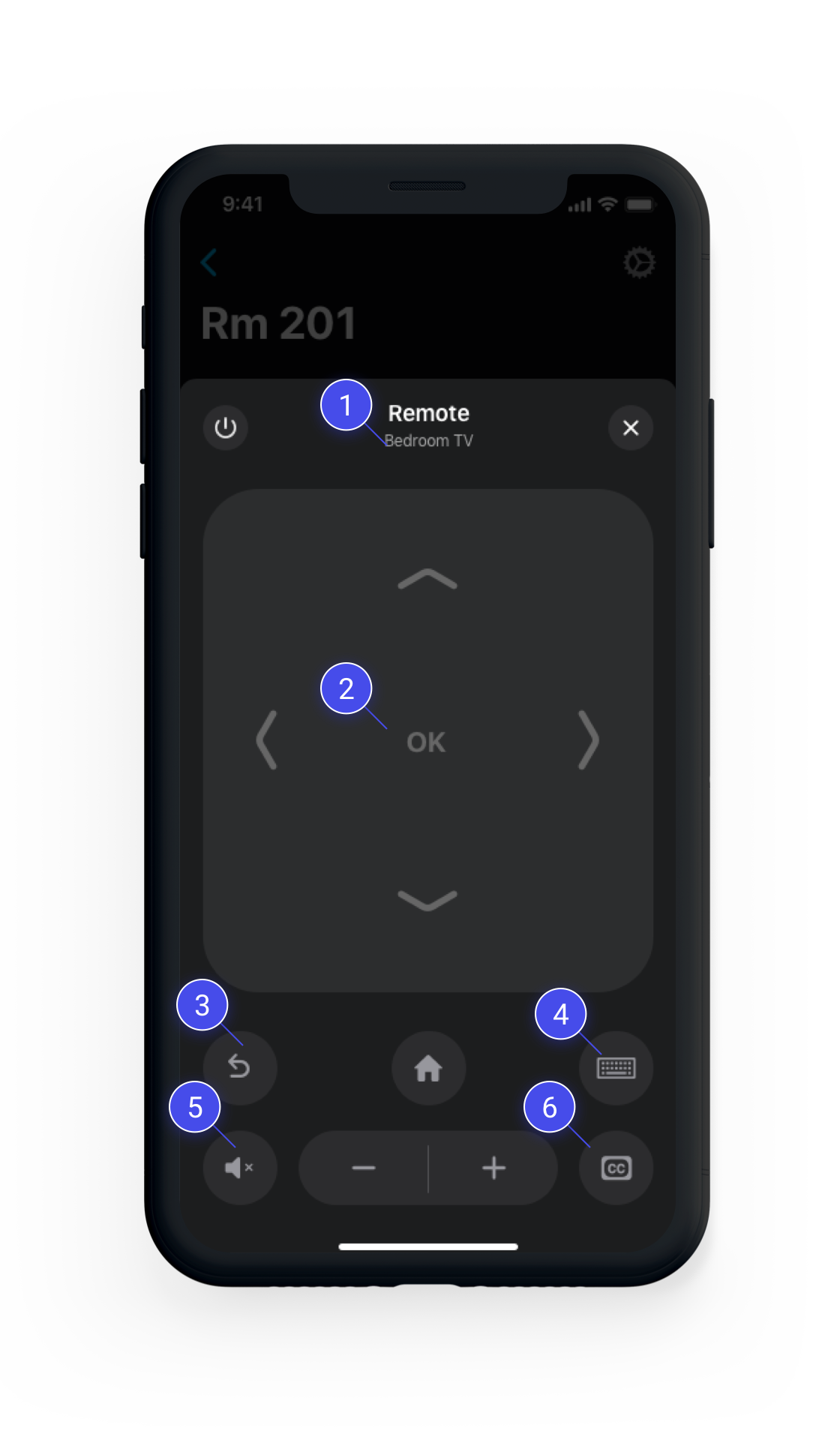
Instead of listing the room number on the remote, we displayed the active TV in a suite, if there’s more than one. This is much more useful, since the new dashboard listed the room number already.
D-pad and swipe pad
Testing showed poor understanding of swipe control scheme, but users liked it better once they learned it. We decided to ship with dpad as default, but still allow the user to switch to a swipe pad in settings, with onboarding backlogged for another release.
Ergonomic placement
“Back” and “Home” now comfortably under the user’s thumb. This works well for larger phones as well, since the remote remains a fixed height.
Keyboard mode clarity
When users taps the keyboard button, the entire remote interface transitions to a keyboard mode with a helpful explantion of what the feature does and an easy way to go back to the remote.
Mute next to 'lower volume'
Common sense. We fixed it.
Fewer touchpoints
We kept CC in both room controls, and on the remote to make sure it mapped intuitively to user’s expectations. Sleep timer was removed from the remote, and TV Guide was no longer needed because it was already at the same nav depth on the app as going to the remote to launch it.
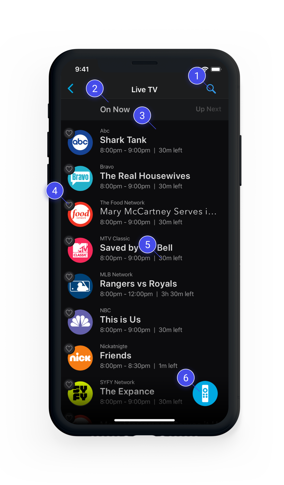
Search is not frequently used
Users can still search, but according to the metrics, it was not used often. So we made the touchpoint smaller, but created a separate, more intuitive search experience
Now/Next
We learned in testing that users strongly preferred a typical linear guide. But our engineering team said it would set the timelines back considerably. Users still understood this interaction well in testing, so we shipped it as an MVP.
Favorite channels section
Not shown here - this actually made favoriting meaningful because a separate list would appear at the very top, allowing fast access to a user’s top channels. The fact that most users had few favorites made this much more logical than a separate tab which would remain mostly empty.
Better positioning for 'Favoriting'
Favoriting is now visually linked with the channel - which is the thing the user is favoriting. It also helps reduce the visual noise and future-proof the layout for a time-based linear guide.
Display remaining time
Since we couldn’t do a linear guide, we did our best to provide enough context to the user about whether or not they want to even start watching a program. If there’s 5 minutes left, would you even bother?
Keep the remote accessible
Users told us in testing that they expected the remote to be accessible here as well. What if you changed channels and it was too loud? Using the FAB was a big advantage here.
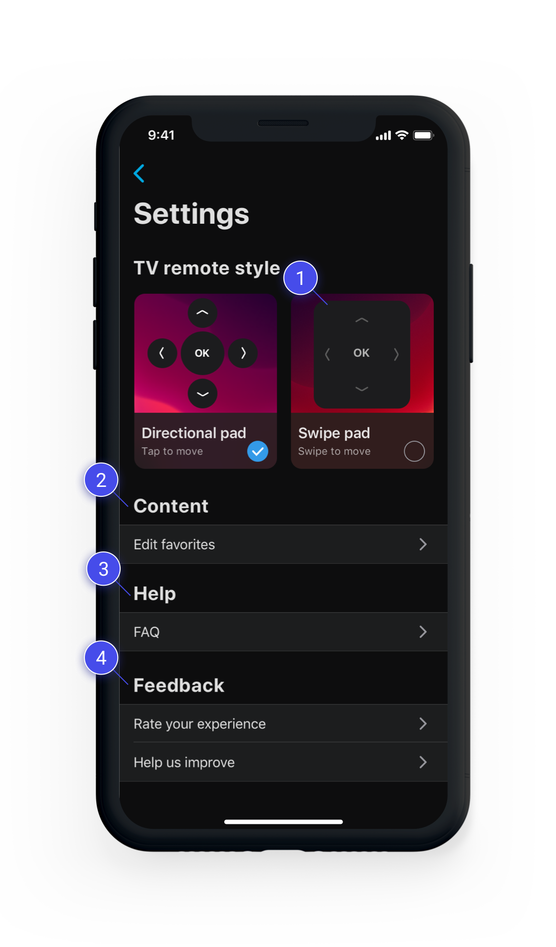
Less looking down
It doesn’t ship as the default mode, but users can now explore and use this scheme to look down less often.
Future-proof content section
We knew we’d be growing the ecosystem and adding content-based tools and personalization, so we made a section. For starters, users could manage their favorite apps and channels here.
Future-proof help section
The FAQ was ok, but we also felt FTUI’s may be needed for some features. We could store them here so users could reference them since hotel stays typically are very intermittent for most users.
Less intrusive feedback touchpoints
While initially we’d likely see a decline in the volume of feedback we’d be getting, we were expecting fairly rapid growth in the number of properties that supported this tech. So we went ahead and placed it one level down. which kept the dashboard area more focused and decluttered.

