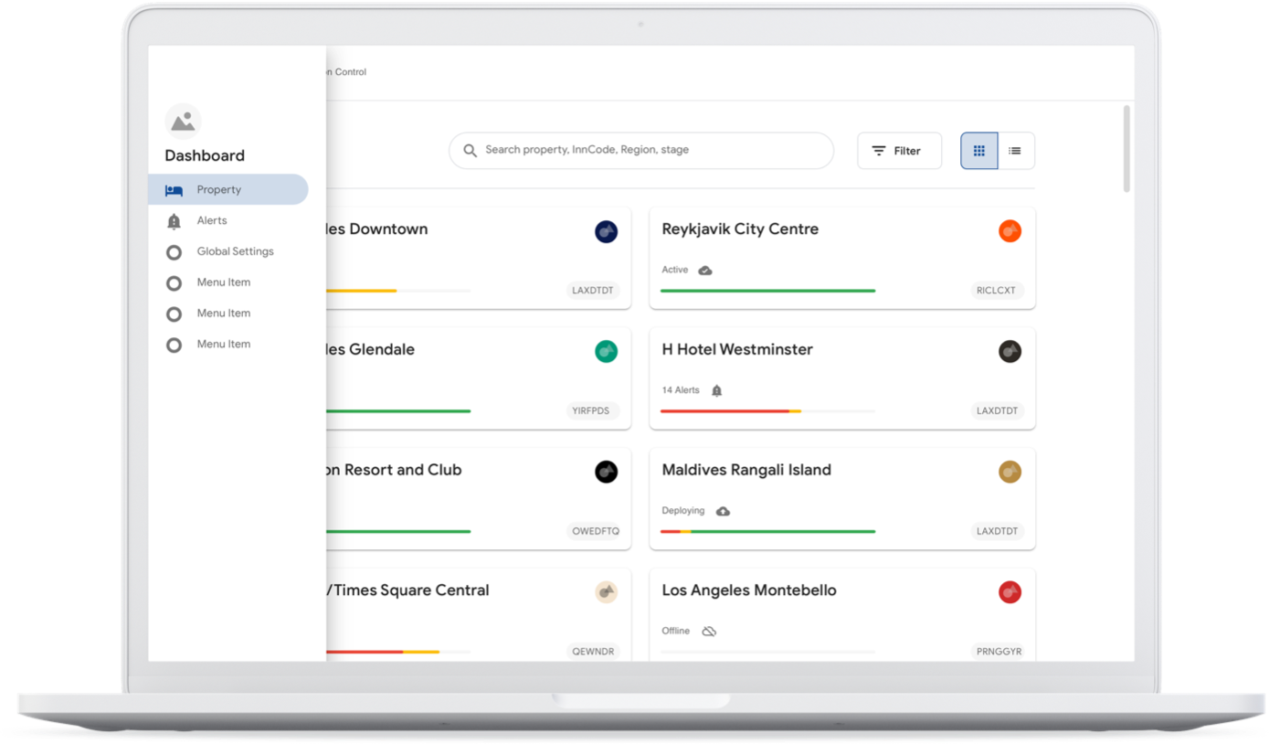
Mission Control
Summary
Mission Control is the backend system powering end-to-end smart device management intended for a global scale. When I joined the project, work had already begun to overhaul the system because, much like the smart room app and smart TV interfaces that were part of the customer experience, the backend was built as a PoC that was beginning to buckle under the pressure of increased scale.
My role
Tools used
LucidChart
Sketch
Confluence
JIRA
Mural
How do you go about creating a smart device management system that scales to thousands of properties?
Problem Discovery
Shortly before I joined, multiple workshops were held with stakeholders ranging from engineers, system architects, property deployment managers, and operations. A few of the key learnings are summarized below.
Hotel metadata documented in excel
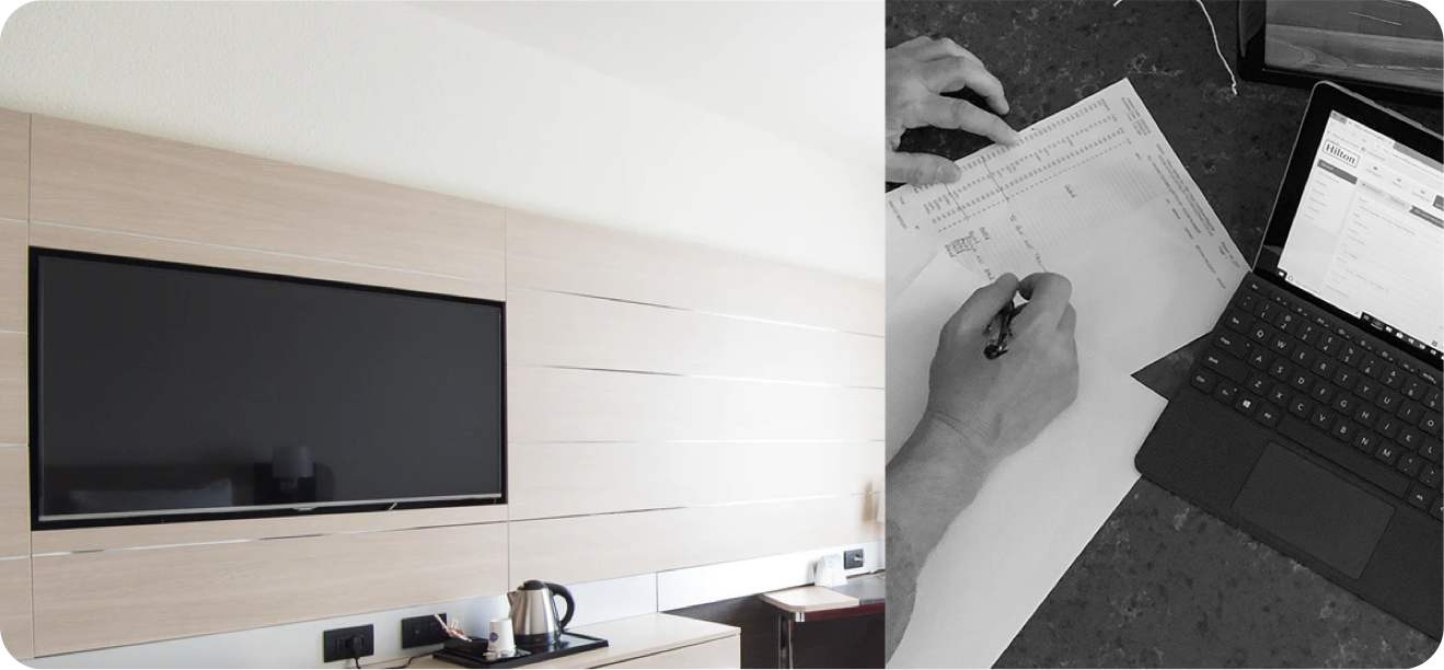
Every new property that purchased the technology had to be audited by a human, and the results of these site-surveys were stored in gigantic spreadsheets and were not accessible to the management application in any way.
Manual naming of customer-facing IoT devices
Even at 13 properties, inconsistencies due to manual device naming began to cause pain for users and for operations. Some devices on the conuming client apps would be mis-spelled, or incorrectly identified.
Manual tv channel database configuration
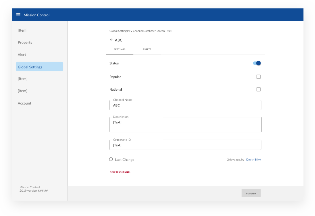
While the backend system did use a vendor API for consuming TV channel program data, there was still a huge amount of manual work that had to be done to scan the headend on-property, save the data into a text file, upload it to an inhouse utility to convert into API keys for each channel, and then manually copy and paste them in.
No support for default asset configuration
While all the properties were based in the US and the streaming partners, assets, and brand-level marketing entry points were the same, there was no way to “re-use” these configurations as a starting point for new deployments.
Confusing information architecture
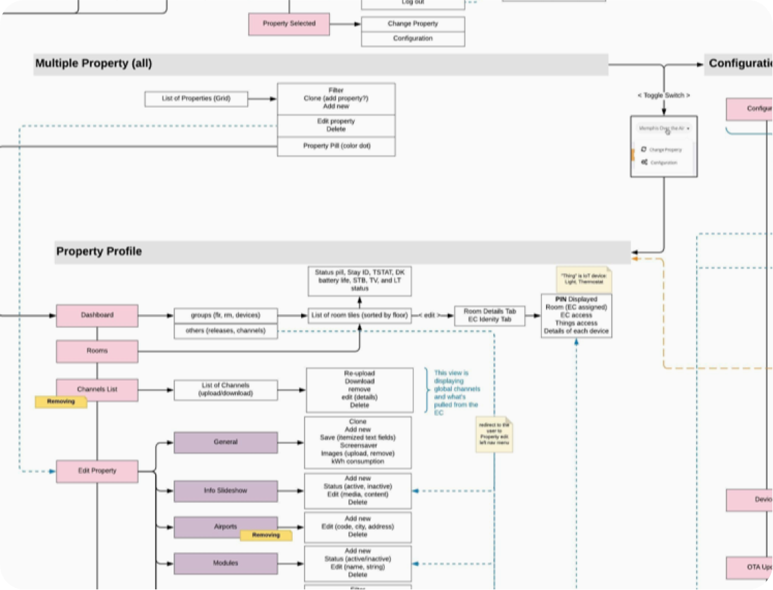
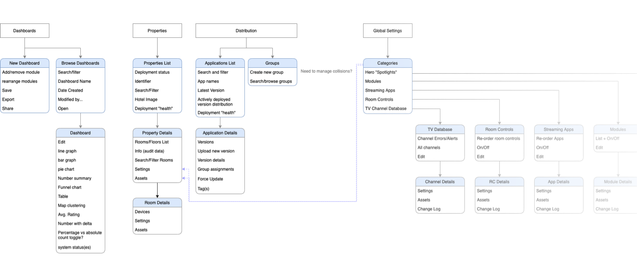
As usual, I like to create an information architecture reference diagram which helps me think about the existing components in the system and how they might be better organized. But even my intial interaction with the system felt vey confusing.
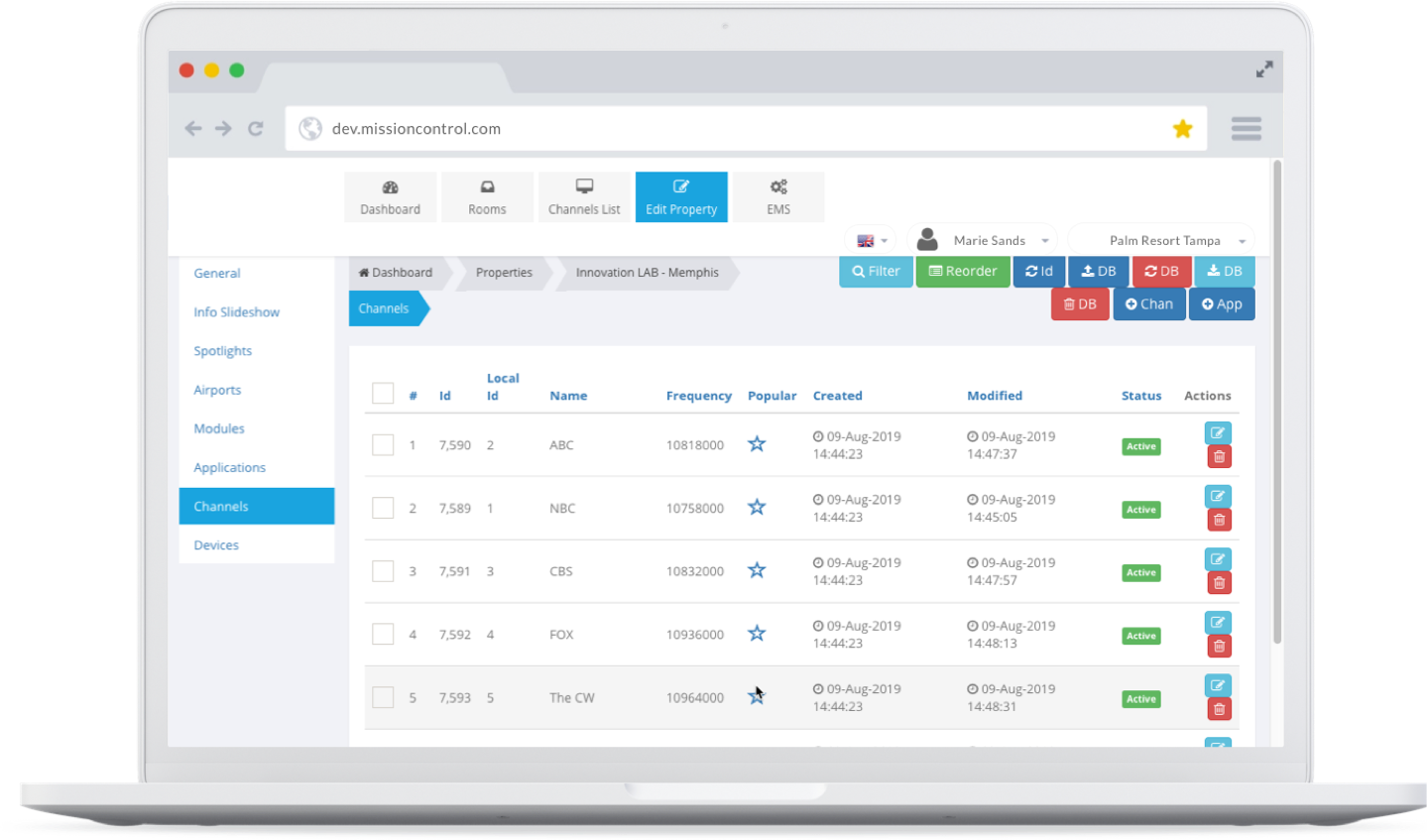
Multiple top navigations
In the upper right, there was a dropdown for swiching basically the entire interface and information architecture, with some similar menu items and some different ones.
Top nav, side nav, breadcrumb nav, tab nav...
Granted, for complex systems, navigation may be justifably complex. But the way in which these elements were structured, and the lack of hierarchy made it very hard to understand where the user was in the context of the entire application.
UI breaks when resizing the window
The entire UI was designed with no thought given to the ability to use these tools from a phone or even tablet. In practice, we learned that responsive design was highly desirable for on-site staff and operations teams so that they wouldn’t have to lug around a full-blown laptop for diagnosing, troubleshooting and resolving on-property issues, especially those that may invlove multiple rooms.
Shadowing on-property deployment staff
As part of problem discovery, we shadowed real deployment teams to understand and document their process, and also identify areas where we could help since the goal was to design an end-to-end system to manage the entire ecosystem - from ordering the right amount of hardware, to streamlining deployments, to managing active devices and troubleshooting anomalies.
- Lack of access to correct TV remotes for different models.
- Lack of access to TV cloning USBs.
- Bottlenecks in dispatching and managing where staff are, and what the status of any given room deployment is.
- Collisions in IoT pairing forcing teams to try and deploy to physically distant rooms.
- Manual hardware diagnostic check and communication with team lead regarding online status.
- False negatives on hotel-provided vacancy list causes awkward interactions as staff let themselves into booked rooms by accident.
Project Goals
Automate
Create a suite of tools to intelligently manage the ecosystem end-to-end.
Enable scale
Enable increased velocity of hardware deployments.
Stop starting from scratch
Increase velocity of configuring properties that are similar to each other by creating useful defaults and configuration cloning functionality.
Enable on-site autonomy
Alleviate bottlenecks in hardware deployment by reducing reliance on a team lead.
Operationalize vital data collection
Increase data reuse and deployment accuracy by creating an auditing utilities.
Not mobile first, but mobile-capable
Design to support mobile interfaces for on-site staff so they don't have to lug-around a laptop.
Whenever possible, simplify
Reduce operations reliance on highly technical stakeholders.

Who is this for?
Working on internal tools provides the unspoken benefit of having very immediate access to the people who are actually going to use the product. Below are a few of the stakeholders that were also our users.
Deployment Ops
These were people that are responsible for arranging deployments with on-site teams. We shadowed them and collaborated on the deployment toolkit.
Content ops
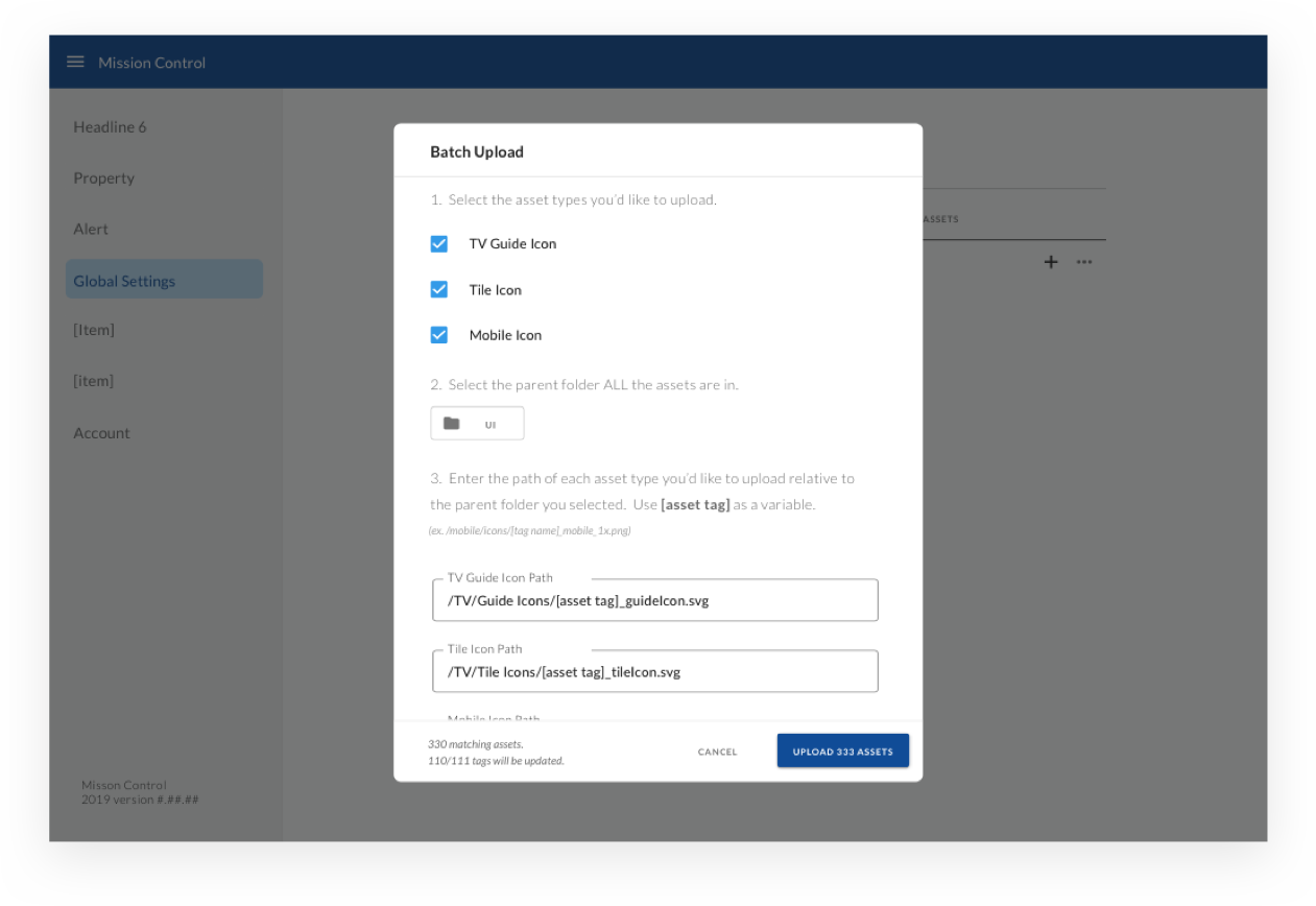
At the time that I joined the project, our UI designer was the one uploading hundreds of assets to the existing system. He gave us feedback for the need to batch-upload multiple assets and link them to their respective “buckets” based on the file-naming scheme as content requirements scaled.
Engineers & QA
These were folks that were simultaneously responsible for the QA’ing new releases and features, but also assisting with anomaly and error detection, routing and resolution.
Key characteristics
Through the interviews and workshops that were conducted prior to my joining the team, I extracted some reoccurring elements from the goals of the various types of people interacting with this system.
Deployment Ops
- Value speed and efficiency to finish rooms quickly.
- Less technical than engineers. Often hired locally, and require the most simplicity from their tools.
- Skill levels and understanding of the system vary greatly, some have a limited troubleshooting skills when issues arise.
- Want to know how complex each room will be to install, including things like distance to power/ethernet, heavy furniture, etc.
Engineering/QA
- Value automation of routine tasks, precise control of code/app bundle deployment, regional configurations, version control, etc.
- Extremely technical - least intimidated by complex interfaces and problems.
- Skill levels and understanding of the system is high, learning curve is low for tools. Many are power-users, use keyboard to navigate interfaces. Prefer fewer nav layers with more controls per layer.
- Need easy access to detailed log data, and granular control over the entire system.
Content Ops
- Value efficient configuration of all creative assets including animations, videos, background images, mobile icons, channels and streaming icons, etc.
- Not very technical - able to understand and configure content, but don’t want more detail than is necessary for typical responsibilities.
- Growing content requirements mean less availibility for new feature UI, and more time spent on maintaining and updating content. Prefer to automate as much as possible.
Team brainstorms
Each problem area required a variety of stakeholders, but typically included the product owner(s), the design team I was a part of, which included two UI designers and one other UX’er, and additional stakeholders as required by the problem area.
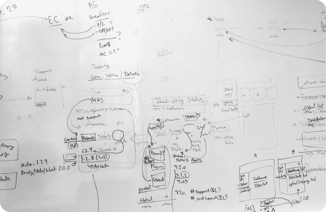
Whiteboard... everything.
OK, not everything — but for majority of meetings and brainstorms following the problem discovery workshops, the main goal was to talk through specific technical challenges, and how the system should function.
It was less about the layout of elements, and much more about the functionality of the system’s many moving parts that required the gathering of people with domain expertise in their “slice” of the service map. The strategy for the IA was largely up to us and product to decide and present for validation to the various user groups.
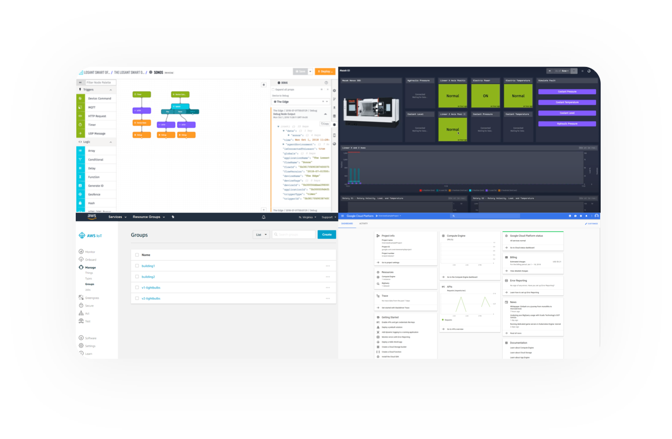
Competitive Audits
Admittedly, this is much harder to do efficiently for B2B because companies tend to keep the actual implementations much closer to the vest than B2C applications, which are easy to audit thoroughly.
Still, ideas come from many places, and even just investigating a few screens for various IoT device and cloud management platforms can yield ideas, insights, and different ways of thinking about information architecture and design systems for similarly complex cloud management interfaces.
A New Design System?
We knew that we were going to need to build a design system to maintain consistency in the wake of so much complexity. Or did we? Design systems can, in and of themselves, be a huge time investment. Did our project really warrant its’ own visual language and identity? Was there a faster way to market both in terms of design AND code?
Material Design to the rescue
We knew that our solution architects were planning on using React.js for the new front end. After our UI designers suggested Material, and we proposed it to engineering, everyone agreed that this was the fastest way forward since Material Design has a vast front-end component library that developers wouldn’t have to write from scratch, and design would have a huge head-start on components.
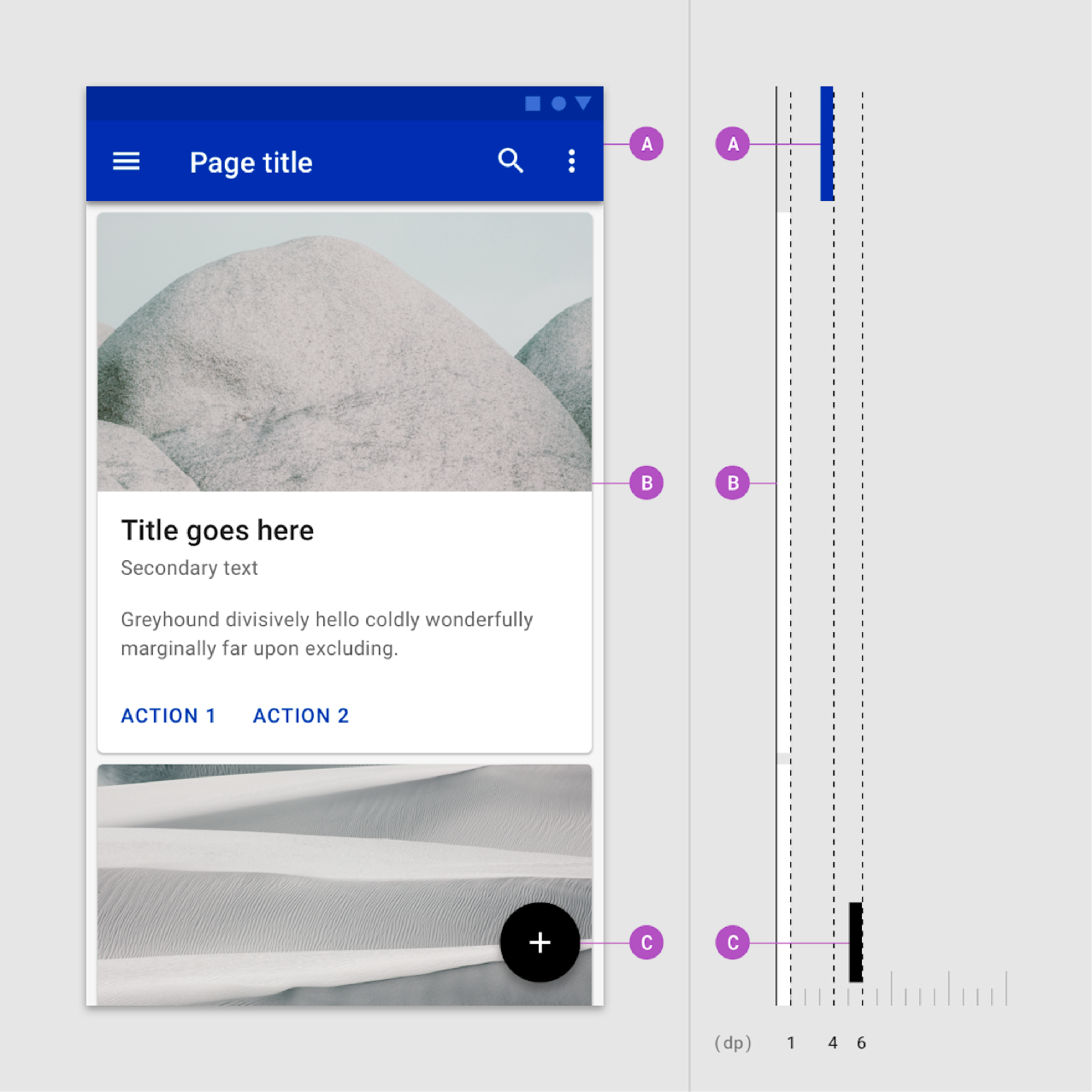
Image Credit
material.io
IA Exploration
Synthesis of stakeholder interviews and painpoints listed in the workshop yielded several top-level categories of tasks which we wanted to align with the navigation.
Wireframe exploration
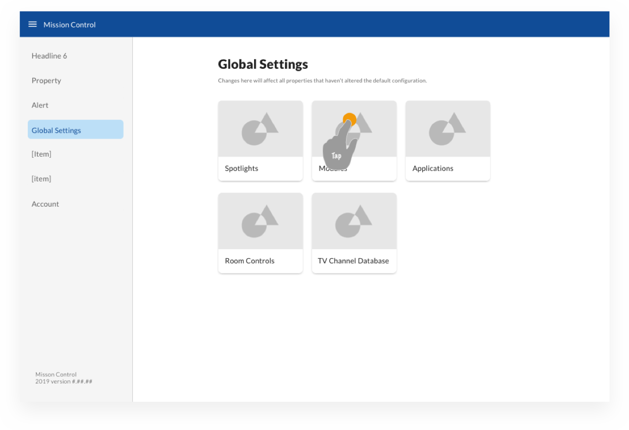
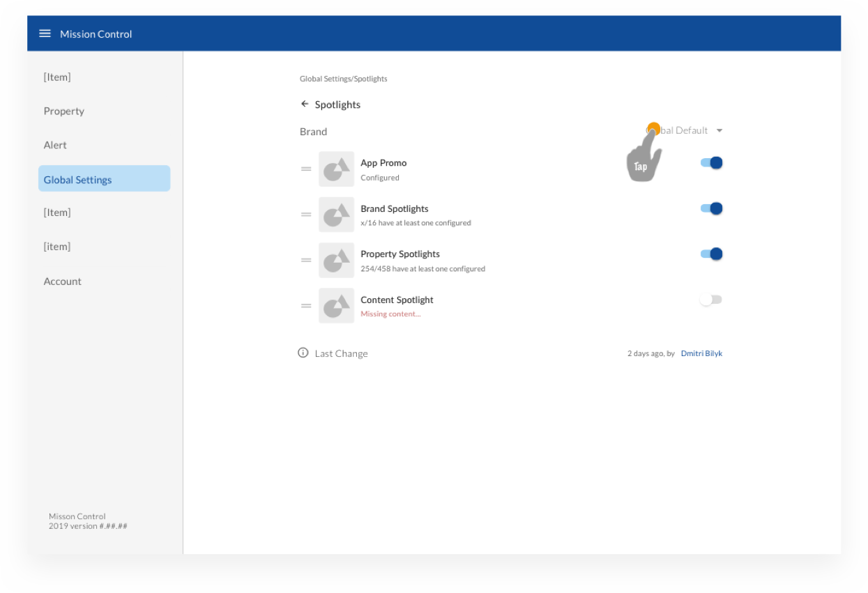
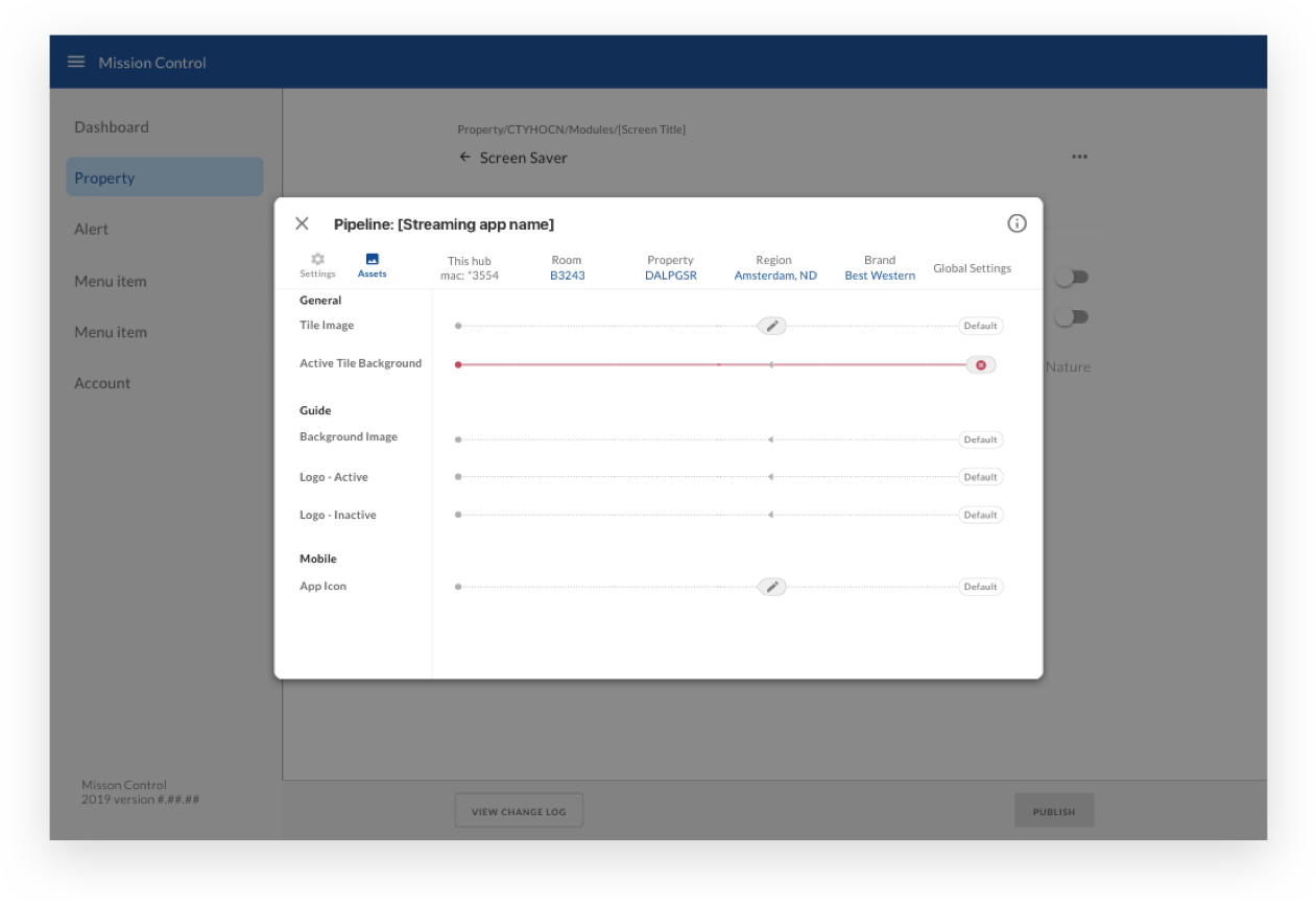
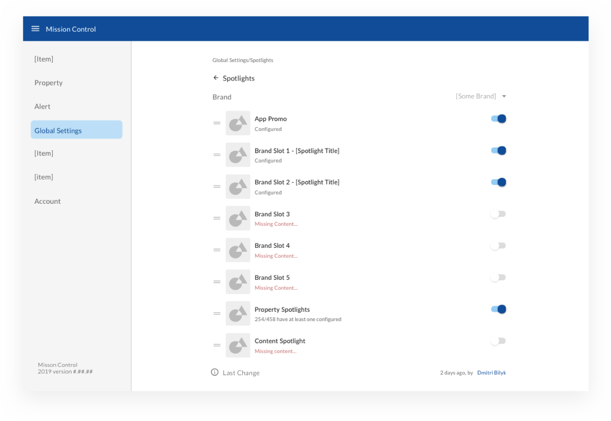
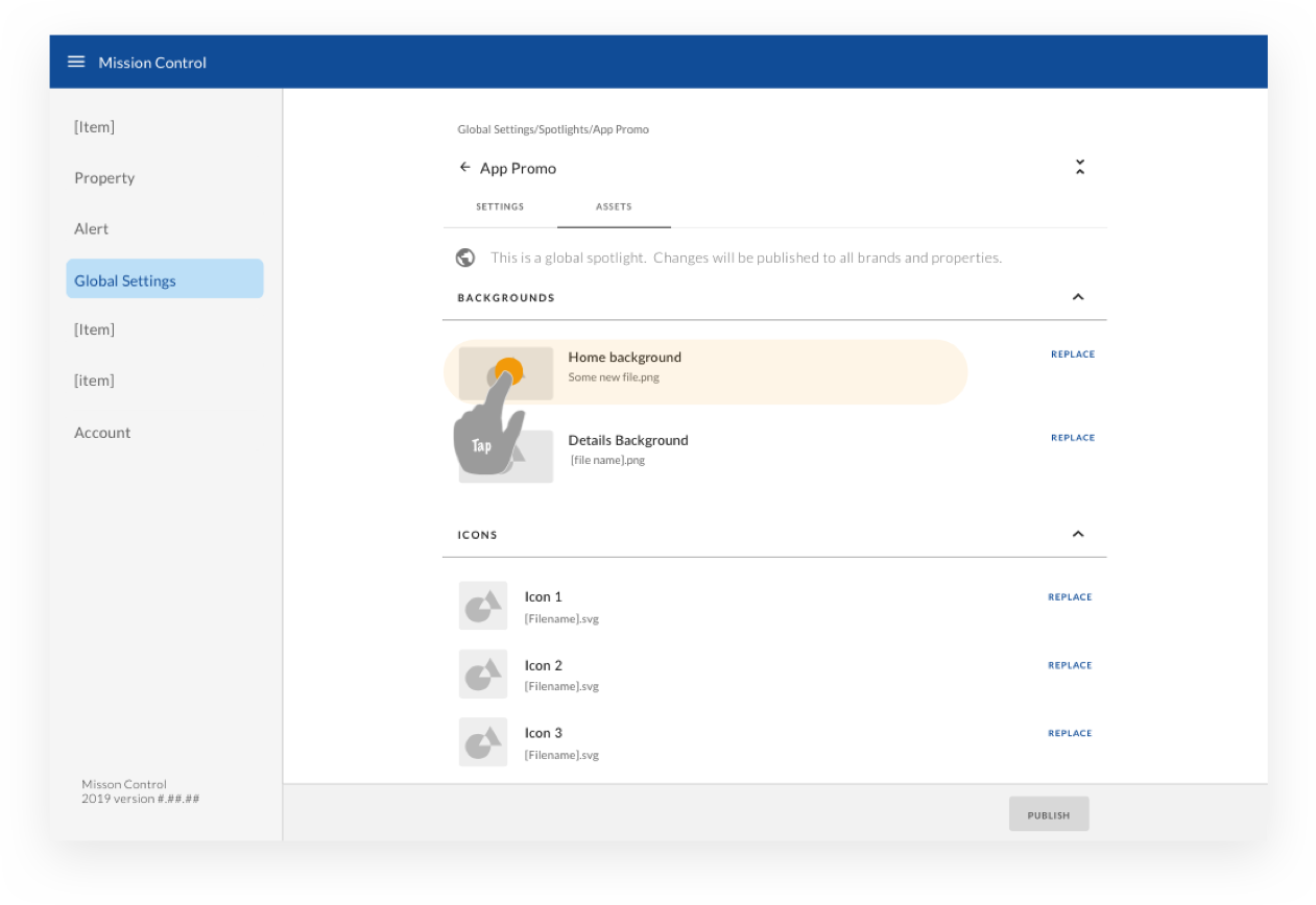
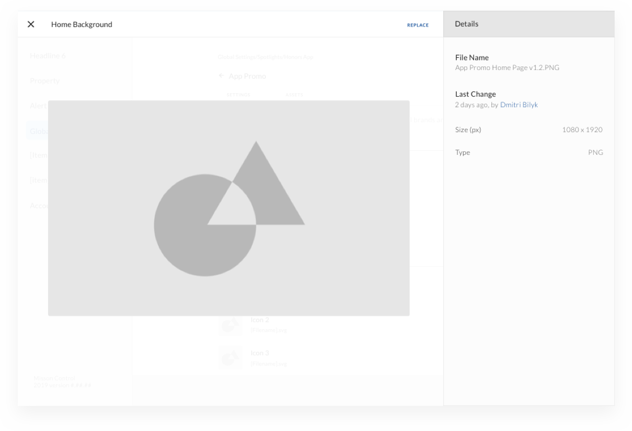
Since we knew we wouldn’t be able to solve and design the entire system monolithically, my UX partner in crime and I collaborated very closely and often scheduled short meetings to keep each other in sync on ideas, edge cases, items that relate to multiple parts of the system, and so on. She had already developed the strategy for laying out pages and navigation, so we both used that as a guide to keep the navigation and responsive design consistent for each flow.
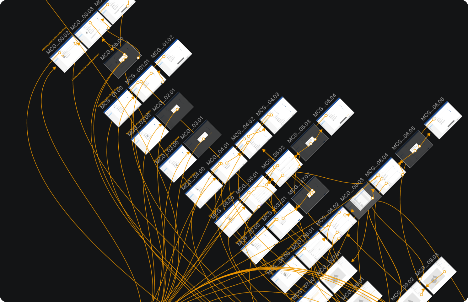
Clickable prototypes
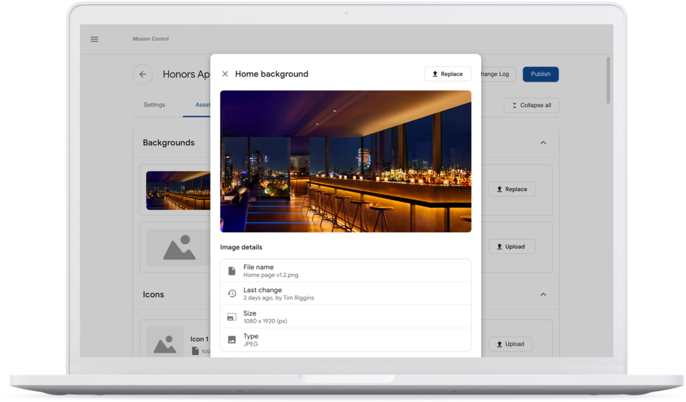
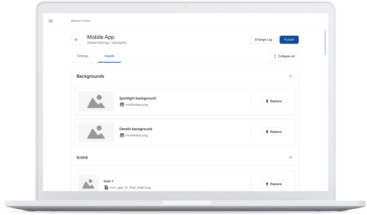
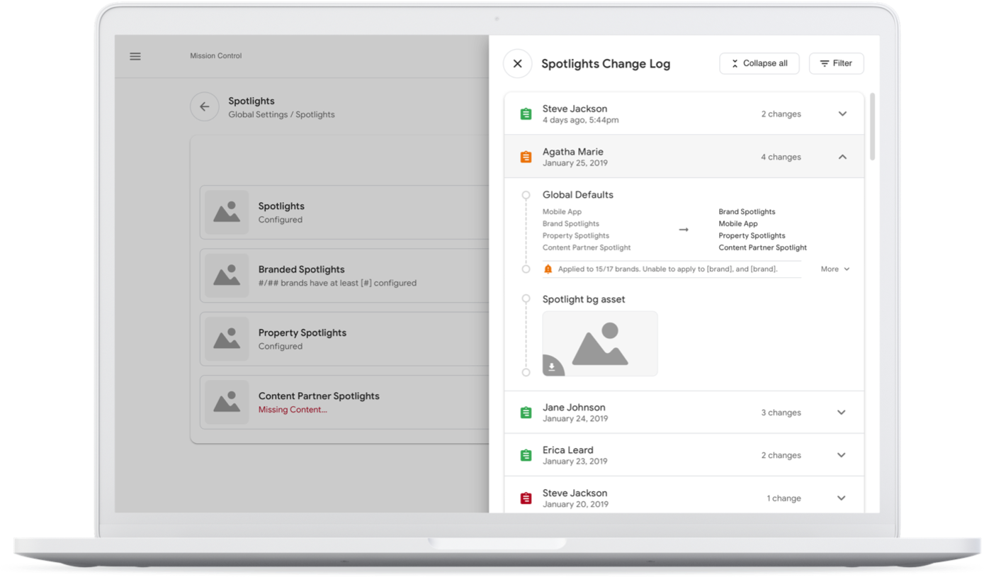
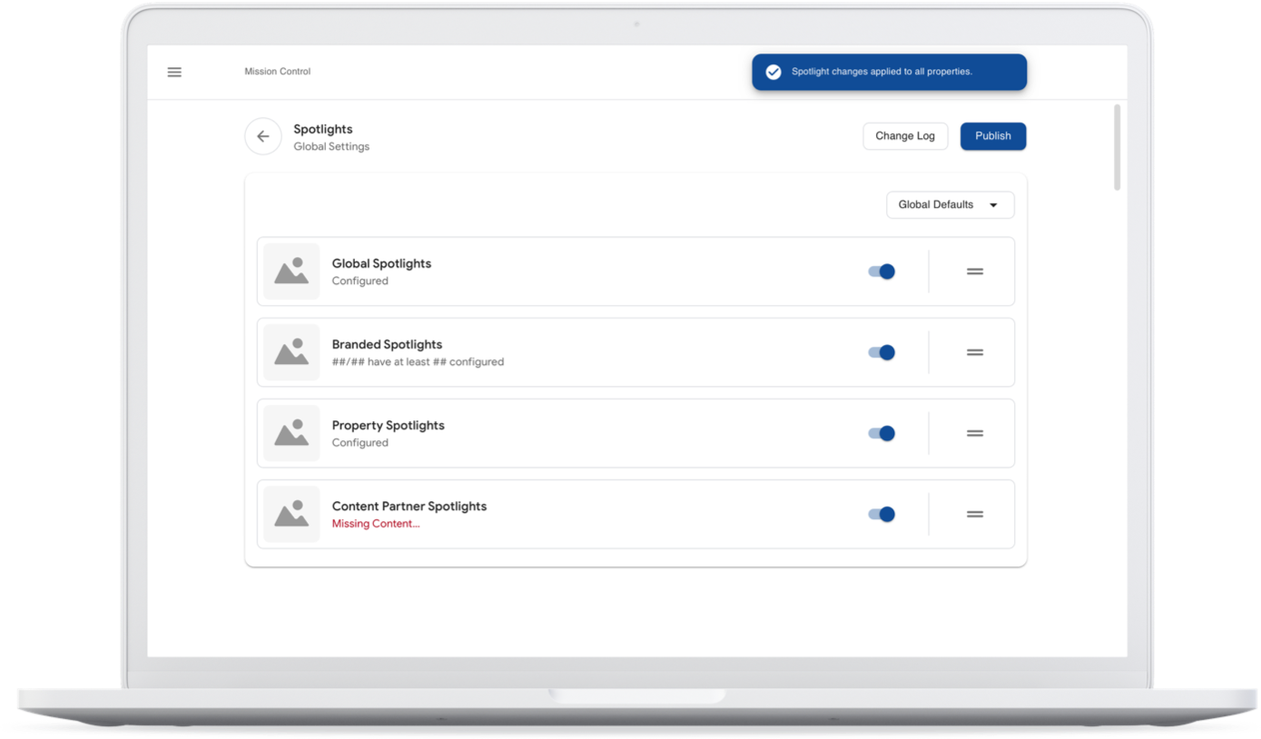
Because this project didn’t require any complex animations or transitions as is more typical of public-facing products, Sketch Cloud clickable prototypes ended up being the fastest and easiest way to share the UX with product and our users/stakeholders.
Anyone from our team could comment on any wire or flow, and we’d get notified and continue the discussion via Slack or Webex Teams.
Testing
Since we had near-immediate access to the people who used this system on a daily basis, our ‘testing’ strategy was much more fluid than a typical user-recruiting, testing, and synthesis cycle would be.
We bounced ideas directly off of relevant team members, collected additional information from them when we felt we lacked clarity on certain functionality or features, and we’d send them prototypes to try out. The feedback was especially positive on aspects of the design that aimed to reduce manual configurations, and tasks.

Communicating complex logic
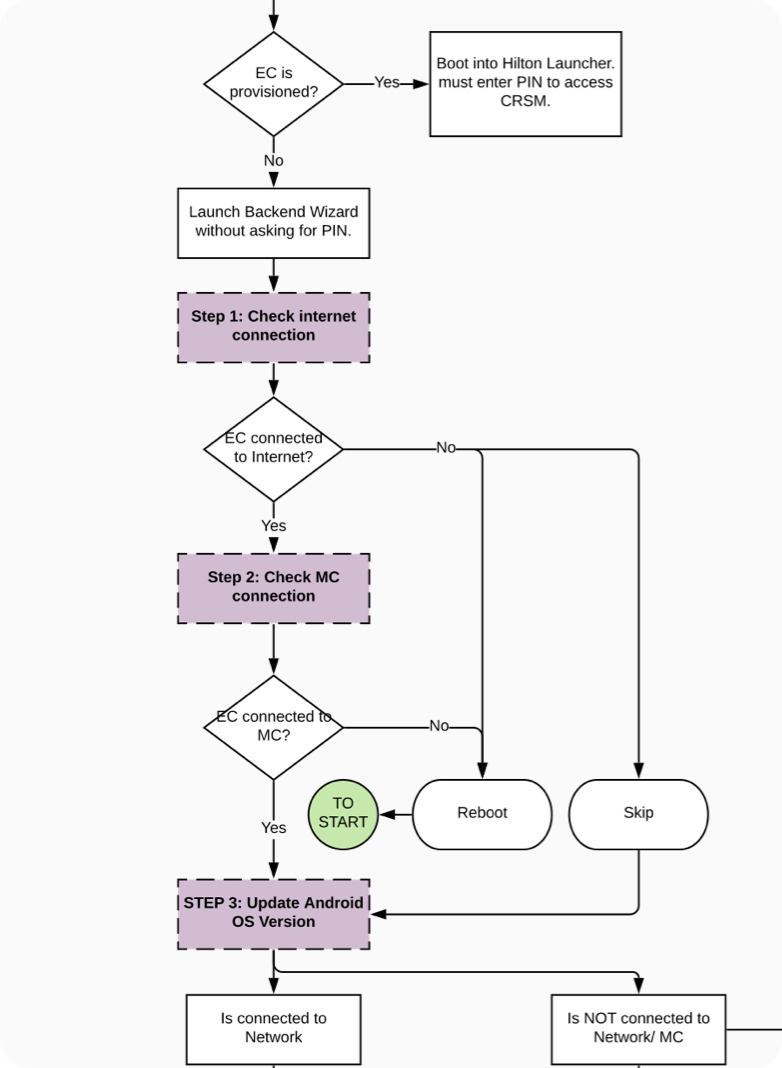
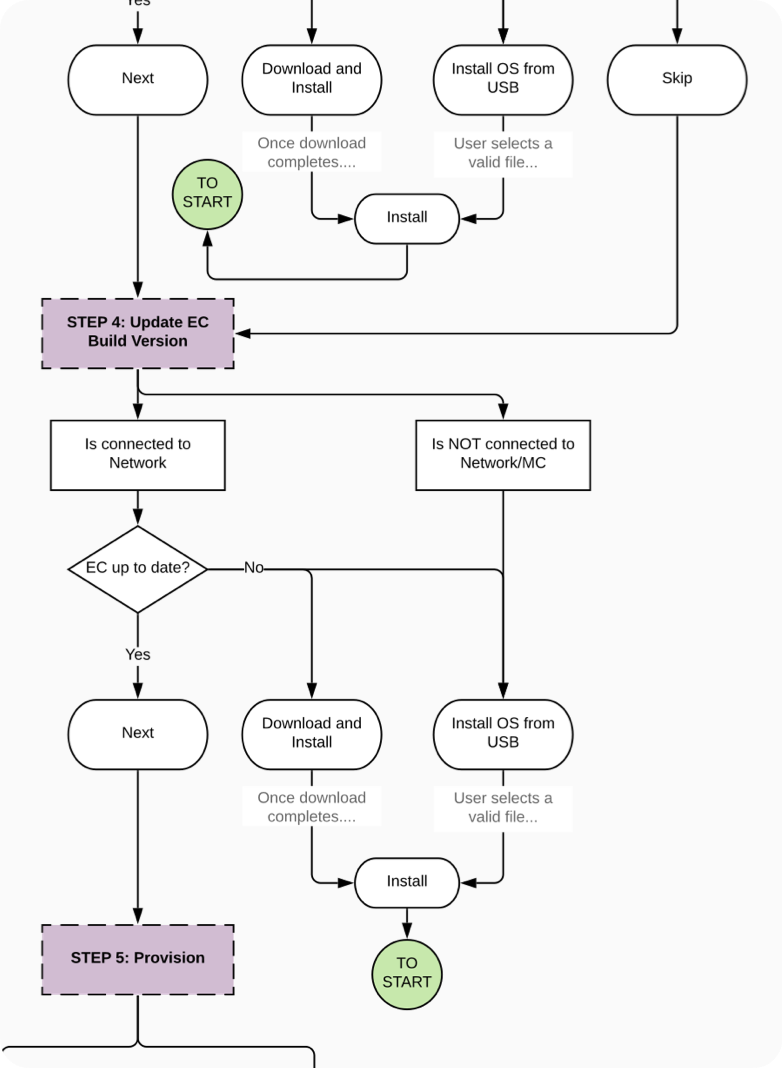
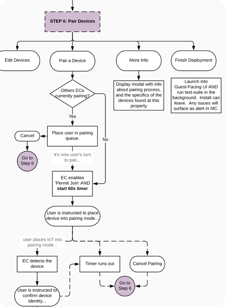
The wires above are from just one of the suite of utilities that we were tasked with designing. As part of this project, I was also tasked with designing a TV deployment wizard for on-site installers to use. The interface hid a lot of potential edge cases and branches from the user, but in order to account for it with product and engineering, I created a logic diagram of the entire utility.
Delivery
Can a redesign be 'Agile'?
My take on it? Not really, and that's ok as long as there is some level-setting ahead of time. The missing piece of the agile cycle for redesign epics is actually shipping code to production, Since it would cause more pain than benefit to ship redesigned UI piecemeal.
Define and stick to the scope
For complex systems, with a lot of moving parts, it’s so important to understand the scope of the MVP. It’s the best defense against feature creep. The challenge is identifying the critical aspects, nice-to-haves, and prioritizing them accordingly, even as the goalposts occasionally move. It may mean that the team has to ship a redesign that does a bit less, but better, if the overall structure, flexibility and scalability of the design system and navigation will support the longer term strategy.
Branches
In the midst of the redesign work, we’d still get typical dev tickets for UX, UI and copy that were related to the version currently in production. That would always take priority as part of normal Agile workflow.
The redesign work was slated in parallel, and our product owners worked to burn down the backlog for the live application in order to put it into a maintenance mode before tackling the redesign epics. Meanwhile, UX research for upcoming projects was also being conducted to keep the UX pipeline a few months ahead of the tickets in the dev queue.
UX Specifications
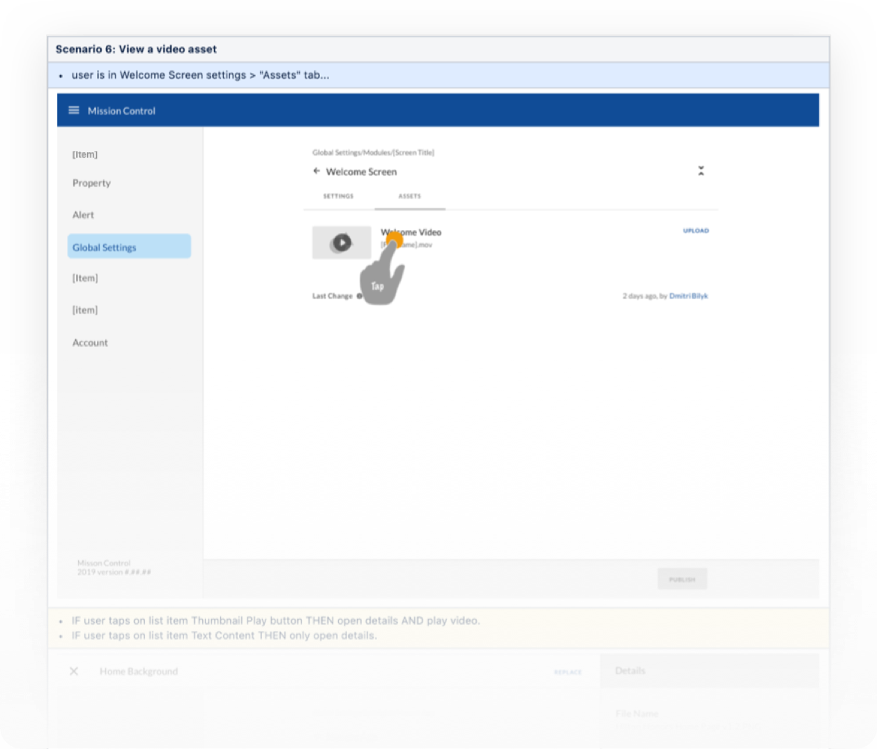
For this project, I created all UX specifications as confluence pages. Each page maps to a JIRA epic. Every story that touches a UX flow or logic in that epic gets a heading, and under each heading, every unique scenario gets a flow. Occasionally, one flow covers multiple scenarios in the ticket.
The benefits are enormous over PDFs, since its faster to update (once you know how), version-controlled, linkable to JIRA tickets for quick access, and fully-documented along with any additional logic diagrams or resources relevant to the UX.
✅ What went right
- Exceptional leadership from our product owners on structuring scope and requirements.
- Material theme crafted by our UI designers was beautiful, accessible, and fast for us and developers.
- Adoption of Material design system increased velocity and consistency of UX work by enabling us to wireframe/prototype with material baseline library.
- Our design was very well recieved by our internal users, in testing and feedback sessions.
- Our work was also lauded and referred to as a “yardstick” by multiple other teams working on internal tools and systems.
🤔 Where to improve
- A faster feedback loop between product and UX on interaction and functional requirements.
- Better collaboration between product and engineering on scheduling and migration strategy would have resulted in less frustration when engineering paused redesign implementation to resolve system architecture issues.
- Structuring my sketch cloud such that artboards in the summary will appear in the same order as the flow specs.
