ItList Editor
Summary
The idea behind ItList is simple. Content creators and online experts struggle to monetize while retaining their authenticity due to brand deals which require them to push product recommendations that their audience may not care or resonate with. At the same time, audiences are struggling to find relevant, trustworthy information as more and more search results ‘sponsored’, and social platforms discourage efficient search in order to keep people scrolling. We wanted to bring to market a new solution that enabled creators to make interactive guides that were quick to make, authentic to the creator, and that audiences would actually pay for and benefit from.
At the core of it all is the design of the proprietary ItList Editor which has 98% positive user feedback, gets 1.2 hours of usage per session on average, and has driven 10x revenues for creators selling ItLists relative to past digital offerings.
My role
Tools used
Figma
Google Sheets
Segment
Notion
JIRA
LogRocket
MixPanel
How I helped ItList go from zero to one, and build the first-ever content curation platform.
The pain
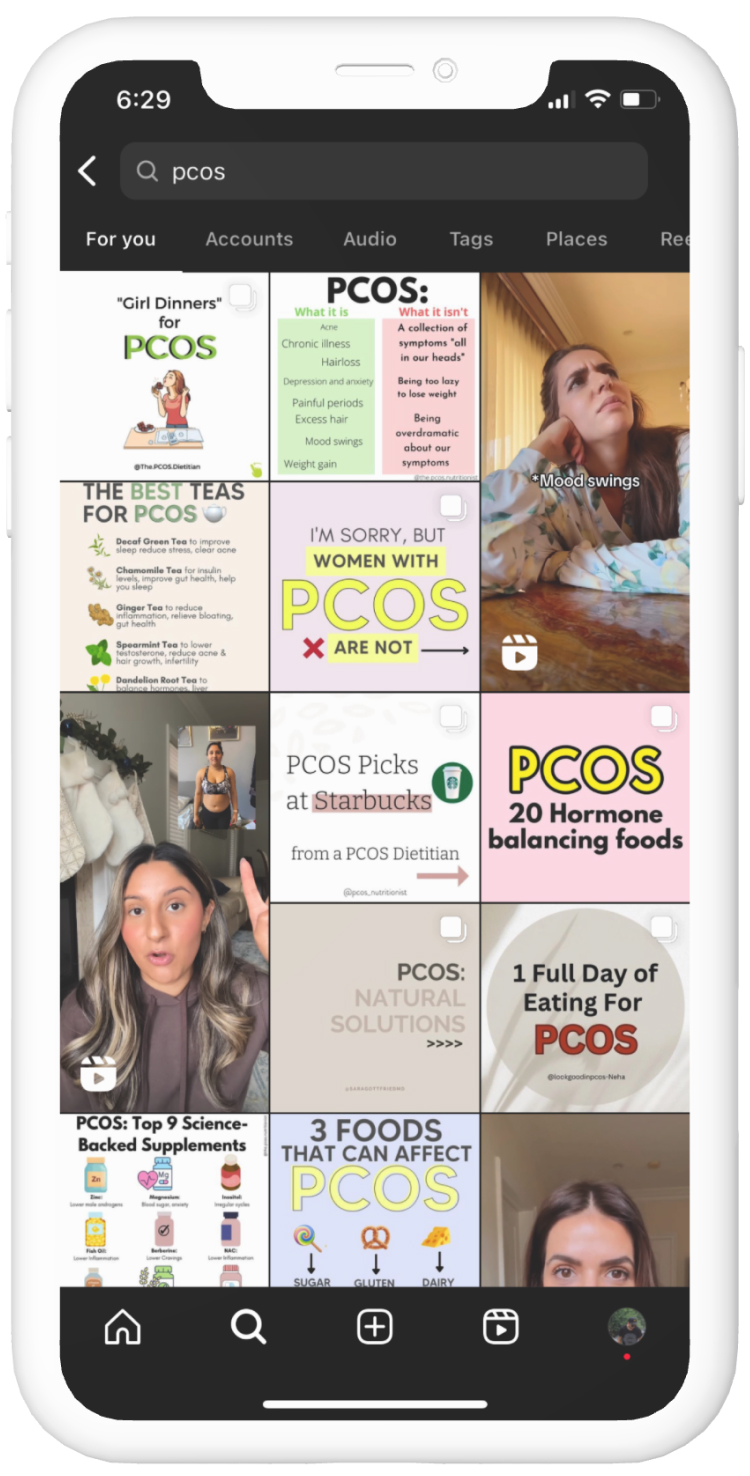
I’d become involved in ItList’s development from the very conception of the idea, as my sister (who is the founder and CEO) struggled to solve a very personal problem for herself after her PCOS diagnosis.
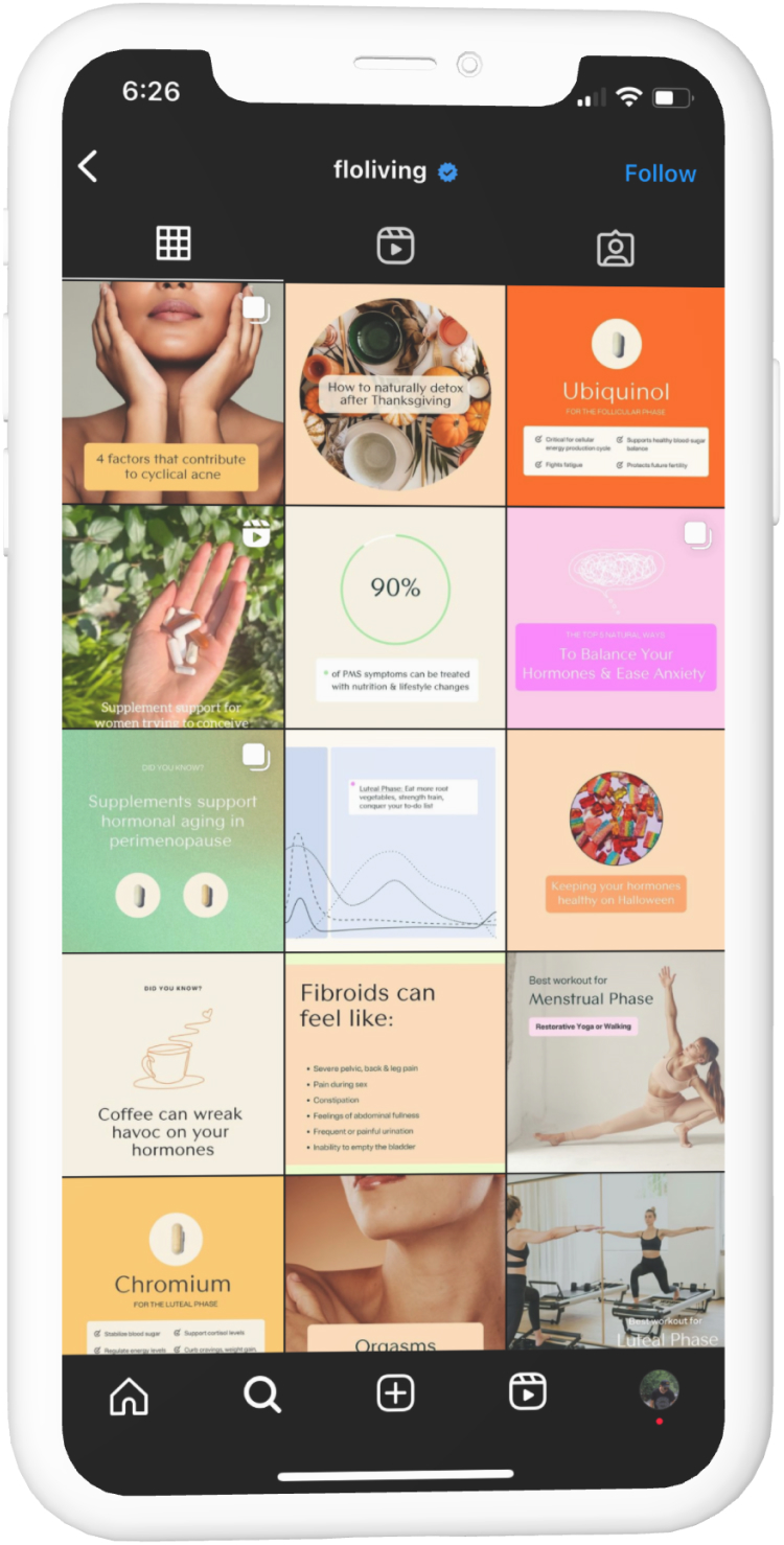
She desperately sought help by searching for trusted domain experts on social media to understand how to treat her condition, but she became frustrated and disillusioned by how difficult it was to sort through and find the relevant content ‘needle’ in the social media ‘haystack’.

The Aha! moment
She suspected that she was not alone. She had a hunch that other audiences would be happily willing to pay for a bundles of content, product and resource links with personal commentary from experts and creators that authentically guide, endorse, streamline and provide invaluable context on each of the many topics they tend to talk about often.
So after confirming the instinct via interviews with dozens of potential creators AND consumers, and a modest pre-seed capital raise based on a prototype and a vision, I joined the project full-time and it fell to me to take this blue-sky idea that’s never been tried before, define and de-risk the scope, UX design strategy, and execution to ensure we built a category-defining product that users fell in love with, on time and on budget.
*Asterisk
My work on ItList encompassed scoping, designing, researching and writing tickets and specs for a dozen epics (payments, payouts, analytics, presale pages, settings, mailing list exports, etc.). But this case study will only be focused on how my approach to designing our proprietary ItList Editor which is the heartbeat of the product.
Scoping core MVP features
Being a design-lead company, we wanted to set a high bar for what an startup MVP could be, within the constraints of our timeline and budget.
We started with a vision
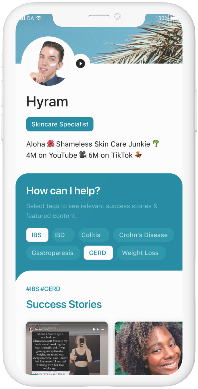
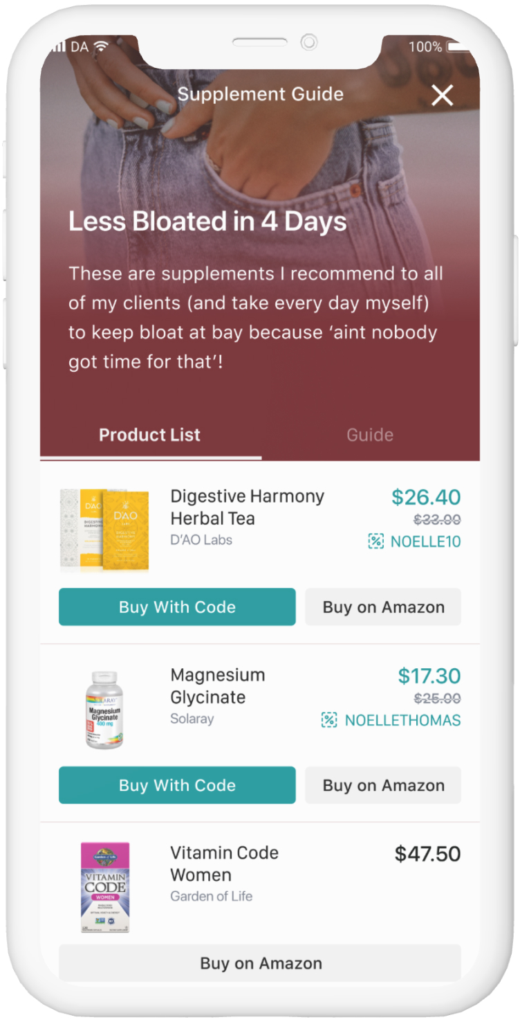
We had prototypes of what an ‘ItList’ could look like. Content creators and would-be consumers responded very positively to our early vision prototypes, and so we could work backwards starting from what creators said they wanted to make on ItList, to define the ‘what’, ‘how’, and ‘why’ of editing and publishing an ItList.
Define the scope - explicitly
I personally believe much disfunction in product, design and engineering collaboration stems from the simple fact that people are generally MUCH less explicit than machines. When we do not apply rigor up-front to define EXACTLY what’s included in the scope of work, and provide as much clarity as possible, we leave room for scope creep, incorrect or inefficient implementations, re-work, and general confusion.
So in designing the editor, which in the end was comprised of nearly fifty tickets, our initial scope doc served as the chopping block to debate all the possible requirements and features we’d need. Only once me, the CEO, COO and CTO agreed on an explicit scope doc did we continue on to the next phase.
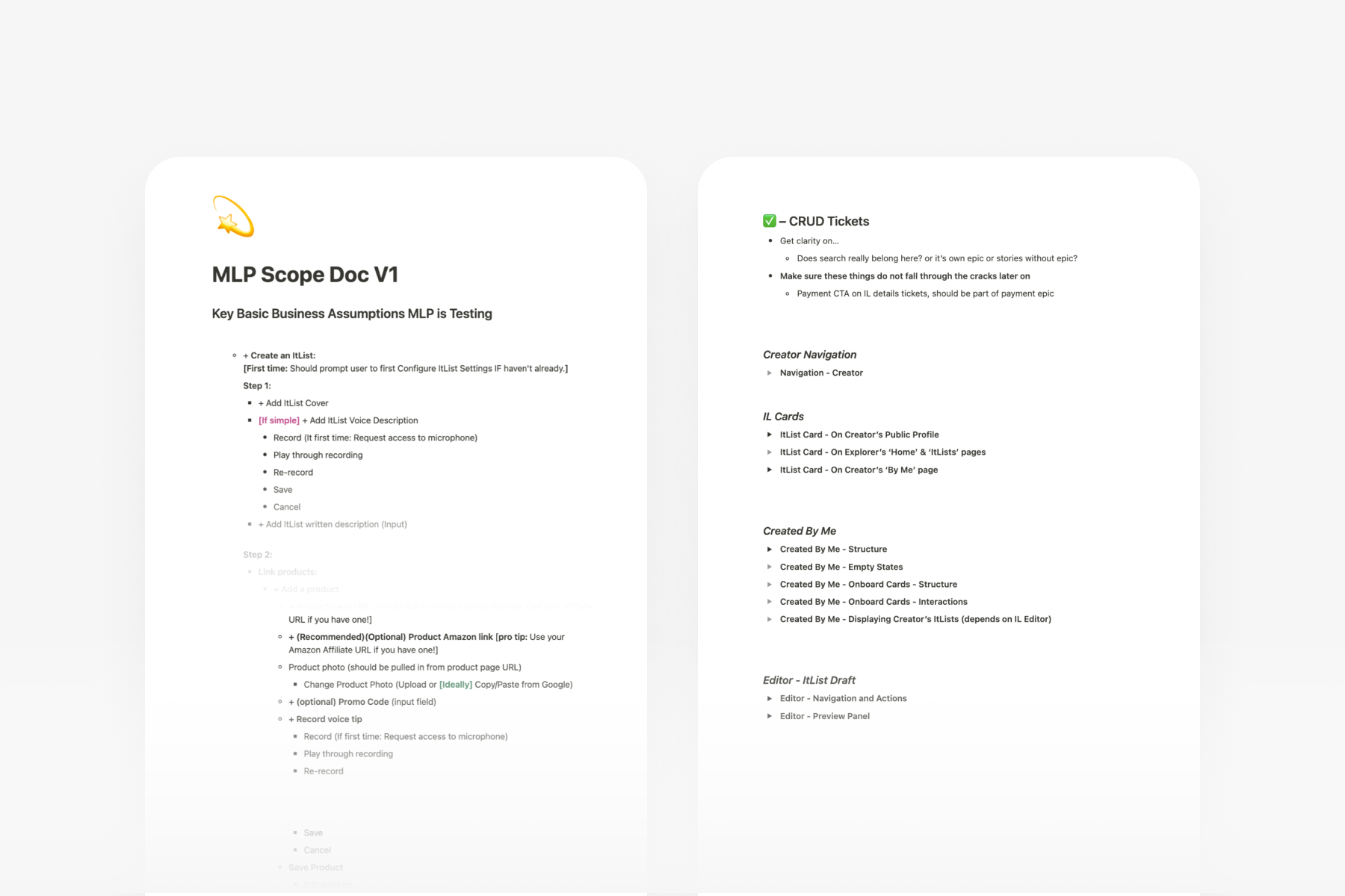
But...how do you know what must be in scope?
Some may take issue with defining the scope before doing design research, testing, etc. But the scope document is NOT the artifact from which the final software solution is built, It’s simply a way to define guardrails on what was most important to include in the design explorations and testing in order to build an experience that would be ‘minimally lovable’, without going off on too many side-quests that would not get us from zero to one.
Competitive research
We knew that the product we wanted to build had no direct comparison, however, conceptually various other products had some elements of what we knew we’d need to build. For instance, we knew that LinkTree and other link-in-bio tools would have a link adding/editing experience, GumRoad would have a digital product editor of their own, and others such as Medium would have publishing flows.
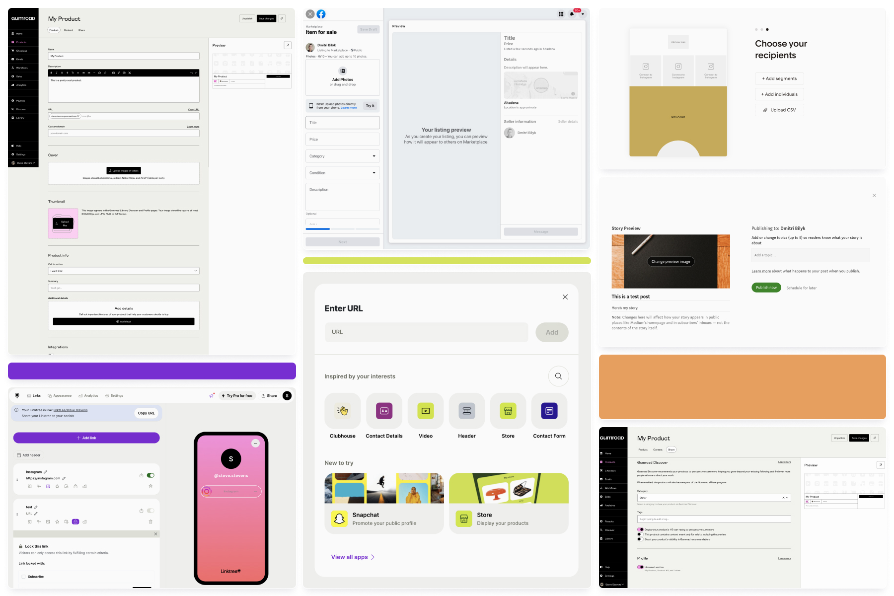
I wanted to understand how other companies approached each of these disparate experiences in order to help define a UX strategy for how to unify them into a coherent, intuitive, and responsive design for ItList creators.
Exploring how the pieces fit together
After gathering many observations from other products on the market, I began to explore various approaches to the editor. I like to approach explorations by using statements like ‘how might we...’:
- ensure creators can make ItLists quickly?
- enforce high visual and interactive appeal for the purchased guide using imagery without forcing creators to do extra work?
- enable creators to easily re-arrange the items in their ItList?
- ensure that the creator has visibility into what the end customer will actually see?
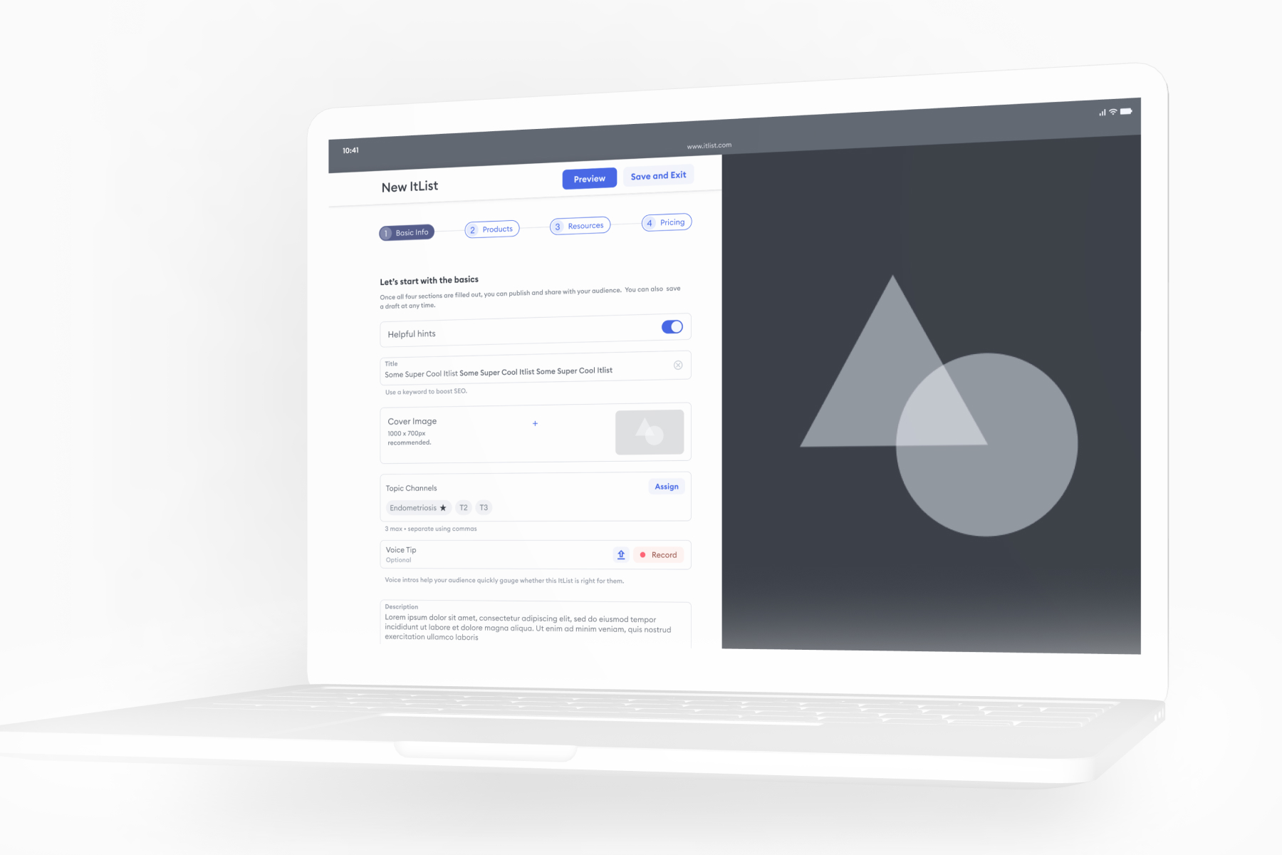
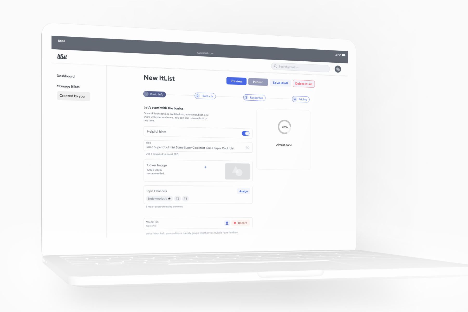
Very early explorations
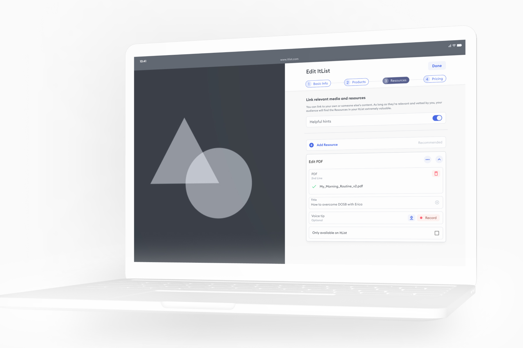
Iteration and de-risking
I typically like to incorporate a lot of cross-functional input during the exploration phase, especially for a project like this which is more time and budget sensitive and experience aspirations need to be balanced with what is reasonably possible.
For example, you’ll notice that in the above wires, there is a large image taking up half of the editor. This was due to the fact that our CTO initially pushed back against displaying a live preview of the creators progress. But this never sat right with me because I knew that the ‘Presale’ and ‘Purchased’ states of an ItList were obviously in scope to build for the MVP. And knowing that preview state would simply be a data-driven rendering of either of these two states, he agreed that it would in fact be simple enough to build after all.
It will be very bad if we get it wrong
The reality was that without a great ItList creation experience, it would be very difficult to get creators to spend their precious time building something on our platform. I always evaluate the UX research fidelity as a function of risk.
This is even more true on a small, nimble team like ours, where the cost of iterating on the shipped code would actually be cheaper than the time spent trying to recruit, interview, synthesize, and revise the design - a process that could take between several weeks to a month.
But in the case of the editor, it was simply too big, too new and too unknown to risk building something that users wouldn’t understand or find frustrating.
Writing the research plan
With a pool of 20 or so creators that were with us before we even had a product, I created a UX research plan for them to use an interactive prototype.
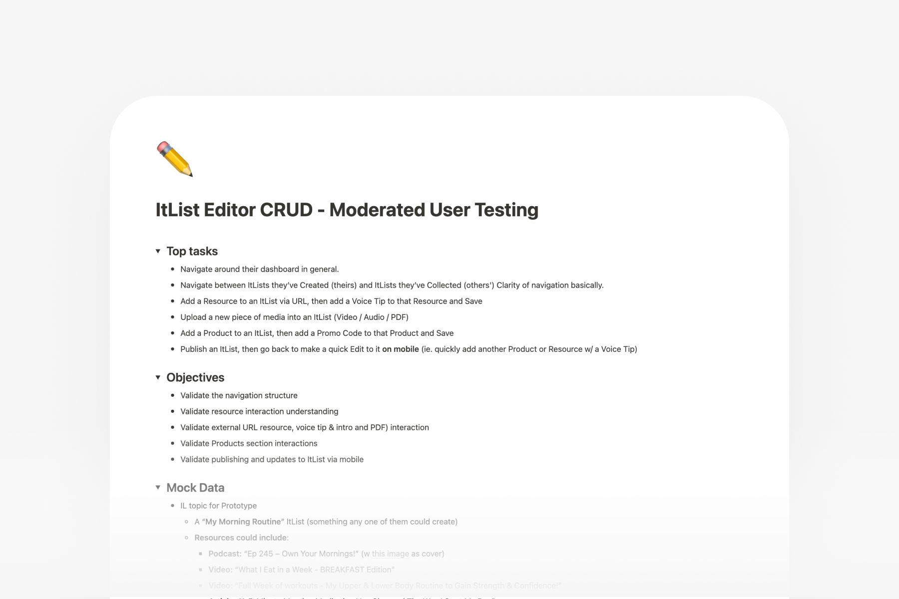
For UX research, I like to start by drafting high-testing objectives, for example:
- Validate navigation understanding
Then, work backwards to ‘what we want to know’ under each objective:
- Can user identify New ItList entry point?
- Mental model matches expectations?
- Is the exit path is understood?
- Is anything missing or confusing?
And finally, write the actual interview questions that will elicit answers which roll up to each research objective:
- Once again you just signed up and are excited to create your first ItList. Go ahead and do that.
- Take a few minutes to explore the interface and speak out loud about what’s on screen. Some elements may not be interactive in this prototype.
- Ok, now talk through how you might try to...
- Add a podcast episode to this itlist?
- Record a voice introduction to this itlist?
- Add your favorite collagen supplement to this itlist?
- Add your favorite workout app to this itlist?
- Great, before we move on to the next prototype, what, if anything, did you find confusing or unexpected?
Review and run interviews
It’s important to gather feedback on the test plan from stakeholders to ensure everyone will be confident that all risky aspects of the design are validated.
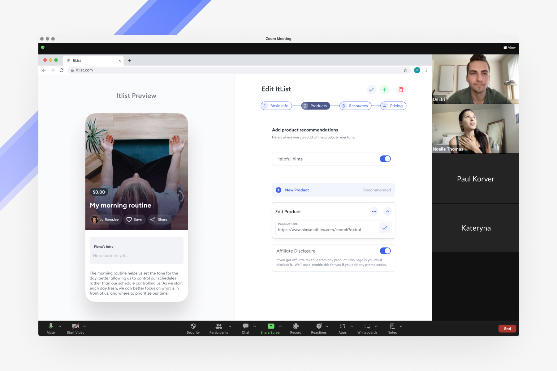
Once we reviewed and iterated on the sequence and questions, it revealed the requirements for the Figma interactive prototypes I’d need to create as assets for our participants to interact with. Below is a portion of the prototype flow for the test.
Prototype Demo
Streamlining the research process
I found many research organizations needlessly siloed and opaque in past jobs - using powerpoints and word docs which are difficult to search and collaborate on. I wanted to design a UX research repository for us that would serve as a unified pipeline for script-writing, interview note-taking, synthesis across users, and searchability for past results so that anyone at the company could find past research at any time.
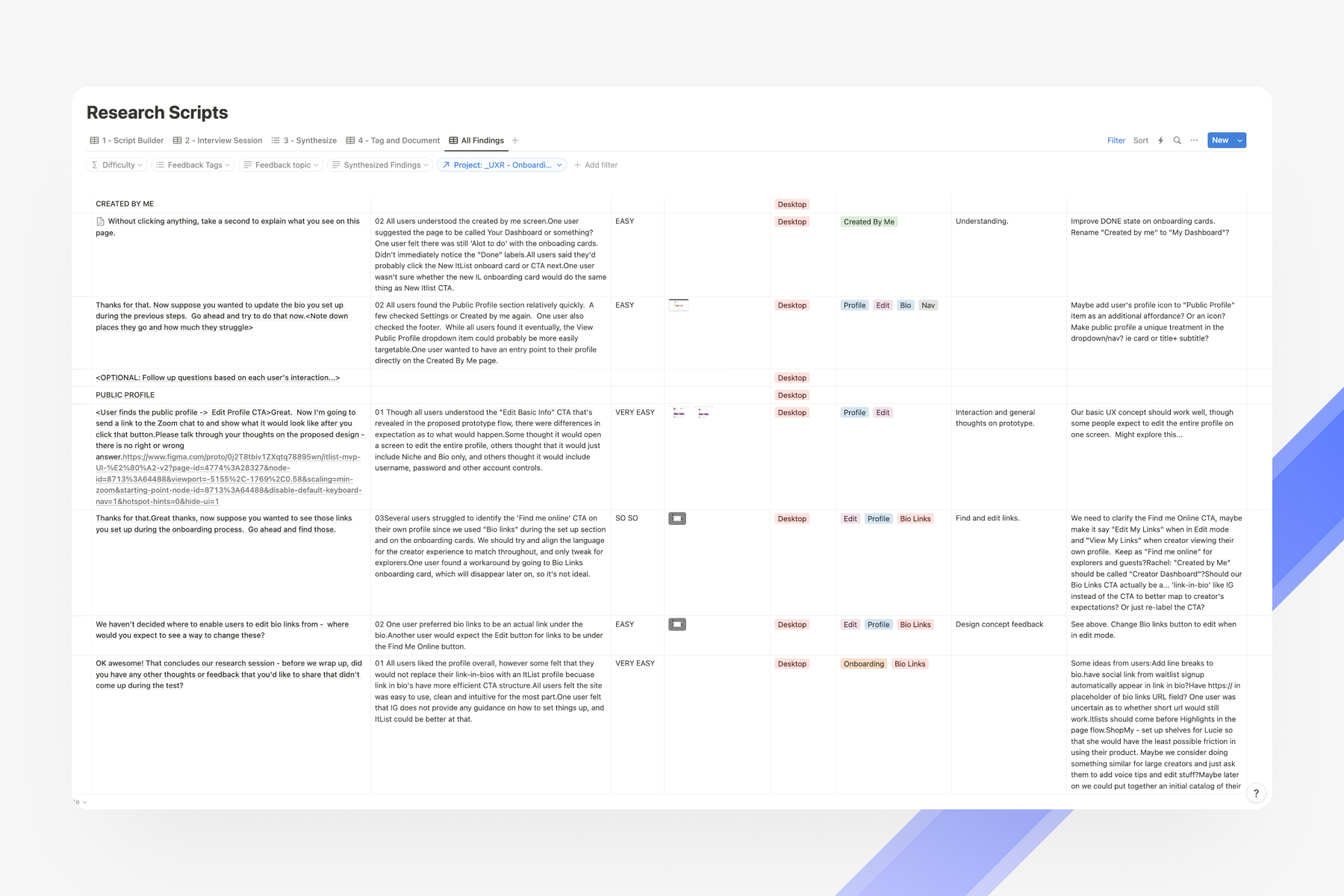
I won’t go into excrutiating detail on how the repository works, but it is essentially a Notion table with multiple views, where each view focuses on one of the following critical steps to conducting a thorough UX research study:
Script-writing
Interview note-taking
Synthesis
Tagging and documentation
And an ‘All Findings’ view for future lookup
Knowing when to ask for help
I knew our CEO and COO would both want to listen in on the interview sessions, and I also know that I’m not a very fast typist or attention-switcher. My brain likes to focus deeply on one thing at a time. So I enlisted the help of our CEO to take thorough notes while I focused on asking questions and capitalizing on interesting follow-ups. This also saved time over simply recording the session and having to go back and extract key findings from transcripts in the future.
Key findings
After running our users through nearly 50 questions, synthesizing the findings and discussing the results with the team, we were able to come up with a comprehensive list of 30+ possible revisions. Needless to say, we were glad we tested this design!
We then triaged our revision ideas into ‘Needed for launch’, ‘Needed soon after launch’, and ‘Nice-to-have’.
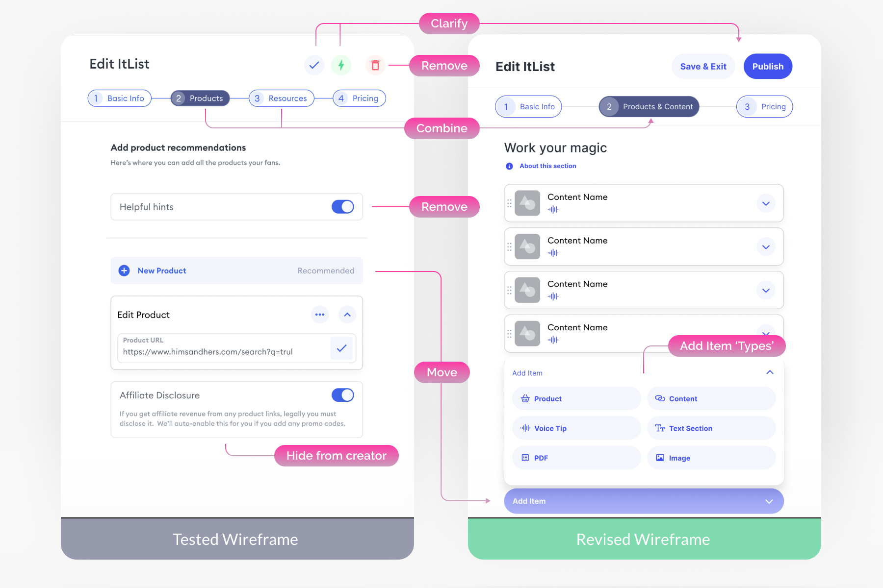
Overall, users understood the editor, navigation, and core interactions surprisingly well! There were some naming issues, but by far the biggest finding was that users did not want separate steps for ‘products’ vs ‘resources’, and resources were really just different types of ‘content’. Combining these sections into one step, and presenting an ‘item type picker’ after clicking ‘Add New Item’ turned our to be a far more intuitive UX architecture, and one that made it much easier to iterate on, and sort item types we added later against each other.
Bringing the validated concept to life
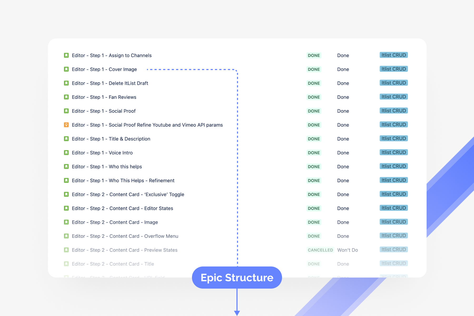
Great, so now we knew we were on the right track. Along with all this work on the UX side, it also fell to me to serve as the de facto PM and figuring out how to split out and sequence the tickets so they logically build on each other in small, manageable chunks.
This was a fantastic proving ground for my general suspicion that the role of the experience designer overlaps significantly with the role of a PM.
Ultimately, the product experience is the sum of the detailed requirements imposed on the codebase.
Challenging the convention
So if thats true, then why do so many design teams write design specs in unrelated confluence pages, using alternative structures to what product owners and developers will be working through in JIRA?
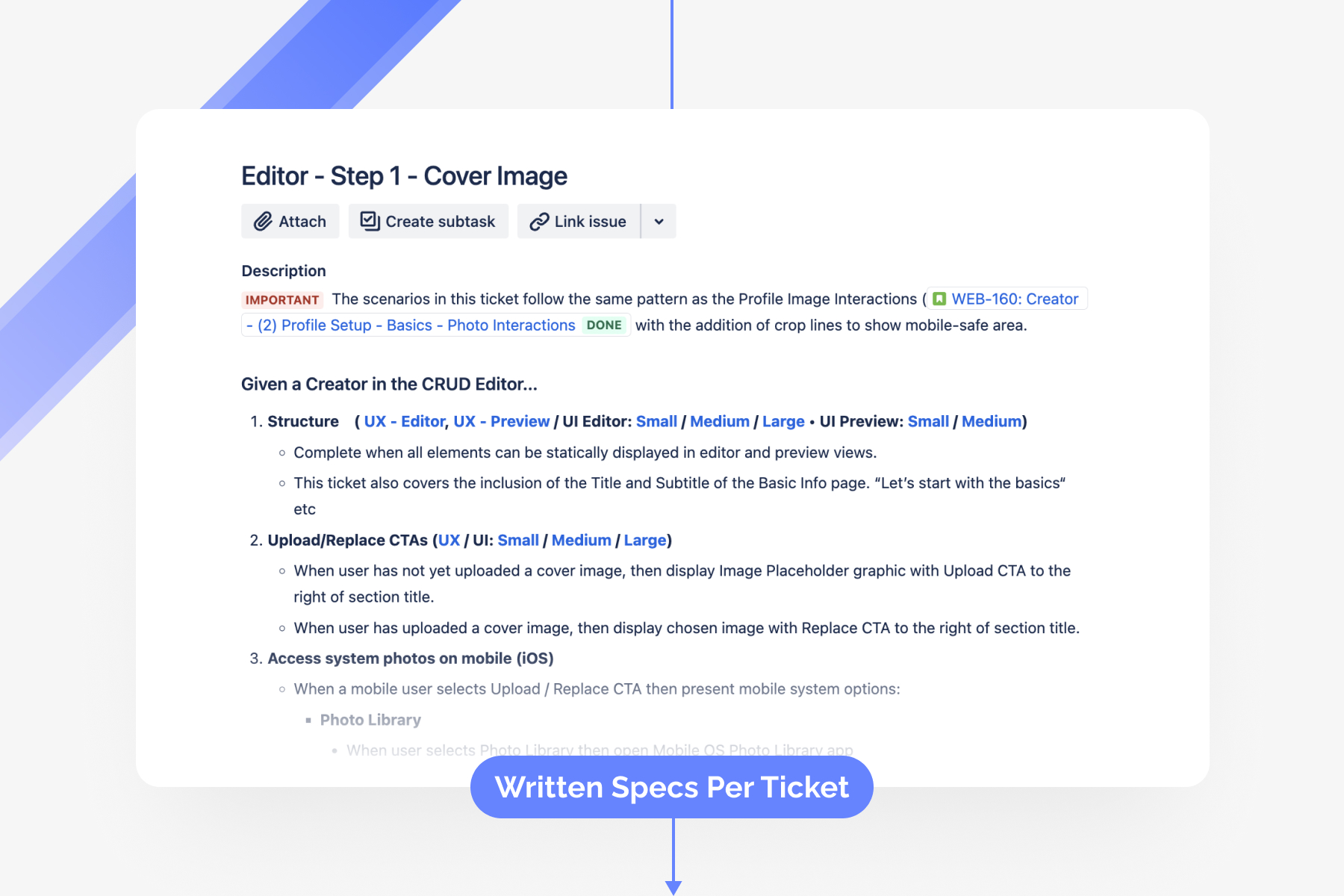
This never made much sense to me, and so I convinced our team to work smarter, not harder. Instead of trying to create monolithic UX specs which are resistant to the changes that Agile assumes, I wanted us to lean in! I wanted to define the UX and UI specs DIRECTLY in the tickets, so that the user experience requirements were not some dull confluence page to gloss over as an appendix to vague user stories, but rather the very requirements that developers MUST write code, unit tests and e2e tests against.
If the UX specs in each ticket are not fully implemented and working, then the ticket cannot be considered done, nor can it be merged. Full stop.
Wearing my ‘product’ hat
It fell to me to break out the UX specs to align with how developers would be implementing them. This is where knowing how developers work came in very handy, as I could anticipate how they’d want the work structured.
I also ensured that we could always revisit the specs and requirements in the future, simply by linking the JIRA ticket above the wireframe specs belonging to each ticket.
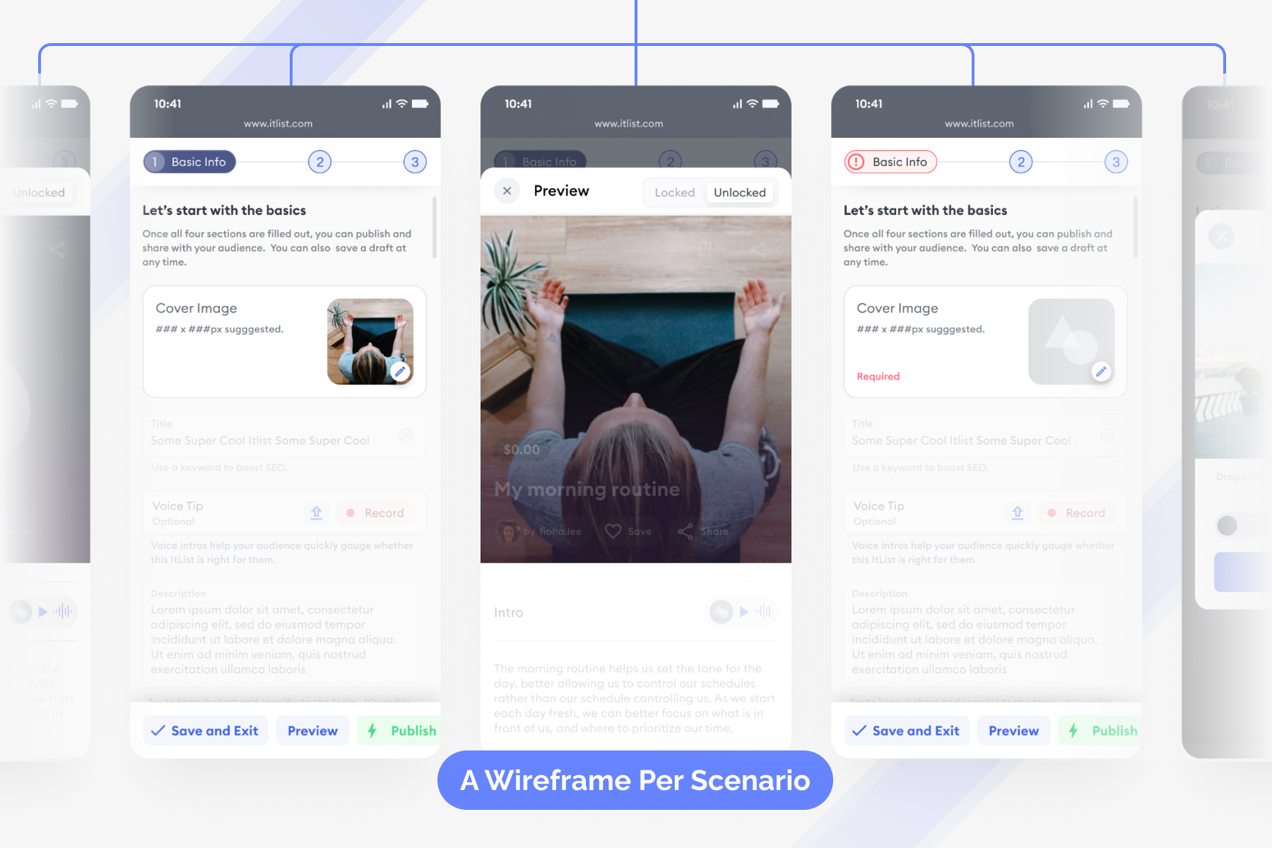
Mobile-first responsive design
Our go-to-market strategy revolved around creators with existing audiences sharing their ItLists with them. And most of those audiences are on social media. This meant that our entire experience had to be mobile friendly, since content creators are typically on their phones often, as well as their would-be customers.
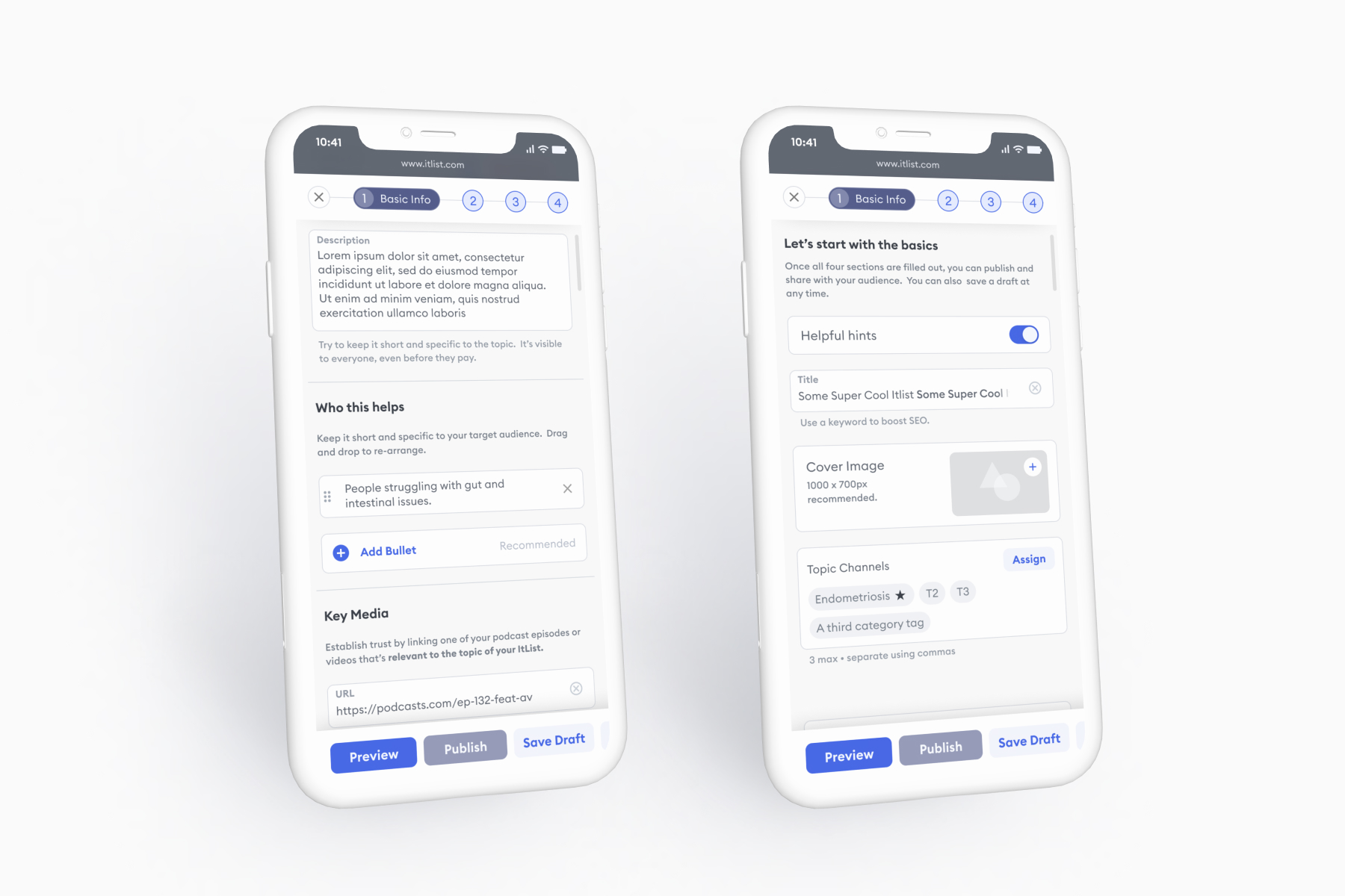
Below is a selection of mobile wireframes from a single ticket, describing the requirements for the ”Who this helps” section of an ItList’s presale page, which helps creators speak to their target customer.
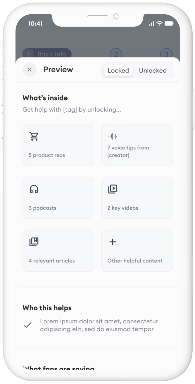
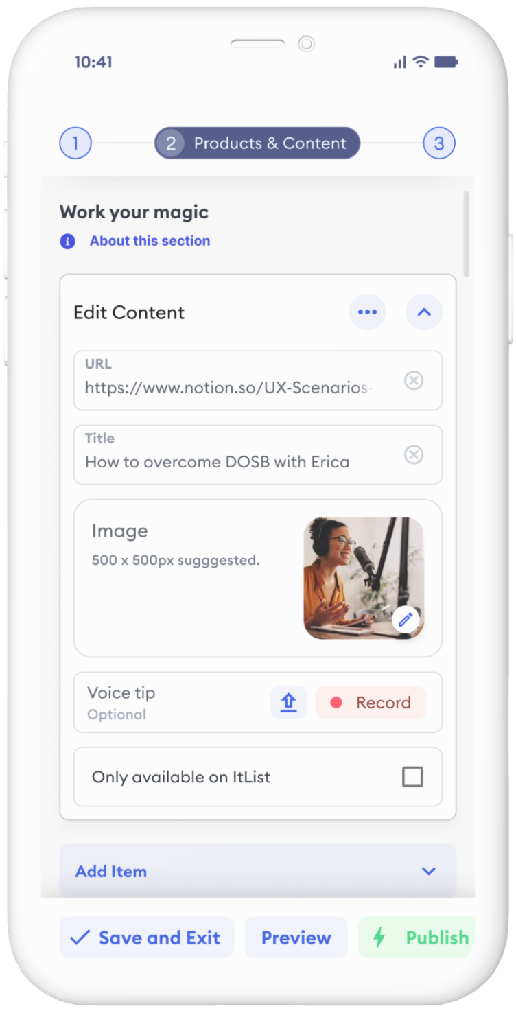
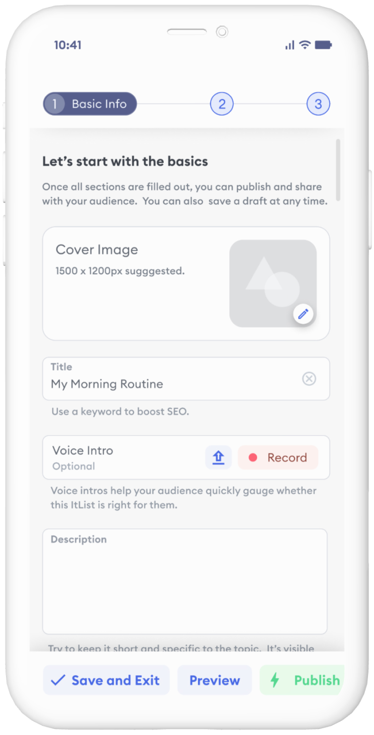


I like to have relatively high fidelity in the UX wireframes so as to provide clarity for the UI designer, and because the wires are constructed from a living design system, they are faster to create and maintain than low-fi wires from scratch, and more closely reflect the requirements I needed to communicate to down-stream team members.
Hand-off to UI
Our UX spec’ing process typically moved very fast. Once the overall constraints and design direction were established and de-risked, I wrote and created wires for UX specs such as those described above for over 50 tickets in a matter of a few weeks. Our developer worked on ticket A, while UI was finishing ticket B, and I was establishing the requirements for ticket C.
All UX and UI specs were linked directly to the relevant scenario in each ticket. Below is a selection of some of the final UI states in the ItList editor.
I collaborated closely with all involved via regular check-ins and requests for feedback on Slack, and gave the UI designer leeway to infer the tablet and desktop breakpoint comps from mobile once where there was no signifiant UX difference between them.
Results
Evaluating the metrics of the ItList Editor on its own is a bit of a fools errand, as ultimately it serves the larger purpose of providing the core of every other metric ie. ItLists created, ItLists sold, Engagement with individual ItLists on the consumer side, etc. So I’ll list a few key stats related to the editor design itself, and then some stats related to our startup as a whole:
- Creators spend an average of 1.2 hours using the ItList Editor.
- It takes just one day (cumulative session lengths) to create an ItList, whereas traditional course creation platforms take 30+ days to first publish and many, many more hours.
- The first creator to launch an ItList to a large audience (214k on IG) outsold the sum of her past lifetime digital sales ($3,000) by 10x - within the first 2 weeks.
- Surveys and subsequent interviews reporting an ‘easy’, ‘intuitive’ experience.
- LogRocket session recordings of creators using the editor reveal that they enter a state of flow, and almost never encounter blocking issues, rage clicks, or the like.
- 92% of creators that create one ItList go on to create more.

